Graphic Design Alignment Explained: Principles, Benefits, and Real-World Examples (2026 Update)
📌 Key Takeaways: Mastering Alignment in Graphic Design
- Alignment is the invisible backbone of design: It creates order, harmony, and visual connections between elements, making compositions easier to navigate and understand.
- Two main types of alignment: Edge alignment (left, right, top, bottom) and center alignment (horizontal/vertical). Each serves different purposes – edge for readability, center for emphasis.
- Justification and hyphenation require care: Justified text can create “rivers” of white space; hyphenation, when used thoughtfully, improves spacing but must be controlled to avoid awkward breaks.
- Grid systems are essential tools: Modern design software uses invisible grid lines to help designers align elements precisely, ensuring consistency across layouts.
- 2026 trends: AI-assisted alignment tools, variable fonts, and responsive grids are transforming how designers approach alignment across devices.
Graphic designers must effectively convey messages through visual media. Incorporating text into their designs is a fundamental element for communicating with the intended audience. The placement of text plays a crucial role in determining the impact and readability of the content. As graphic design continues to play a significant role in a visually dominant world, understanding the finer details is essential for establishing oneself as a reputable graphic designer. Among these details, alignment and justification stand out as two key features to consider when creating content.
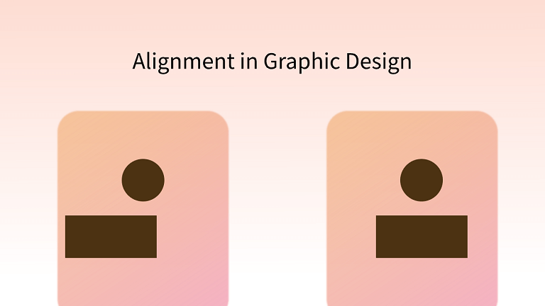
Alignment plays a pivotal role in graphic design, ensuring that the work is visually appealing to a broad audience. It acts as an invisible backbone that offers support to design elements, orchestrating them in an orderly and harmonious manner. In this blog, we will delve deeper into the significance and principles of alignment in graphic design. Additionally, we’ll explore some illustrative examples. So, without further ado, let’s embark on this journey.
⚡ 2026 Update: What’s New in Design Alignment
- AI-powered alignment tools: Software like Figma and Adobe XD now include AI assistants that automatically suggest optimal alignments based on content hierarchy and user behavior data.
- Variable fonts and responsive alignment: With variable fonts, designers can adjust letter spacing dynamically across screen sizes, maintaining perfect alignment without manual tweaking.
- CSS Grid and Flexbox advancements: Web designers now have unprecedented control over alignment across devices, with subgrid and container queries enabling pixel-perfect layouts.
- Accessibility-first alignment: WCAG 2.2 guidelines emphasize proper text alignment for readability, especially for users with cognitive disabilities – left-aligned text is recommended over justified.
What is Justification?
Justification in text refers to the process of creating a uniform text block by adjusting the spacing between words. Justified text has a structured appearance, which can initially appear neater. However, it comes with a drawback – it may result in the creation of unintended gaps or rivers in the text, which can disrupt the overall design. The sharp, straight edges on both sides of justified text can give it a clean look, but the presence of these unwanted gaps can make the design seem disorganized.
As a graphic designer, it is your responsibility to create designs that are not only aesthetically pleasing but also functional and visually appealing. The primary consideration in text design is readability. It is commonly believed that left-aligned text, with varying line lengths, facilitates easier reading because it helps readers keep track of their place in the text more effectively.
Hyphenation
Hyphenation is a typographic technique that some designers tend to avoid, mainly because it can result in short sections of words at the beginning or end of lines, which can disrupt the overall visual flow. However, when used thoughtfully, hyphenation can be a valuable tool for improving word spacing.
To employ hyphenation in your design, you can use keyboard shortcuts like Cmd+Opt+Shift+H (for Mac) or Ctrl+Alt+Shift+H (for Windows). But it’s important to note that hyphenation can introduce certain issues if not used carefully.
To control hyphenation, you can access additional options within the Type tool. This allows you to specify parameters such as the minimum word length required for hyphenation, the minimum number of letters at the beginning or end of a line before hyphenation can occur, and whether you prefer better spacing or fewer hyphens to maintain the aesthetics of your text. Properly managed hyphenation can help improve the overall appearance and readability of your typography.
Definition and Importance of Alignment in Design
What Is Alignment in Graphic Design?
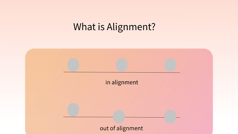
Alignment is an essential design principle that creates a sense of order and organization in visual compositions. Imagine a library with books scattered haphazardly or a chaotic crowd at a supermarket with no defined queue. These scenarios appear disorderly because there is no alignment.
When you introduce alignment, the difference is striking. In the library, books are neatly arranged on the shelves, and in the supermarket, the crowd forms a neat and orderly queue as they wait their turn at the cashier. Alignment brings structure and order to these situations, making them more organized and visually pleasing.
In graphic design, alignment serves a similar purpose. It ensures that elements within a design, such as text, images, and other visual elements, are arranged in a harmonious and structured way. This not only enhances the aesthetics but also improves the overall readability and comprehension of the design. Alignment is a powerful tool that designers use to create visually appealing and well-organized compositions.
Why Is Alignment Important in Graphic Design?
Alignment is indeed a crucial design principle, as it imparts consistency and coherence to design work. This principle is commonly employed by major brands to enhance the visual appeal of their logos and overall branding. Designers use alignment in various elements, including text, images, and shapes, to achieve a range of visual effects. In summary, effective alignment offers several benefits:
- Better Organization and Structure: Alignment helps create a clear and organized layout, making it easier for viewers to navigate and understand the design.
- Enhanced User Experience: Well-aligned design elements contribute to a smoother and more user-friendly experience, as viewers can quickly grasp the content’s structure and hierarchy.
- Contextual Connection: Alignment can establish connections between related elements in a design, conveying meaning and context more effectively.
- Aesthetic Appeal: Proper alignment enhances the visual attractiveness of a design, making it more visually pleasing and engaging.
- Harmony: Alignment fosters a sense of harmony within the composition, ensuring that elements work together cohesively and coherently.
Incorporating alignment into design work is a fundamental aspect of creating effective and visually appealing designs that resonate with the audience.
Canva Design School – Free Tutorials
Types of Alignment in Design
In design, alignment is divided into two major types:
1. Edge Alignment
Source: 254 Online
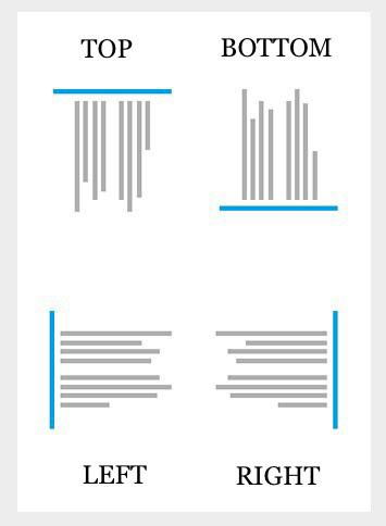
Edge alignment is a fundamental design concept that involves positioning content towards the edges of a page or layout. It encompasses aligning content to the left, right, top, and bottom. This type of alignment is commonly used in various design contexts, including web layouts, where it plays a significant role in arranging elements like body text and menu items.
Here are some key aspects of edge alignment:
- Horizontal Alignment: This involves aligning content from left to right or vice versa along the horizontal axis. It’s commonly used for arranging elements side by side or ensuring that text flows consistently from left to right, providing a smooth reading experience.
- Vertical Alignment: Vertical alignment, on the other hand, focuses on aligning content from top to bottom or vice versa along the vertical axis. It’s used to create a balanced and visually pleasing composition, especially in multi-column layouts.
- Justified Alignment: Justified alignment is a specific type of alignment that involves aligning the left and right sides of text or images against a straight, invisible line. This creates a neat and uniform appearance, where the text or content spans the entire width of a given area, ensuring a clean and polished look.
Edge alignment is a critical design principle that helps maintain order and consistency in layouts, making them more visually appealing and easier to read or navigate, depending on the context in which it is applied.
2. Center Alignment
Source: 254 Online
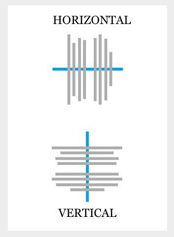
In the context of center alignment, an imperceptible line is established down the middle of the content or elements, resulting in a more centralized arrangement. This approach comprises both horizontal center alignment and vertical center alignment. In web layouts, it is a frequently employed technique for drawing user attention, especially in prominent headings, and is a prevalent choice in numerous logo designs.
Principles of Alignment in Design
Establish a Clear Hierarchy:
In design, elements hold different levels of importance. To convey this, it’s essential to establish a clear hierarchy within your work. Experienced designers often employ various alignment techniques to emphasize the central composition.
Maintain Visual Harmony:
This principle may appear to contradict the previous one, but it’s not the case. Balance is a fundamental aspect of all forms of art, including graphic design. Design is about focusing on the overall impact. Therefore, when applying techniques like hierarchy, it’s crucial to ensure that harmony exists among all design elements.
Utilize the Power of Contrast:
Contrast is a valuable tool for maintaining equilibrium between hierarchy and harmony. It’s particularly useful when you have multiple focal points. In such cases, you can employ both color contrast and alignment contrast within a single interface. For instance, using both left-aligned and right-aligned text to indicate the importance of content on both sides.
Harness the Benefits of Repetition:
While this principle may seem at odds with the previous one, repetition is one of the most commonly used rules in graphic design and plays a significant role in alignment. By using repetition, you can create a cleaner and more organized design.
Allow Space for Imagination:
The concept that “less is more” is well-known and equally applies to alignment. Regardless of your design and the alignment method you employ, it’s essential not to overcrowd the final result. Leave some space for simplicity and the user’s imagination to flourish.
Examples of Alignment
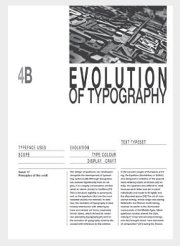
1. Uniform Alignment
Source: 254 Online
In this example, you can observe a three-column layout where the text is meticulously aligned. The consistent use of a single alignment technique contributes to a straightforward and uncluttered interface.
2. Mixed Alignment
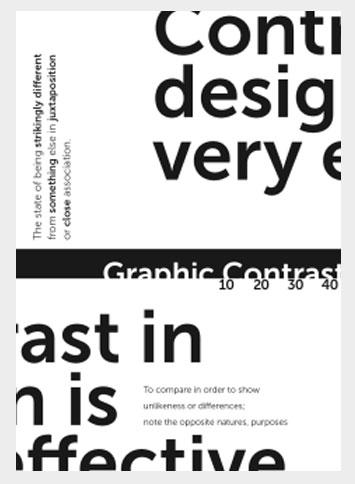
Source: 254 Online
In this example, you’ll notice a diverse range of alignments being used. Some elements display contrasting alignments and text placements. Surprisingly, this mixed alignment approach manages to introduce a sense of balance to the design, creating an appealing visual effect. It illustrates the creative possibilities that can be achieved through the use of mixed alignment techniques.
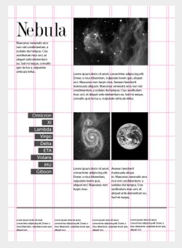
3. Helpful Grid Lines
Source: 254 Online
In modern times, design software offers invisible grid lines that assist designers in aligning text, images, and other design elements in a highly organized manner. These grid lines can be visualized and manipulated to create a unique and distinctive style. In the image above, you can observe how these grid lines play a pivotal role in precisely positioning content elements and ensuring their tidy arrangement.
Frequently Asked Questions (FAQ) About Graphic Design Alignment
1. What is the difference between alignment and justification?
Answer: Alignment refers to how text or elements line up relative to a page or container (left, right, center, top, bottom). Justification is a specific type of alignment where text is spaced so both left and right edges form straight lines – but this can create uneven gaps between words.
2. Which alignment is best for body text?
Answer: Left-aligned text (ragged right) is generally considered most readable for body copy because it creates consistent word spacing and helps readers track lines easily. Justified text can work for books and newspapers but requires careful hyphenation to avoid “rivers.”
3. How do grids help with alignment?
Answer: Grids provide a structural framework – invisible lines that guide placement of elements. They ensure consistency across pages, create visual rhythm, and make designs more scalable and maintainable.
4. Can I mix different alignments in one design?
Answer: Yes, mixing alignments can create visual interest and hierarchy. For example, center-aligned headlines paired with left-aligned body text is a common, effective combination. The key is intentionality – don’t mix alignments randomly.
5. What tools help with alignment in 2026?
Answer: Modern design tools like Figma, Adobe XD, Sketch, and Canva offer smart guides, auto‑alignment features, and responsive resize capabilities. AI‑powered plugins can now suggest optimal alignments based on design patterns.
6. How does alignment affect web accessibility?
Answer: Proper alignment improves readability for users with cognitive disabilities and dyslexia. WCAG guidelines recommend left-aligned text (for left‑to‑right languages) and sufficient spacing between elements to aid focus.
7. What are “rivers” in typography?
Answer: Rivers are unwanted gaps or white spaces that run through paragraphs when justified text creates inconsistent word spacing. They distract readers and should be avoided through proper hyphenation and manual adjustments.
8. Should I use hyphenation in my designs?
Answer: Hyphenation can improve spacing in justified text but should be used with limits. Set minimum word length (e.g., 6 characters) and control consecutive hyphens to avoid visual disruption. Many designers prefer to avoid hyphenation in short columns.
📝 Article Summary: Graphic Design Alignment 2026
- Definition: Alignment is the arrangement of elements along invisible lines – creating order, connection, and visual harmony.
- Types: Edge alignment (left, right, top, bottom) and center alignment (horizontal/vertical). Justification is a specialized form of edge alignment.
- Key principles: Hierarchy, harmony, contrast, repetition, and white space all interact with alignment to create effective designs.
- Tools: Modern software uses smart guides, grids, and AI assistance to simplify alignment tasks.
- 2026 trends: AI‑powered alignment suggestions, variable fonts for responsive layouts, and accessibility‑first approaches are shaping how designers work.
Whether you’re designing a logo, a website, or a magazine spread, mastering alignment will elevate your work from amateur to professional. Practice with grids, experiment with different alignments, and always prioritize readability.
📚 Further Reading from Trusted Design Resources
- Smashing Magazine – Design Section – In‑depth articles on design principles and techniques.
- Canva Design School: Alignment – Beginner‑friendly tutorials with examples.
- Adobe: Understanding Alignment – Official Adobe guide to design principles.
- Nielsen Norman Group: Alignment in UI Design – Research‑based UX insights.
- Google Fonts Knowledge – Typography fundamentals including alignment and spacing.
- AIGA – Professional Association for Design – Industry resources and inspiration.
- Creative Bloq – Daily design news and tutorials.
- Behance – Explore real‑world design projects and alignment examples.
- W3C Accessibility: Designing for Web Accessibility – Guidelines for inclusive design.
- Interaction Design Foundation – Alignment – Comprehensive design encyclopedia entries.
