Challenges in WordPress Responsive Web Design
Responsive web design is a web designing approach focusing on developing sites that give an excellent viewing experience. it includes comfort at navigation and ease to read with optimum resizing and scrolling that works on desktop computers and even mobile phones. Responsive web design addresses the changing prospects of browsers, devices, and orientation by creating adaptive and flowing web sites. In other words, it could be stated as responsive web design is an efficient measure simply showing your web site content without considering any specific device if you are interested in tech to discover our site https://www.techlux.ga/ for more tech style and gear
What is Responsive Design?
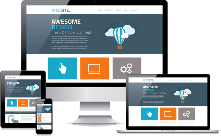
Responsive design is like a magic trick for your WordPress site, making it look fantastic on any device, whether it’s a giant desktop screen or a tiny smartphone. Designers use special techniques to create flexible content grids and make images adaptable using CSS (Cascading Style Sheets). This CSS magic allows your website to rearrange itself dynamically based on the screen size.
Take Mashable.com as an example. Open it on your computer, and as you resize your browser window, notice how the content and images magically adjust to fit. This magic is achieved through fluid grids and CSS media queries. Imagine it as a dance – as the screen size changes, the elements on the page gracefully move and shift to maintain a great user experience.
For instance, if you shrink the window, the site transforms to a layout suitable for an iPhone. The secret lies in the CSS rules that apply different styles depending on the device’s size. The HTML content remains the same, but the CSS instructs it to arrange itself differently, creating a seamless transition between desktop and mobile views.
This technique is not just about resizing text; it can even serve different image sizes based on the device’s resolution. It’s like having a responsive wardrobe for your website, ensuring it always looks sharp, whether it’s dressed up for a large desktop screen or casually browsing on a mobile device. Cool, right?
Optimizing Performance for Responsive Sites
While responsive design works wonders for user experience, it comes with performance considerations. Loading multiple CSS files and various image sizes can strain the backend processing of your site. As you embrace responsive design, it’s crucial to treat performance as a top priority. Users may tolerate a slightly slower mobile site, but patience wears thin if the wait is too long.
Here are key steps to optimize your responsive site for performance:
Image Optimization:
Detect the device’s screen size and deliver the appropriate image size.
Implement caching mechanisms to efficiently store and retrieve images.
HTTP Request Reduction:
Minimize the usage of CSS and JavaScript to reduce the number of HTTP requests.
Implement caching strategies to store and reuse CSS and JavaScript resources.
Conditional Asset Loading:
Plan your design to load essential assets only, especially for smaller devices.
Avoid unnecessary loading of large elements like social media buttons on smaller screens.
Lazy Loading:
Delay the loading of certain assets, particularly JavaScript, until after crucial page elements have loaded.
By prioritizing the loading of essential content first, users can access the information they seek before additional assets load.
Considering that delivering content to mobile devices using cellular data introduces inherent delays, with even fetching 40KB taking around 700ms under optimal conditions, proactive measures in optimizing your responsive site become imperative. Strategically managing assets and embracing performance-focused design principles will ensure a seamless and speedy user experience across devices.
Elements of responsive web design

Let’s take a WordPress e-commerce website designed according to responsive techniques includes three basic elements:
Media query – media queries could be used to apply different style rules to page based on characteristics of the device displaying site. Semantic operators such as AND and NOT could be used to test for several features of combined queries. Features include height, width, max-width, device height, orientation, resolution, etc.
Flexible grids – fluid grid concept include the page elements size to be in relative percentage rather than absolute units. Developers should avoid using pixels as for today it is almost pixel oriented description of layout and text sizes.
Target / context = result
This means you need to have some math to achieve a flexible grid. This is perfectly applied in WordPress plugin. You will see some great flexible grid options.
Flexible images – images also need to be sized in relative units up to 100%. This feature allows you to adapt the image to load differently depending upon the device by using scaling. This feature is very significant in websites for WordPress e-commerce and WP project manager.
Does responsive design really helpful?
Native Tablet applications are usually taken as more engaging than browser-based web applications. There are certain characteristics of native experience that presents it differently from other browser-based web applications. While considering a responsive design approach to optimize web experiences for tablets, most of the developers are keen to design a more “app-like” mobile web experience.
There exist significant gaps between browser-based web experience which can be optimized for improved tablet use. This not only helps to put forward reveal existing desktop web experience more intuitively but also give a vital approach with responsive web design. Organizations have often strived hard to optimize the tablet experience by the desktop experience, particularly assigning the additional cost of optimizing web experience.
Improve the WordPress website experience
There are certain vital aesthetics of native tablet app design that can be used as an acceleration to improve the web experience but if you are interested in tech discover our https://www.techlux.ga/riviews/collest-gadgets-for-man.html coolest Gadgets for Men.
Simplified navigation paths – To keep navigation easy to find when required, without diverging from the rest of the experience, tablet applications employ simplistic navigation techniques making use of the extra screen real estate area.
Focus on design principle – One of the features that a tablet application holds is the focus at each screen taking cognizance of the core user task. To make the experience more flawless, distractions are removed that may take away from the core element.
Persistent actions – Tablet applications generally make use of toolbars that are placed along with points of action at an easy reach. Adding to this, there are various actions related to a particular piece of content that is placed in the proximity to that item in the manner which indicates how it can be manipulated. Now optimize your actions using we devs appsero
Use of transitions and animations – Attenuate animations and transitions can help offer tablet experiences that feel much prompt and engaging as well as helping provide ample feedback at the times while the user completes an action. I find some best animations in wedevs elementor Addons plugins. It is Powerful elementor widgets to create beautiful websites. This plugin has many features for free.
WordPress plugins revolution
WordPress plugins revolution has completely changed the developer’s order of implementing their jobs. Scenario reveals it’s time now to change your old fashion WordPress themes to new plugins management. Templates in the website theme need to change according to the requirement of the author requirement.
Many themes in the market are come up with just the basic grid structure. The remaining CSS and js part is being done by plugins. There are many good WordPress plugins in the market to solve all the responsive problems on the website. You can have a try with beaver builder, Divi builder, elementor, WPBakery, and many more.
To overcome eCommerce website problems there are many plugins. We devs provide some wonderful solutions for all your business needs. You can easily start a multi-vendor eCommerce website.
If you like you can hire use for Responsive web design more info can be found at Responsive Web Design Services


