Top 10+ Best Google Fonts For 2025 – Web Developer Guide & Review
Fonts are one of the most important factors influencing both the appearance and the user experience of a website. After all, fonts are the tools by which you basically communicate your content to the audience, and striking the right note between readability and attractiveness is what matters most. A bad choice of font can, therefore, lead to very adverse consequences. It may irritate the user’s experience and, at the same time, make your content less readable. If users have a hard time understanding what they read, they become frustrated, which, in turn, makes them less likely to engage with your site. Consequently, you may get increased bounce rates and lowered user satisfaction.
Factors to Consider Before Choosing Google Fonts:
List of Top 10+ Google Fonts of 2025:
1. Roboto
2. Open Sans
Open Sans is distinctively a font that is highly friendly to users and extremely readable. The adaptable typeface is the most suitable of the broad applications, not only going thereby into the headlines, but also making a body text which is of great importance. Its main attractiveness is in its being able to serve the reader without any breakdown thus it is chosen by many designers and developers.
A major evidence of Open Sans’s readability is the default font selection in Divi theme. This acknowledgment emphasizes the font’s outstanding neatness and flexibility, thus making it an ideal tool for the creation of the content that is attractive and easy to understand. The font's readability is due to the balanced letterforms that create a perfect blend of a modern, sans-serif style and the basic principles of readability. With this quality at hand, it is an excellent vehicle for information in both digital and print media.
In fact, the font may be utilized for headlines aimed at attracting the attention of the reader or the body text to inform thoroughly, anyway, Open Sans is always there to confirm itself as a dependable and friendly-to-the-user font. Its use is not limited to one design context but it is rather a widespread choice which is a strong indication of the font's longevity and reliability as a solution for anyone to blend readability with aesthetic appeal in typography.
3. Montserrat
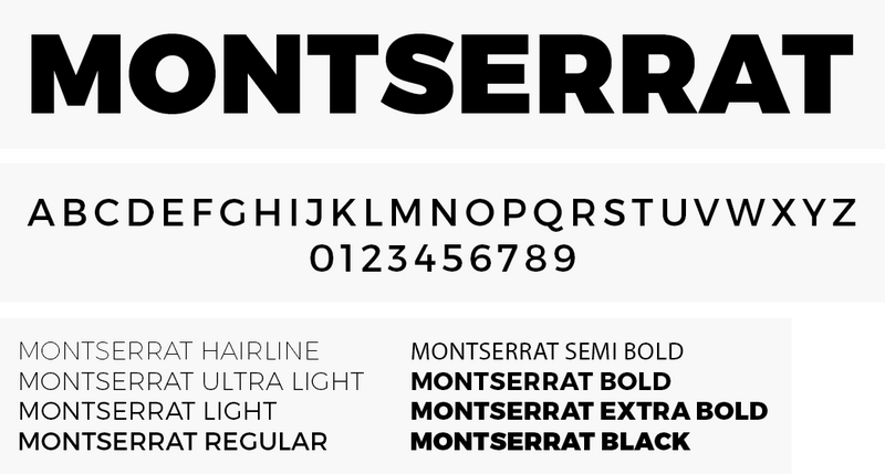
The font Montserrat is a perfect example of a very versatile typeface as it features more than 30 different style variations. Its historical origins are based on the Montserrat neighborhood in Buenos Aires, Argentina, at the beginning of the 20th century, and both its name and artistic inspiration are taken from this culturally rich area. The huge font family of the Montserrat, with a wide range of styles, is capable of handling almost any type of design work.
Essentially, the font weights vary from extremely loud and vivid versions to slightly neutral and fancy styles, thus, Montserrat can cover a broad spectrum of typography requirements, which, in turn, makes it an indispensable tool for both designers and typographers. On top of that, the font features a storyline which is a bit more than just a mediocre font, picking-up the very core of an epoch built around the vibrant artistic scene and architectural diversity of the Montserrat district.
The blend of history and art delivered to the font creates an uncommon character, which, in turn, increases its aesthetic value. Depending on the context, Montserrat can be used to communicate a warm feeling of timeless classic or a bit more stylish contemporary vibe. Also, the font can be seen as a bridge connecting past and present and even though it takes its roots from the artistic heritage of Montserrat, it is still able to answer to contemporary typographic needs. Hence, it remains an open-ended and long-lasting option for designers who like to spice up their work with a bit of historical flavor.
4. Lato

According to Google, one of its key features is a unique duality of “serious and friendly.” Lato is a typeface that originated in Poland, and its name means “summer” in Polish. The name is a perfect match for it – a versatile typeface that radiates good-weather playfulness and liveliness. Lato is a font that can be used for any purpose and is particularly noted for its design which makes it very readable and yet retains a bit of its personality.
The carefully designed letters of Lato are harmonious and the font is very readable without any effort, thus it can be used in a wide range of applications i.e. it can be printed on paper or used on the digital screen. Its precision and attractiveness to the eye make it a preferred choice by designers and typographers. Conforming to the description of Lato as an entity that is “serious but friendly,” Lato is a typographical chameleon that can be in harmony with any design context.
Lato’s proficiency as a language is also reflected in the mere fact that it can be used in formal documents, as well as creative works where a certain degree of informality is required. Apart from these, the font’s qualities evoke images of summer and thus it is imbued with the characteristics of a carefree child and also lightheartedness. The playful side of Lato makes it a perfect instrument if you are working on projects that want to communicate one or more of the following: being upbeat, energetic, or the very essence of summer.
5. Poppins
Poppins is a font that has been very popular with many people and is known for its very rounded and stylized appearance, which makes it a very versatile font for usage in different types of typographic works such as for the text of the main body or titles or subtitles, etc. The font was designed in 2014 and later made available as an open-source font. This font is a perfect blend of two different writing systems: Devanagari and Latin, hence, it is very versatile and can be used in non-Latin-based scripts as well.
The font Poppins is able to change its style according to the different design contexts without losing its unique features. The use of rounded letters in the Poppins font gives it a more contemporary and friendly look. This makes the font equally effective for use in large and eye-catching titles as well as in running texts which are long and are need to be easily readable. The adaptability of the font is one of the main reasons for the design of the font to be given so much thought.
The fact that Poppins is based on the Devanagari and Latin scripts means that it is an inclusive typeface and can be used globally. Poppins takes its features from both the Latin and Devanagari scripts thereby becoming a link that connects different cultures and languages and offering a visual communication medium that is borderless.
6. Raleway
Raleway, which can be best described as a thin and elegant font, is a typeface that works great as a display font, i.e., for the visually larger text in the page like the titles and subtitles of the text. It was initially released in 2012 as just one light font but now Raleway has developed and diversified its range to include nine different families. The inherent thinness of the font gives it a characteristic of being very chic and sophisticated, and thus it can be used for fashion in design aestetics projects.
Most notably, Raleway has the strength to hold the eye of the viewer with still a sense of reserve and it is therefore, extremely appropriate for the purpose of the gist of the text in the headings and subheadings. From the mere single thin variant to a full family of nine, the font’s progression mirrors its versatility and popularity among users. This growth in the font family range means that more design needs are met thus giving designers more freedom and increasing their options when it comes to typography.
If one is to compare the use of Raleway in the digital versus the print field, then the conclusion is that in either of the two, the font brings to the table a sense of modernity and is fashionable. By being offered for use in different weights and different styles, the designers are given the freedom to choose from a palette of different visual output, whether it is the thin, almost transparent version or the striking and powerful style from the same family.
7. Noto Sans

Noto Sans is a very powerful type of font. It offers a total of 18 different types of font. The font which stems from a record is the mind blowing array of more than 3700 glyphs, thus making the typeface an extraordinary one with an almost unlimited possibility of use. In the Noto Sans family, you will discover 18 variants covering different weights, widths, and italics.
This variety makes Noto Sans perfect for any kind of application, whether it be visual or written. If your work had to be loud and eye catching or calm and eloquent, Noto Sans would still have the right instruments in its piano to help you deliver your message.
Simply put, the large number of glyphs available in Noto Sans is an indication of the font’s goal to support as many languages and characters as possible. Hence, it is an ideal tool for designers and typographers who have to create projects accessible and inclusive to the whole globe, since the font can easily accommodate a vast number of writing systems and special characters.
8. Inter
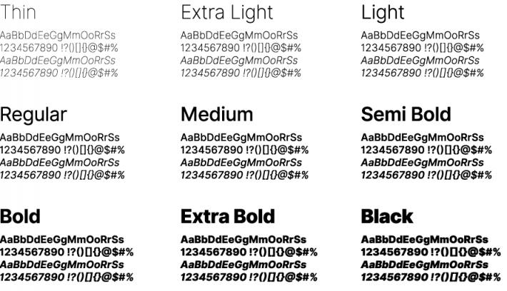
Inter is the latest addition to our font library, a font carefully designed to give the best results on computer screens. In 2017, it was introduced as “Interface” and since then this font has been a very serious typographic choice in a short time.
The main thing that differentiates Inter from other fonts is the outstanding feature of the font to have the classical charm of Helvetica and, at the same time, the modernness of San Francisco Pro. By combining these 2 styles, Inter becomes the designer’s friend who is looking for a modern style yet timeless in his works.
By concentrating its design on computer screens, the font receives excellent readability at different sizes and different resolutions. The font is a perfect fit for digital interface, web design and any other area in which clarity and readability are essential.
One of the reasons why the font has been so popular in a very short time is its great adaptability and the fact that it can meet the requirements of modern design, while at the same time, it keeps a bit of typographic nostalgia. As a result, this font has been very popular among people who seek the perfect merging of beauty and functionality in their typographic works.
9. Roboto Slab
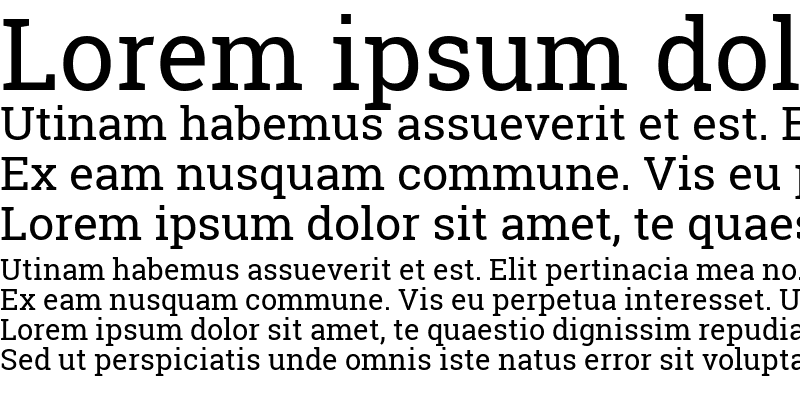
Roboto Slab is a very special and different kind of font to the Roboto family which is, by the way, composed of the highly successful Roboto typeface. The particular variant of Roboto features a different concept that gives up the sans-serif chic of the parent’s font to bring in the old-fashioned style and, at the same time, more adaptability.
Roboto Slab follows the same basic concepts of clearness and readability, which are the reasons for the huge success of the original Roboto font, but it decides to break the rule by adding serifs – those small, decorative strokes at the character ends – thus making the font look more traditional and timeless. Such a design decision enables Roboto Slab to be the best in different typographic situations where a certain level of sophistication and seriousness is required.
10. Merriweather
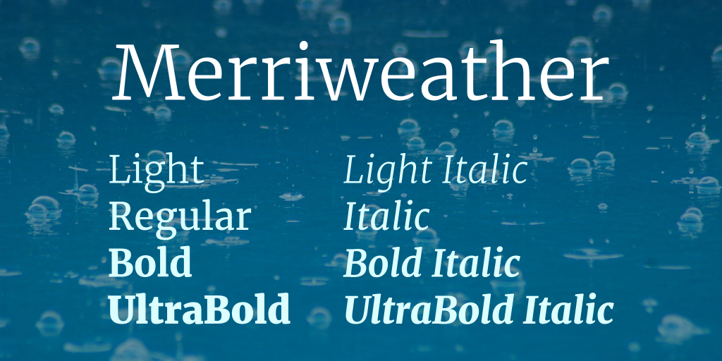
Merriweather, one of our distinctive serif typefaces, is a font that combines a playful typographic side with a serious one, almost like the font is smiling. Tall and condensed letterforms characterize this harmonious balance of the two seemingly contradictory qualities and thus become a usable, diversified and attractive font solution.
In spite of the fact that Merriweather is a condensed font, it is still very readable on all sorts of screens which means that this font is great for use in digital contexts. The attribute thus becomes a great choice for design works of various kinds making sure that the content you produce is both beautiful and easily accessible to your target audience.
Besides that, Merriweather is a font with a very rich family, the feature also known as companion typeface can be called Merriweather Sans that is a sans-serif variant which is designed to produce a similar effect to the serif version. Hence, the designers may use the two fonts to create a harmonious typographic composition by pairing the two. The pairing enriches the designer’s toolkit by giving them different typographic stylistic expressions in which they can reconcile readability with aesthetic appeal.
11. Playfair Display
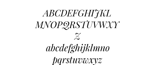
Playfair Display is a font that can easily be compared with the classy style of the past but still has a modern trendy vibe. Thus, it’s a sort of contradiction that works well when this exceptional font is placed in a cramped space with other fonts, i.e., as a heading graphic by its regal and attractive character.
If you decide to use Playfair Display in your work, you must know that pairing is an art. To fully benefit from the font and still be able to read the text, it is a must that Playfair Display is accompanied by a matching sans-serif font. Roboto, Open Sans, Work Sans, and Lato, which are recognized for their neat and friendly-to-the-eye nature, are the perfect partners.
Combining Playfair Display with a sans-serif font results in an elegant yet simple look that gives the reader visual delight and better text understanding. Such an arrangement of fonts is not only attention-grabbing but also easy to read, thus, it can be used in a variety of ways from finely designed invitations to classy digital interfaces. So, these were the most popular Google fonts.
Best Practices for Google Fonts:
Conclusion:
With an extensive library of fonts that make websites visually appealing and readable, Google Fonts has really been a game changer for web designers and developers. From its initial offering of only a few fonts, Google Fonts has evolved into a huge repository with thousands of styles and variations for fonts since it was launched in 2010. This priceless tool is instrumental in the promotion of fair typography competition which is very important because designers of any budget can get good fonts. In a way that satisfies both parties, Google Fonts harmonizes the two factors, beauty and readability, thus, a great variety of design preference and requirements can be met.
FAQs on Google Fonts:
Could Google Fonts be printed?
Sure, Google Fonts are allowed for any type of work, printing included. Although considering that they are primarily designed for the web, a few changes might have to be made in order to get a nice printout.
Is it possible to utilize Google Fonts for with Commercial Purpose?
Indeed, Google Fonts are fairly permissive in terms of licensing, freeing up their usage for commercial intents. Nevertheless, watch out for the external font foundries as some of their fonts might not be liberally licensed. Always double-check if the font is from the Google Fonts Catalog.
What is the method of adding Google fonts to my PC?
- How you can Google Fonts on your PC is not complicated:
- Browse the Google Fonts directory.
- Pick the fonts you want to use and add them to your collection.
- Download your collection by clicking the button.
The download file should be unzipped and the font should be extracted to the font’s folder in your system directory.
Would Google Fonts decrease the loading speed of my site?
It depends. When fonts are loaded from Google’s CDN users get the fastest possible connection which is further facilitated by the fact that the fonts are compressed. So, if Google Fonts are already cached on the user side, you’re quickly done. On the other hand, if you have numerous fonts with various styles and weights active on your site, you are risking slow down of your site. What will most likely help trick your site into loading faster is the selection of a few fonts and a few font weights.
What are the greatest Google Fonts?
Best Google Fonts might be different from one person to another as personal taste matters. There are more than 900 fonts to choose from which is quite a challenge of deciding. You can take a look at our article to which we have dedicated the best Google fonts to find out more. Moreover, a UI/UX expert can help the right choice of Google font for your company.


Thanks for finally writing about the current topic Loved it!