Serif vs Sans Serif: The 2026 Guide to Choosing the Right Brand Font
Sans serif and serif fonts are the two most common typography styles used in branding and web design. Understanding the differences between them helps designers choose the right typeface for readability, brand personality, and visual hierarchy. Similar to choosing the right outfit for an occasion, selecting fonts for your branding and website design is crucial. Fonts, like clothing, offer a first impression of your brand, setting the tone for your overall identity. It’s essential to be intentional and strategic in your font choices to effectively communicate your brand image.

Quick Comparison: Serif vs Sans Serif
| Feature | Serif Fonts | Sans Serif Fonts |
|---|---|---|
| Defining Trait | Decorative “feet” (tails) at letter ends | Clean, blunt endings without decoration |
| Brand Vibe | Traditional, Formal, Reliable, Established | Modern, Approachable, Clean, Friendly |
| Best Use Case | Print books, Newspapers, Law firms, Luxury brands | Websites, Mobile apps, Tech companies, Startups |
| Common Examples | Times New Roman, Georgia, Garamond | Arial, Helvetica, Open Sans, Futura |
| Readability (Digital) | Good for long-form print, can be harder on screens | Excellent for digital displays, especially at small sizes |
Why Is Choosing the Right Font So Important?
Selecting the right “outfit” for your brand is crucial. Fonts, like clothing styles, vary in casualness and expressiveness, and the wrong choice can alter your brand’s personality, leading to misconceptions about your company. The impact of font selection is evident in the example below, where iconic logos take on a completely different tone when switched to Comic Sans. Brands that once appeared clean and refined now seem childish and playful. This highlights the importance of choosing a font that aligns with your brand’s identity to ensure an accurate perception. To begin, it’s essential to understand font categories, with serif and sans serif being the two main classifications, despite the plethora of other categories like script, display, and gothic.
Serif vs Sans Serif: What’s the Difference?
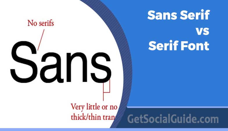
Distinguishing between serif and sans serif fonts is a crucial step in narrowing down your font choices. The distinction is straightforward, as the presence or absence of serifs defines each category. Serifs are decorative strokes that conclude a letter’s stem, often referred to as the “feet” of the letters. A font with serifs is called a serif font, while one without is labeled as sans serif, denoted by the term “sans,” meaning “without” in French. The example below illustrates the contrast, with the serif font featuring ornamental details and extending serifs, while the sans serif font maintains clean and precise endings.
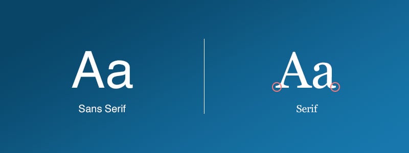
Both styles convey unique personalities and messages, emphasizing the importance of aligning your font choice with the intended message of your brand. Now that you grasp the disparity between serif and sans serif fonts, let’s explore the background and psychology behind each font style.
Natalie Downey, Senior Designer at Duckpin, explains, “The main difference between these two typefaces is the presence or absence of serifs within the letters.” She goes on to describe serifs as decorative lines or tapers added to the beginning and/or end of a letter’s stem, creating small horizontal and vertical planes within a word.
In simpler terms, serif fonts have these decorative lines or tapers, often called “tails” or “feet,” while sans serif fonts do not include these decorative strokes, which is why the name includes the word “sans,” meaning “without.” According to Downey, sans-serif fonts are characterized by simple, clean lines that maintain the same width throughout, without the additional tails.
Common serif fonts include Times New Roman, Garamond, Baskerville, Georgia, and Courier New, while popular sans-serif fonts include Arial, Helvetica, Proxima Nova, Futura, and Calibri.
What Is a Serif Font?
A serif font is a typeface that features serifs, which are extra strokes at the ends of its letterforms. These fonts evoke a sense of history, tradition, honesty, and integrity. There are various types of serif fonts, each with different shapes, thicknesses, and lengths. Here are some examples:
Serif Font Styles
- Old Style: Old style serifs have wedged ascenders in the serifs and a noticeable contrast between thick and thin strokes in the letterforms. Garamond, named after the sixteenth-century Parisian engraver Claude Garamond, is a classic old style font often used in body text and book publishing. It is characterized by slanted counters or scooped serifs.
- Transitional: Transitional serifs exhibit more contrast between stroke thickness and wider, bracketed serifs compared to old style serifs. Times New Roman, a common choice for plain text reading, falls into the transitional category. Libre Baskerville is another example, designed specifically for digital body copy with wider counters and less contrast than traditional Baskerville.
- Slab Serif: Slab serif fonts, like Clarendon, have thick, blocky serifs that can be as thick as the letter strokes themselves. Other examples include Courier, Excelsior, and Rockwell.
- Didone: Fonts in the Didone family, also known as Modern serifs, are characterized by high contrast in stroke thickness. While not ideal for body text or long-term reading, Didone fonts like Didot and Bodoni can evoke a sense of luxury or elegance. These high-contrast “Modern Serifs” are currently trending in luxury branding and fashion magazines .
What Is a Sans Serif Font?
Sans-serif fonts are typefaces that lack serifs on the ends of their letterforms, giving them a more modern and minimalist appearance. These fonts are known for their high legibility and clean, orderly look. Here are some types of sans-serif fonts:
Sans Serif Font Styles

- Grotesque: Grotesque sans-serif fonts have consistent stroke widths, and uppercase letters exhibit a uniform appearance. An example is Franklin Gothic, which features an extra-bold design.
- Neo-grotesque: Neo-grotesques prioritize neutrality and simple legibility. They have fewer strokes than standard serif typefaces and are more refined than traditional grotesque fonts. Arial is a neo-grotesque typeface with fuller and softer curves, and terminal strokes cut on the diagonal. Helvetica, another neo-grotesque font, has a dense letterform with a high x-height and tight character spacing.
- Geometric: Geometric fonts are influenced by geometric shapes, resulting in a more modern look. Futura is an example of a geometric sans-serif typeface with weightier letterforms. Avant-Garde Gothic is another example within the geometric font family.
- Humanist: Humanist sans-serif fonts draw inspiration from traditional letterforms, often featuring variations between thin and thick strokes. These fonts have loose letter spacing, wide counters, and a large x-height, making them easier to read in smaller text. Calibri is a humanist sans-serif with a rounder and warmer aesthetic.
PRO TIP: Accessibility Considerations for 2026
As a web accessibility expert, I recommend prioritizing sans-serif fonts for body text on digital screens. Users with dyslexia and other reading difficulties find sans-serif fonts significantly easier to read on backlit displays due to their simpler, more consistent letterforms. For body copy, stick to fonts like Open Sans, Arial, or Verdana at 16px or larger. Reserve serif fonts for headings or print materials where their decorative qualities shine without compromising readability.
Tips For Using Serif And Sans Serif Fonts Together
Follow the guidance of designers and utilize templates if you’re not a design expert. You don’t need to become a font-pairing master for serif and sans serif fonts. Instead, leverage existing font combinations crafted by designers. Platforms like Easil offer templates with great font pairings that feature both serif and sans-serif fonts.
Draw inspiration from free fonts. Explore our comprehensive guide on using free fonts to discover options in both serif and sans-serif styles.
Refer to our extensive Font Pairing Guide, ideal for uncovering font combinations, including those with both serif and sans-serif fonts.
Exercise caution with the number of fonts you use. Aim for a maximum of two fonts in your design to maintain a balanced ratio of serif to sans-serif fonts. One of each is generally sufficient for most designs.
Consider the “mood” of your fonts. Serif fonts often convey a classic or formal mood, even an elegant one. On the other hand, sans serif fonts are typically described as modern, friendly, and minimal, exhibiting stylish simplicity without decorative strokes.
Determine the font that best suits your needs. When choosing between serif and sans serif fonts, your selection will depend on various factors such as project type, desired mood, color scheme, and the nature of the images you’re incorporating. Both font types can be versatile and applied in a wide range of projects and applications.
What Does a Serif Font Say About Your Brand?
If you aim for a classic and traditional vibe in your designs, opting for serif fonts is the way to go. Robyn Young, founder of branding agency robyn young & co., explains, “Serif fonts have been widely used in books, newspapers, and magazines, which is why they remind us of more classical, formal, and sophisticated themes—think of Old English and Roman scripture.”
Serif fonts are an excellent choice for brands seeking to convey trustworthiness, establishment, and reliability. According to Natalie Downey, Senior Designer, “Because serif typefaces date back to the 18th century, companies that utilize serif fonts are often seen as more established, serious, and traditional.” She adds, “Consumers are drawn to the traditional look because of the implied heritage and loyalty of the brand.”
Serif Fonts Say Traditional, Established, and Trustworthy
The origin of serif fonts traces back to the 18th century, where stonemasons carved letters into rock surfaces. In contemporary times, serif fonts are prevalent in traditional mediums like newspapers, magazines, and books. This association with classic and refined aesthetics makes serif fonts a popular choice for companies aiming to convey these traits.

As mentioned earlier, the distinctive feature of serif fonts lies in their decorative tails and strokes. Additionally, serif letters often incorporate varying stroke weights, resulting in some parts of a letter appearing thick while others are thin.
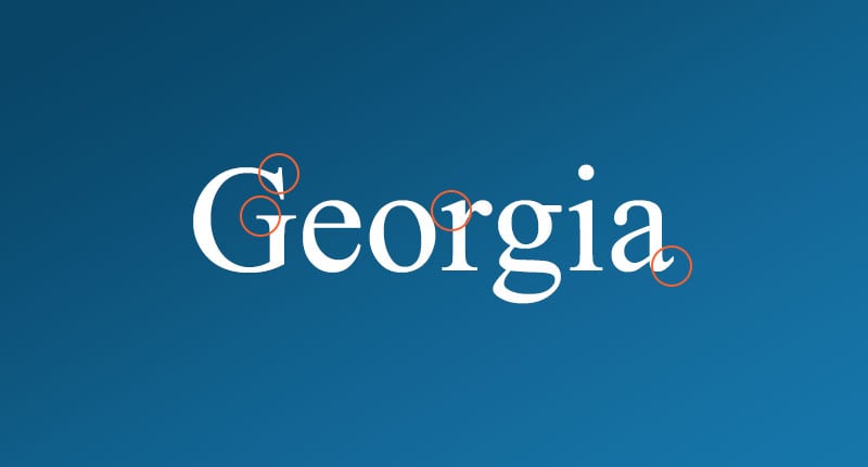
The unique characteristics and historical background of serif fonts evoke a sense of elegance, confidence, and trustworthiness. Consequently, these fonts are well-suited for companies aiming to project a more reputable, established, and serious image. Professional businesses, including law practices, editorials, and insurance companies, are examples of entities where choosing a serif font would be a fitting and advantageous decision.
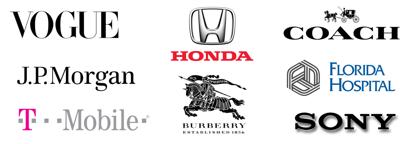
Photo Credit: Different Perspective
Examples of Serif Fonts in Design
The New York Times
The New York Times, a venerable publication established in the 1850s, employs a serif font across various elements, including its logo and article text. This use of serif fonts is intentional, aiming to convey a sense of tradition and reputability. Additionally, serifs are traditionally linked to print newspapers, enhancing the formality and credibility of The New York Times.
Sans Serif Fonts Say Modern, Approachable, and Clean
In contrast to serif fonts, sans serif fonts convey a distinct message. While serif fonts emphasize tradition and history, sans serif fonts opt for simplicity and a modern feel. The key features of sans serif fonts include the absence of decorative serifs and the utilization of simple, uniform lines. Web designers often favor sans serif fonts for on-screen applications due to their clean, crisp lines, which enhance legibility on digital displays.
What Does a Sans Serif Font Say About Your Brand?
Sans serif fonts convey a sense of casualness, informality, friendliness, and approachability. Companies aiming for a youthful and relatable brand image often opt for sans serif fonts.

Photo Credit: Different Perspective
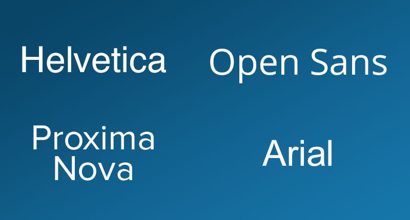
These characteristics make sans serif fonts a popular choice for many start-up and tech companies aiming to convey a cutting-edge and humanistic image. Some popular sans serif fonts include Helvetica, Open Sans, Proxima Nova, and Arial.
Sans serif fonts are commonly used in digital interfaces, website design, and mobile applications due to their clean and modern appearance. Their simplicity and straightforward design contribute to a contemporary and user-friendly aesthetic.
When selecting a font for your brand or design, it’s essential to consider the overall message and image you want to convey. Serif and sans serif fonts each have their distinct characteristics, and choosing the right one depends on the personality and values you want your brand to embody. Experimenting with different fonts and understanding their impact on perception can help you make informed decisions about your brand’s visual identity.
Examples of Sans Serif Fonts in Design
Wix
Wix is a well-known name, offering a cloud-based Content Management System (CMS) that simplifies website building. Wix strategically communicates its key messages—ease of use, excellent customer support, and the enjoyment of creating a website—through its font choice. Opting for a clean and rounded font, Wix cultivates an atmosphere of relaxation and approachability, ensuring that individuals feel at ease and unburdened when interacting with their brand. This deliberate font selection aims to transform the perception of website creation from an intimidating task to an enjoyable experience.
HubSpot
HubSpot, a prominent company in the industry, employs a sans serif font in its branding strategy. The rounded and clean design of both their logo and website fonts instill a sense of friendliness and approachability. This choice of a youthful font contributes to humanizing their brand, fostering relatability, and making the company more accessible to their audience.
Sans Serif or Serif—So, Which One Should You Use?
The answer to choosing between serif and sans serif fonts is not a one-size-fits-all solution. Although some high-profile companies have embraced sans serif fonts in rebranding efforts, it doesn’t imply that everyone should follow suit. The key is to select a font that effectively communicates the intended message and reflects your brand’s personality. This decision varies for each company. For instance, a trendy tech company like Uber aims to convey a different message compared to a more formal entity like The New York Times.
Before embarking on the search for a font, it’s crucial to brainstorm the qualities and characteristics that define your brand. Consider the mediums through which people will interact with your company. This approach provides a roadmap for font research, allowing you to evaluate potential fonts against your brand’s qualities and use cases. Remember that a font can significantly alter how your brand is perceived. Take Apple as an example. In its early days, Apple primarily used a serif font in its branding before transitioning to a more modern sans serif font. The two examples below illustrate the shift. Your font and design choices should align with and reflect your brand’s essence.
Choose the Font That Exemplifies Your Brand
When employed appropriately and selected for the right reasons, both serif and sans serif fonts can be effective. The critical factor is choosing a font that aligns with your brand. It involves finding a font that creates the desired first impression and consistently embodies your brand’s qualities. Although there’s no universal solution for selecting the perfect font, some general guidelines can assist you in making the right choice:
1. Don’t Overload Your Brand With Too Many Fonts
It might be tempting to use a variety of fonts in your designs, but doing so can actually harm your brand. A rule of thumb to follow when selecting fonts is to limit yourself to one to three different fonts. Using more than that can make your designs appear cluttered, and you may encounter the issue of different fonts competing with each other.
2. Choose Fonts That Have the Right Amount of Contrast
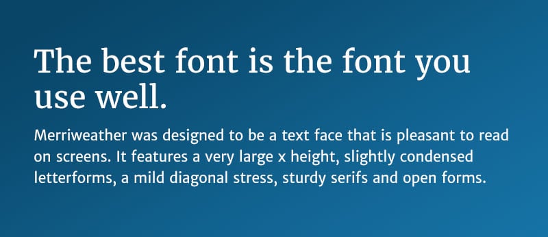
Selecting multiple fonts for your brand can be an effective way to establish hierarchy in your designs. However, it can be challenging to choose two fonts that strike the right balance of contrast while still complementing each other. According to the online design tool Canva, one approach is to find fonts that share a common quality. For instance, you might select two fonts with similar letter height or width, or opt for fonts created by the same designer. Merriweather and Merriweather Sans serve as a good example of two fonts that contrast effectively while still maintaining cohesiveness. These fonts were both designed by the same individual, resulting in shared qualities in the spacing and shapes of the letters that contribute to a sense of unity.
3. Look for a Font With Multiple Weights and Styles
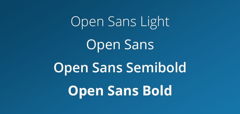
Using a font that comes in various weights and styles, like light, semibold, bold, and others, gives you more flexibility. It lets you convey different messages in your designs using just one font.
4. There Are No Hard Set Rules
Traditional companies aren’t limited to using only serif fonts, and vice versa. Although serif fonts are often linked to a more traditional feel, and sans-serif fonts are usually seen as more modern, there are exceptions to this guideline. The key factor is how you employ the fonts in your design.
WARNING: Common Font Pairing Mistakes
Avoid pairing two fonts that are too similar—it creates confusion rather than hierarchy. Also, steer clear of fonts with conflicting moods, like pairing a playful sans serif with an ultra-formal serif. Always test your font combinations at different sizes and on different devices before finalizing your brand guidelines.
Conclusion: Choosing Between Serif and Sans Serif
In Easil, you have a wealth of type styles and font families at your disposal, especially in our templates. Make the most of this variety by using this guide to help you decide when to employ serif or sans-serif fonts, or even a combination of both.
In general, prioritize clear and concise messaging. Choose sans-serif fonts for headings and small text, especially when clarity and readability are crucial. For larger blocks of printed text, such as on a flyer, serif fonts are a good choice.
However, it’s essential to consider the entire context rather than relying solely on predefined rules when making design decisions. Experiment with different font combinations, and don’t hesitate to unleash your creativity.
Last Updated: March 2026
Frequently Asked Questions
A: For digital screens, sans-serif fonts are generally preferred due to their clean lines and better readability at small sizes, especially for users with visual impairments or dyslexia. Fonts like Open Sans, Roboto, and Arial are excellent choices for web body text.
A: Absolutely. Serif fonts work wonderfully for headings, logos, and print materials. For body text on websites, ensure you choose a serif font designed specifically for screens, like Georgia or Merriweather, and test readability across devices.
A: A classic and safe pairing is using a serif font for headings (like Merriweather) and a sans-serif for body text (like Open Sans). This combination provides clear contrast while maintaining visual harmony.
A: Generally yes—sans-serif fonts emerged in the early 20th century and are associated with modernism. However, some serif fonts can feel very contemporary depending on their specific design. Always consider the individual typeface, not just its category.
A: Limit yourself to 2-3 fonts maximum. A common approach is one font for headings, one for body text, and possibly a third accent font for special uses. Using too many fonts creates visual chaos and weakens brand recognition.
A: Generally, Sans Serif fonts are considered better for digital accessibility. Their clean lines and lack of decorative strokes make them easier to read on low-resolution screens and for individuals with visual impairments or dyslexia. However, modern high-resolution displays have made Serif fonts much more legible than they used to be.
A: Yes! This is a common design technique called font pairing. A popular strategy is to use a bold Serif font for your headings to establish authority and a clean Sans Serif font for your body text to ensure easy reading.
A: Brands like Google and Airbnb transitioned to Sans Serif to prioritize simplicity and scalability. Sans Serif fonts remain legible at very small sizes (like app icons) and convey a modern, “human-centric” vibe that aligns with tech innovation.
A: For printed books, Serif fonts (like Garamond) are traditional because the “feet” are thought to lead the eye from one letter to the next. For digital blogs, Sans Serif (like Open Sans) is often preferred to reduce eye strain during vertical scrolling.
A: Not at all. While Sans Serif dominated the late 2010s, modern Serifs are making a huge comeback in 2026, especially in luxury branding, editorial sites, and “dark mode” designs where they provide a high-end, sophisticated aesthetic.
