This guide expands on the previous version, offering more in-depth design techniques and considerations for crafting an exceptional YouTube banner, even for beginners!
Essential Software:
- Image Editing Software: While free options like Canva and GIMP are great for beginners, consider exploring paid options like Adobe Photoshop for more advanced features and creative control.
- Font Resources: Utilize free or paid font libraries like Google Fonts or Adobe Fonts to find unique and readable fonts that complement your brand identity.
Step-by-Step Guide with Enhancements:
Background Selection:
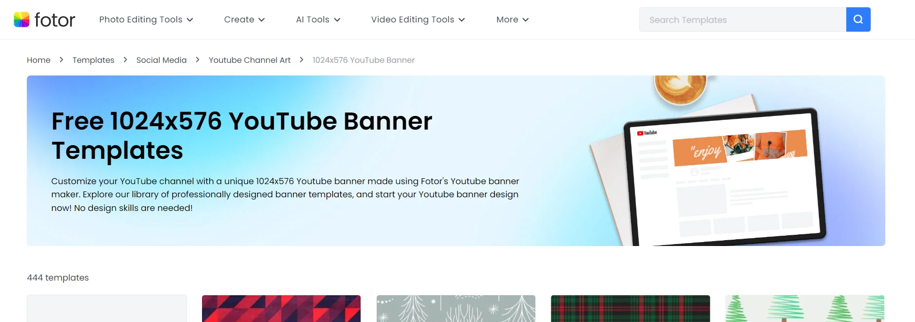
Image Selection: Explore royalty-free image platforms like Unsplash or fotor to find free 1024×576 youtube banner templates to find high-resolution background images that resonate with your channel’s theme. You can check
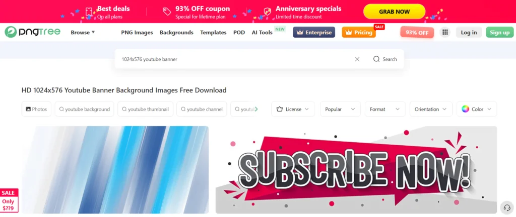
Background Creation: If you’re comfortable with design software, consider creating a custom background using gradients, patterns, or vector elements for a more unique look. for background creation for 1024 youtube banner’s you can use pngtree.
Text Elements:
Channel Name & Slogan: Craft a clear and concise channel name using a bold, easy-to-read font. Consider adding a short, catchy slogan that encapsulates your channel’s essence.
Text Effects & Hierarchy: Experiment with text effects (e.g., drop shadows, outlines) to make your text stand out, but ensure readability. Use font size and weight to establish a hierarchy, with your channel name being the most prominent.
Alignment & Safe Areas: Align your text strategically within the YouTube banner template, considering the areas obscured by profile pictures and channel buttons on various devices. Utilize tools like online banner templates or grid systems to ensure proper placement.
Visual Storytelling (Optional):
Icons & Illustrations: Integrate high-quality icons or illustrations that visually represent your content or channel niche.
Photo Overlays: Consider using photo overlays strategically. For example, a faded image of yourself behind your channel name can add a personal touch.
Maintain Visual Balance: While incorporating visuals is encouraged, avoid cluttering the banner. Ensure all elements work cohesively and don’t overshadow your text.
Color Theory and Branding:
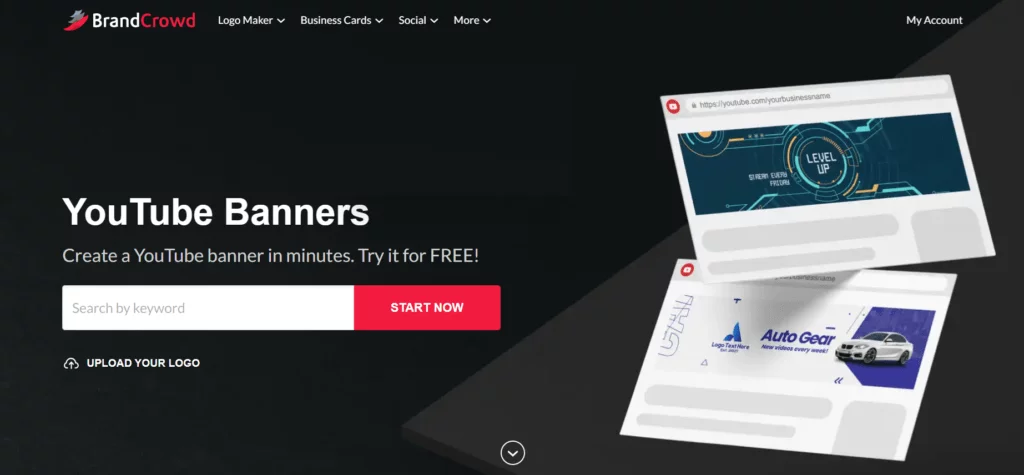
Color Psychology: Research basic color theory to understand how colors evoke emotions and influence viewers. Choose a color scheme that aligns with your brand identity and the emotions you want to convey (e.g., red for energy, blue for trust). for color branding you can use brandcrowd.
Color Palette Selection: Utilize online color palette generators or tools to create a cohesive color scheme for your banner and overall channel branding.
Call to Action:
Subscribe Button Integration: Many banner design templates offer pre-designed “Subscribe” buttons. These can be a clear and visually appealing call to action.
Promotional Text (Optional): If you’re promoting specific content or a new series, consider including a short, attention-grabbing tagline to entice viewers.
Bonus Tips for Advanced Customization:
Animation (Optional): Some online banner creation tools offer basic animation features. A subtle animated element can add dynamism to your banner, but use it sparingly to avoid overwhelming viewers.
Mockup Generators: Utilize online mockup generators to preview your banner design on different devices (desktop, mobile, tablet) before finalizing it.
If you like you can check sample youtube 1025×576 banners at pinterest also.

Practical utilization of 1024×576 Pixels Images
- For websites, those dimensions are money for banners, sliders, and graphics. Having that consistent size baked in makes your site look clean and cohesive from page to page. It’s a nice standard size to design around.
- Bloggers and content creators can resize images to 1024×576 to maintain a slick, uniform look across articles and posts. The images complement the text without bogging things down with huge file sizes that kill load times.
- Speaking of sharing, that size is perfect for social media posts and feeds. Your images look sharp and eye-catching whether you’re pumping content onto Instagram, Twitter, Facebook, you name it. It creates a professional, unified vibe for your brand’s presence.
- Presentation warriors can optimize graphics and visuals to 1024×576 for crisp slides that project beautifully in any setting. No more fuzzy, distorted images derailing your pitch – just clean, sized-to-fit graphics that look polished.
- For all the e-comm heads out there, product shots at 1024×576 enhance that online shopping experience big time. Pages load faster with optimized images, giving customers a smooth user journey that could boost sales.
- Photographers can build gorgeous online portfolios showcasing their work at that size. Potential clients get a flawless, quick-loading gallery view to enjoy all those stunning visuals in their glory.
- Even email marketers can capitalize on 1024×576 dimensions. Email campaigns look vibrant and clean with images optimized for fast loading. That helps reduce abandonment and boosts engagement.
- So in a nutshell – standardizing around 1024×576 pixels for graphics, images, and visuals creates a crisp, cohesive, and user-friendly experience whether you’re rocking a website, social media, slides, products, or emails. It’s a versatile size that translates beautifully across platforms and use cases.
1. Understand the Safe Area
- YouTube banners are displayed differently on desktops, tablets, and TVs. The “safe area” (1546 x 423 pixels centered) is the most critical part of your banner, as it ensures that important text and logos are visible across all devices.
- Since 1024×576 is smaller than the recommended size, ensure that the safe area is centered and scaled proportionally within your design.
- Software: Use graphic design software like Adobe Photoshop, Canva, GIMP, or any other tool you’re comfortable with.
- Background: Choose a background that is visually appealing and aligns with your brand. High-quality images or solid colors work well.
- Text and Logo: Place your text and logo within the safe area to ensure they are visible on all devices. Use large, clear fonts and high-resolution logos.
3. Template
- Create a template to help visualize the safe area. You can use the following dimensions to mark the areas:
- Safe Area: 640×180 pixels centered within the 1024×576 canvas.
- This safe area should be 192 pixels from the top and bottom, and 192 pixels from the left and right.
4. Save Your Design
- Once you are satisfied with your design, save the file in a high-quality format like PNG or JPEG.
5. Upload to YouTube
- Go to your YouTube channel.
- Click on your profile picture in the top right corner, then select “Your channel”.
- Click on the “Customize Channel” button.
- Hover over your current banner and click the camera icon to upload your new banner.
- Upload the 1024×576 banner and adjust the crop as necessary. YouTube will show a preview of how your banner will look on different devices.
- That 1024×576 size hits the sweet spot for YouTube banners. It’s exactly what the platform recommends, so your channel art will look clean and polished across all devices – desktops, tablets, phones, you name it.
- With the perfect dimensions dialed in, your banner enhances that all-important branding. You can proudly showcase your logo, channel name, and key info without worrying about awkward cropping or distortion. It allows you to create that cohesive, visually-appealing vibe you want for your channel’s identity.
- Speaking of visuals, editing and customizing at this size is a breeze. You can tweak text, colors, and graphics to keep things fresh while knowing your banner will display properly every time. No squinting required.
- Using the recommended 1024×576 pixels also means you’re following YouTube’s guidelines to a T. That’s just good practice to avoid any issues with weird cropping or stretching. Your banner will look tidy instead of wonky.
- Optimizing to that size helps with load times too. Smaller files zip onto your channel page faster for a smooth user experience. Nobody wants to wait around for images to load, right?
- Mobile viewers will appreciate the love too. At this size, your slick banner remains looking great on smaller smartphone screens as more people ditch laptops for on-the-go viewing.
- With thumbnails perfectly framed against that 1024×576 backdrop, you create an awesome, consistent visual flow through your channel’s content. That polished presentation goes a long way in reeling people in.
- At the end of the day, hitting that size sweet spot just elevates the whole professionalism factor for your channel’s first impression. It shows you sweated the details and are serious about cultivating your brand’s look and feel.
Example Template:
(replace with actual image link if needed)
- Center Safe Area: 640×180 pixels (marked in blue).
Tips:
- Keep it Simple: Don’t overcrowd your banner with too much text or images.
- Consistency: Ensure that the banner aligns with your overall branding and channel theme.
- High Contrast: Use high contrast between text and background to ensure readability.
Creating a YouTube banner with a resolution of 1024×576 pixels requires careful attention to ensure key elements remain within the safe area. Always preview your banner across different devices to ensure it looks good everywhere.
Remember: Consistency is Key!
Maintain a consistent visual style across your YouTube banner, channel thumbnails, and other marketing materials to solidify your brand identity and create a professional look. For best image compressor and resizer you can use wp guru tech tools.
By following these expanded guidelines and exploring design software features, you can create a truly unique and impactful YouTube banner that sets your channel apart from the crowd.
Here are the most frequently asked questions about converting images to 1024×576 pixels for YouTube banners.
Q1: Why 1024×576 – what’s so special about that size?
A1: That’s the size YouTube specifically recommends for channel banners. It’s designed to look great and fit properly across different devices – desktops, tablets, phones, you name it. Using their suggested dimensions just ensures your banner looks slick and professional.
Q2: But what if I have a bigger image I want to use?
A2: You could try uploading a larger size, but YouTube may end up cropping or stretching it weirdly to fit. That could make your banner look distorted or cut off important parts. It’s better to just resize it to 1024×576 from the start.
A3: Nope, they don’t do that auto-resizing thing. If you’ve got an existing banner in a different size, you’ll need to manually update it to the new 1024×576 dimensions. Otherwise it may not display properly.
A4: Most graphic editing tools like Photoshop or online converters have a resizing option to get your image down to those exact pixels. Just a couple clicks and you’re good to go.
Q5: But what if I don’t resize to 1024×576 – is it really that big a deal?
A5: Using non-standard dimensions does run the risk of your banner looking stretched, squished, or chopped off in weird ways across devices. Not the most polished look for your channel’s first impression!
A6: Absolutely! 1024×576 gives you plenty of room to include your branding elements, channel name, taglines – whatever you need. Just design with that size in mind.
Q7: Will using that size make my channel page load faster?
A7: Optimizing to YouTube’s recommended dimensions can definitely help keep your file size trim, which contributes to zippier load times. No more waiting for slow images!
A8: You betcha. Those dimensions are meant to scale nicely even on smaller smartphone screens as more people browse channels on the go.
A9: For sure! Feel free to update your channel’s banner look as often as you’d like. Keeping it fresh with new 1024×576 designs helps your page look active.
Q10: Are there any good tools to help me resize for 1024×576?
A10: Tons of options – basic photo editors, free online resizing tools, converters, you name it. Lots of user-friendly apps make it easy to pump out banners at YouTube’s preferred size.
Summary
The 1024×576 dimensions are the recommended size from YouTube for channel banners. Using this standardized size ensures your banner looks sharp, properly formatted, and optimized across all devices like desktops, tablets, and mobile phones.
While you can use larger image sizes, YouTube may automatically crop or resize them, potentially cutting off important elements. Existing banners won’t automatically resize either. To get your banner to the 1024×576 dimensions, you’ll need to create a new one or use an image editing tool to properly resize it. Many free and paid tools make this easy. Not using the recommended size risks your banner looking stretched, squished, or improperly cropped on different devices – hurting the visual appeal. The 1024×576 size optimizes your YouTube channel’s professional appearance, branding consistency, and improved user experience across all platforms. Taking the time to resize is well worth it.
