The Ultimate Guide to Parallax Scrolling for Websites
The parallax effect has been used in classic video games for years, but it has recently become popular in web design. This fantastic effect is now frequently seen as part of a web page’s scrolling feature. It creates a sense of depth (a faux-3D look) and an exciting surfing experience by using numerous backdrops that appear to move at varying rates.
When viewed from different angles, nearby things have a larger parallax than farther away items, hence parallax scrolling can be used to calculate distances. We’ve gathered 30 of the most stunning websites that employ the scrolling parallax effect.
The parallax scrolling effect created waves as a new and fascinating web design trend when it first appeared online in 2011. In the years afterward, many internet fads have come and gone, but parallax scrolling has cemented itself as a fundamental design tool that is here to stay.
When designing a website, using parallax scrolling to add depth and movement to the surfing experience is a terrific way to go. Below you’ll discover a detailed explanation of what parallax scrolling is, as well as some inspirational website examples and website designs to get you started.
Why Use Parallax Scrolling?
Advantages:
-
Enhanced Storytelling: Guides users through a narrative with visual progression
-
Increased Engagement: Unique motion captures attention and encourages scrolling
-
Memorable Experiences: Creates emotional connections through immersive design
-
Modern Aesthetic: Conveys innovation and technical sophistication
-
Directional Focus: Subtly guides users toward important content or CTAs
Considerations & Drawbacks:
-
Performance Risks: Can cause lag on lower-end devices if not optimized
-
Accessibility Challenges: May affect users with motion sensitivity or vestibular disorders
-
Overuse Fatigue: Can feel gimmicky if not purposefully implemented
-
SEO Concerns: Heavy implementation might impact page load speed (a ranking factor)
-
Mobile Complexity: Requires careful responsive adaptation
Types of Parallax Effects
1. Layered Parallax
Multiple background layers move at different speeds, creating classic depth.
Best for: Hero sections, landing pages
2. Reveal-on-Scroll
Content elements appear, fade, or transform as the user scrolls.
Best for: Portfolio showcases, product features
3. Fixed Background (“Ken Burns Effect”)
Background image remains static while foreground content scrolls over it.
Best for: Text-heavy sections needing visual interest
4. Horizontal Parallax
Vertical scrolling triggers horizontal movement of elements.
Best for: Timeline displays, creative agency sites
5. 3D Tilt/Depth Effect
Elements respond to mouse movement or gyroscope for pseudo-3D.
Best for: High-engagement product showcases

What is parallax scrolling?
Parallax scrolling is a web design method in which the foreground and backdrop of a page move at different speeds. As users scroll down the site, a 3D effect appears, adding depth and creating a more immersive browsing experience.
The concept of parallax is based on optical illusion. We view distant objects as moving more slowly because the human eye interprets objects close to us as larger than objects farther away.
The illusion has long been used in parallax across a variety of mediums, resulting in a realistic appearance. Its initial appearances were in traditional animation, such as Disney’s Snow White and the Seven Dwarfs, and video games like Super Mario.
Parallax scrolling is a web design technique where background content (usually an image) moves at a different speed than foreground content while scrolling. This creates a faux-3D effect and a sense of depth and immersion.
When used correctly, it transforms a static webpage into a dynamic storytelling experience. Here is the ultimate guide to understanding, using, and mastering parallax scrolling.
1. How It Works: The Optical Illusion
The concept is based on an optical illusion where objects closer to the viewer appear to move faster than objects further away.
-
The Layers: The web page is divided into multiple planes: the background (slowest), the middle ground, and the foreground (fastest).
-
The Trigger: As the user scrolls down, the browser calculates the position of each layer relative to the scroll speed.
-
The Result: The brain interprets this difference in speed as depth, making the 2D screen feel like a 3D environment.
2. Why Use Parallax? (The Benefits)
Parallax is rarely purely functional; it is experiential.
-
Visual Storytelling: It guides the user through a narrative linearly. As they scroll, they “reveal” the story piece by piece.
-
Increased Time on Page: The interactive nature encourages users to keep scrolling to see “what happens next,” reducing bounce rates.
-
Product Highlights: It allows for explosive views of products (e.g., a phone dismantling into its components as you scroll) which is highly effective for tech hardware.
3. Types of Parallax Effects
There isn’t just one way to do it.
-
Scroll-Jacking: The scroll wheel doesn’t move the page down pixels; instead, it triggers the next “slide” or animation sequence. (Use with caution: this can frustrate users who want to scroll quickly).
-
Layering: Elements float over each other at different speeds.
-
Reveal / Curtain Effect: The user scrolls “past” a section, revealing the image underneath, almost like wiping a window clean.
4. Implementation: From Simple to Complex
Level 1: CSS Only (The Simplest Method)
You can achieve a basic parallax effect using just CSS. This locks the background image in place while the content scrolls over it.
CSS
.parallax-section {
  background-image: url('image.jpg');
  height: 500px;
  background-attachment: fixed; /* The magic property */
  background-position: center;
  background-repeat: no-repeat;
  background-size: cover;
}
Level 2: JavaScript Libraries (Professional Grade)
For complex animations where elements move horizontally, rotate, or fade in based on scroll position, you need JavaScript.
-
Rellax.js: A lightweight vanilla JS library specifically for parallax.
-
GSAP (GreenSock Animation Platform): The industry standard for high-performance scroll-triggered animations (ScrollTrigger plugin).
-
Locomotive Scroll: Popular for smooth scrolling effects combined with parallax.
5. The Downsides (Risk Management)
Parallax is resource-heavy. If done poorly, it ruins the user experience.
-
Performance Hit: Calculate positions on every pixel of scroll can cause “jank” (stuttering visual) on older devices.
-
SEO Issues: If content is hidden behind complex JavaScript, search engines might struggle to index it.
-
Motion Sickness: vestibular disorders can be triggered by aggressive parallax.
-
Mobile Difficulties: Mobile browsers often disable
background-attachment: fixedto save battery. You must have a fallback for mobile users.
6. Best Practices Checklist
Before launching a parallax site, ensure you meet these criteria:
-
[ ] Mobile Fallback: Disable parallax on mobile screens (use
@mediaqueries) to ensure smooth scrolling on phones. -
[ ] Performance Optimization: Use lightweight images (WebP format) to prevent slow loading times.
-
[ ] Accessibility (A11y): Include a “Reduce Motion” toggle for users who are sensitive to motion sickness.
-
[ ] Don’t Overdo It: Parallax should enhance the content, not distract from it. If the user forgets what they are reading because the background is spinning, you’ve gone too far.
Enhancing User Experience with Parallax Scrolling
Parallax scrolling is a great way to keep users entertained and engaged as it provides a nice visual depth effect. One can say it is giving the website a bit of life and making everything more attractive and interactive. Some of the ways it does that are:
- By introducing this feeling of space, it captivates your attention, thus, leading you to explore more what the website is offering.
- It changes the presentation of products or the narration of stories into a fascinating visual experience.
- Important elements on the page become more visible with the help of parallax scrolling, thus, directing your attention.
- The overall mood and style of the website are improved.
- At present, majority of people use their smartphones to access the internet. Parallax scrolling is a great way to mobile browsing as it adds an extra layer of interaction.
What is more, even large social media brands such as Facebook and Instagram have embraced parallax scrolling. They are utilizing it to make their platforms more attractive and get you more involved with what they are presenting.
Common Errors That Should Not Be Done in Parallax Design
While implementing the parallax design to your site, do not fall into traps that could bring down the user experience. Here are the things you should watch out for:
Overdoing parallax scrolling: It may become too much if every page is equipped with it. It is definitely better to use it only where it really makes a difference.
- Not thinking about mobile devices: Parallax maybe is not the case for phones or tablets, thus slow loading and choppy scrolling might result. Your site should be working smoothly on these devices.
- Not providing sufficient aids: In case your visitors have trouble finding the way on your site or do not understand how the parallax parts work, they are most likely to give up and go somewhere else.
- Allowing the site to be slow in loading: Due to all those attractive tricks your website might be taking a long time to load. Try to keep it light and fast.
- Making it difficult for users of old technology: There are some old browsers and gadgets that are not compatible with parallax scrolling. Check and get feedback from different platforms so users have a good experience regardless of their device.
Through avoiding these mistakes, you can provide users with an enjoyable and easy navigation experience, which ultimately results in an effective use of parallax, thereby improving user experience without compromising performance mainly on mobile devices.
Parallax effects later evolved into the world of web design as we know it today, thanks to developments in CSS and HTML. Here are nine beautiful parallax scrolling examples created with Wix for your web design inspiration:
Real Live Examples of Parallel Scrolling Websites
Jomor Design

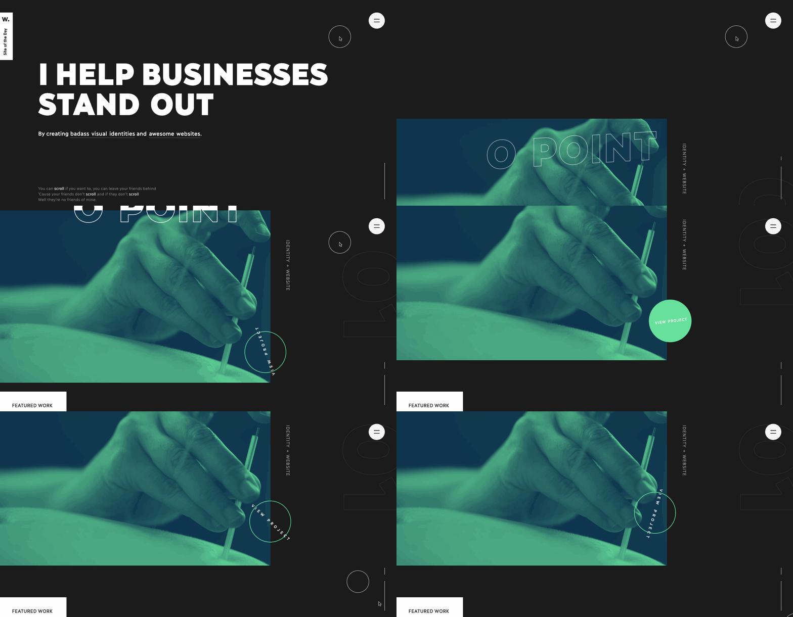
This portfolio by Jomor Design demonstrates how to strike the proper mix between design and personality, with a clever layout, interesting microinteractions, and plenty of wit.
Everything comes together for a smooth user experience, from the subtly changing text to the multiple parallax effects affecting its graphic components. Along with his design work, Jo adds just the appropriate amount of levity. “78 percent of my clients describe me as a genius,” he says. The remaining 22% think I’m a sexy genius.” This, coupled with a few more amusing quips, elevates this beyond a portfolio of his work to a depiction of who he is.
Timeslot

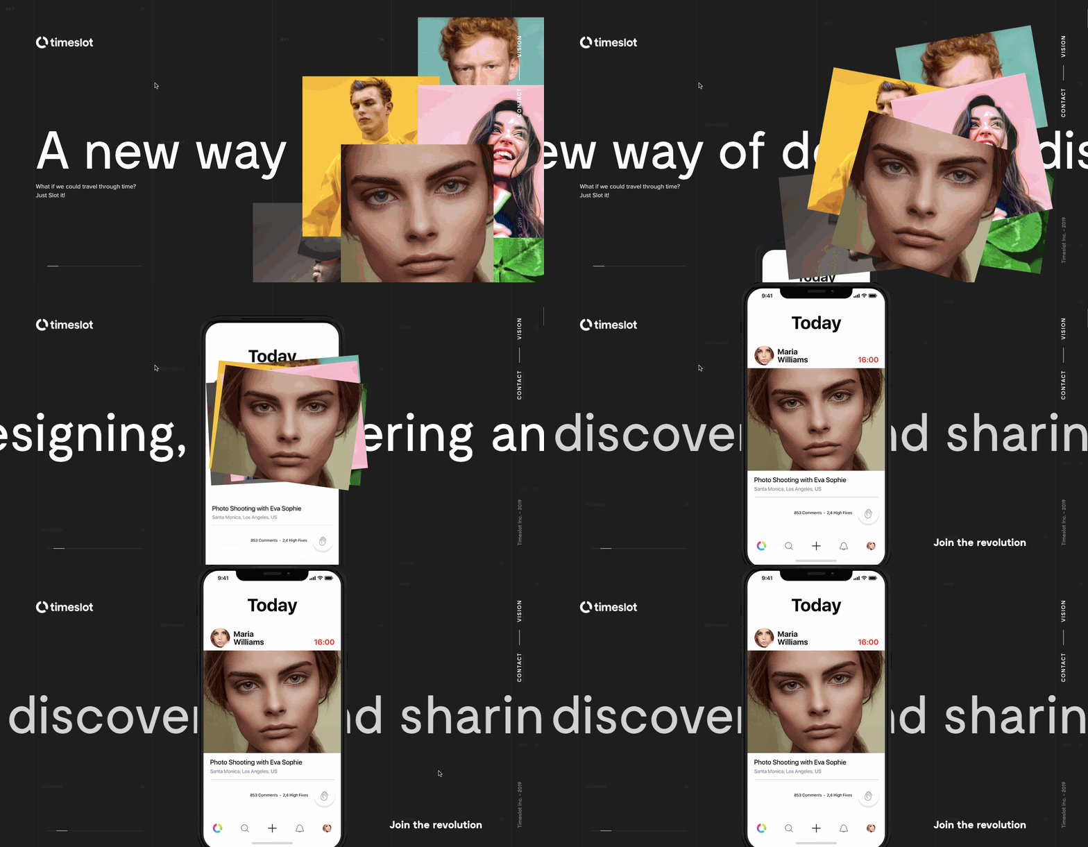
With its social media platform, Timeslot takes a unique approach. They want individuals to post what they’re up to on their calendars and connect with their pals to make future plans. Instead of sitting by idly, they focus on how technology can bring people together to share experiences.
Horizontal parallax is used by Timeslot to assist communicate the tale of how their software works for their users. A tiered stack of people’s images appears at the top of the page. As you scroll down, these people are grouped together and displayed on a smartphone screen. This powerful picture is a terrific metaphor for what their programme intends to accomplish in terms of connecting people.
Weglot
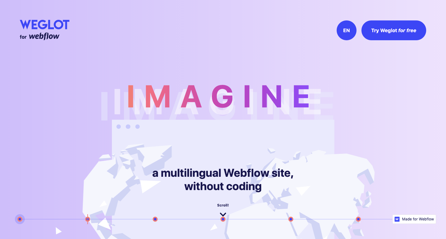
Webflow makes it possible for anybody to be a designer, thanks to no-code visual platforms that put the tools in front of you to create without the need for programming. Weglot extends Webflow’s capabilities by allowing designers to develop multilingual sites without needing to know another language. This allows you to work with clients from all over the world and overcome language barriers.
The homepage of Weglot’s website features a globe that is being ripped apart. These elements are brought together by a downward scroll. This symbology accurately expresses the spirit of what their program accomplishes by allowing them to pull in overseas clients who would otherwise be out of reach.
Parallax effects can be used to create subtle design alterations or to make a larger impact, as Weglot accomplishes in this disconnected world animation.

STEEZY Studio
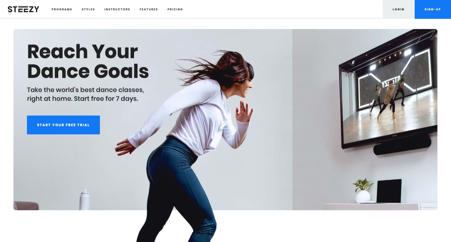
STEEZY Studio wants to help you obtain your daily exercise by teaching you some new moves. They provide video lessons for dance that go beyond simply pressing play on a video. They allow you to study dances in greater depth by allowing you to choose multiple viewpoints, loop movements, and alternatives.
There are a few parallax effects employed throughout the design, but this accordion-styled effect is the most eye-catching. They use an inclined plane to put up the classes for a specific dancing course. This is not only more engaging than a horizontal grid of screenshots, but it saves space as well.

neueform
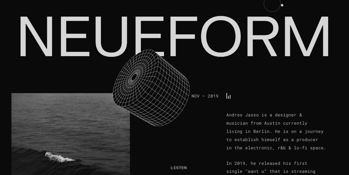
Andres Jasso’s lo-fi, hypnotic, R&B-inspired electronic music may be found on neueform. He’s not only a producer, but also a designer, as evidenced by his work. To promote his tracks, he built a minimalist, almost brutalist black and white music website design.
At the very top, there’s an eye-catching parallax that touches a circular grid. It’s a subtle effect, but it helps this shape pop off the screen. This is another example of how parallax effects don’t have to be overdone; even small movements may make a big difference in a design.

Avenir Creative
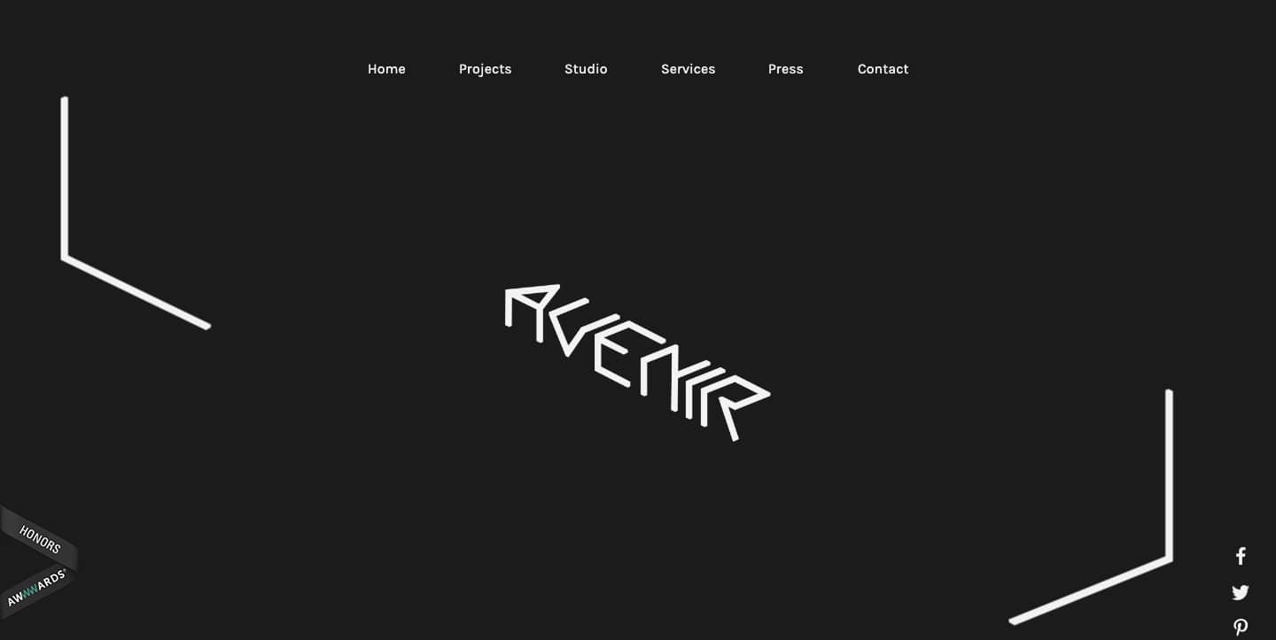
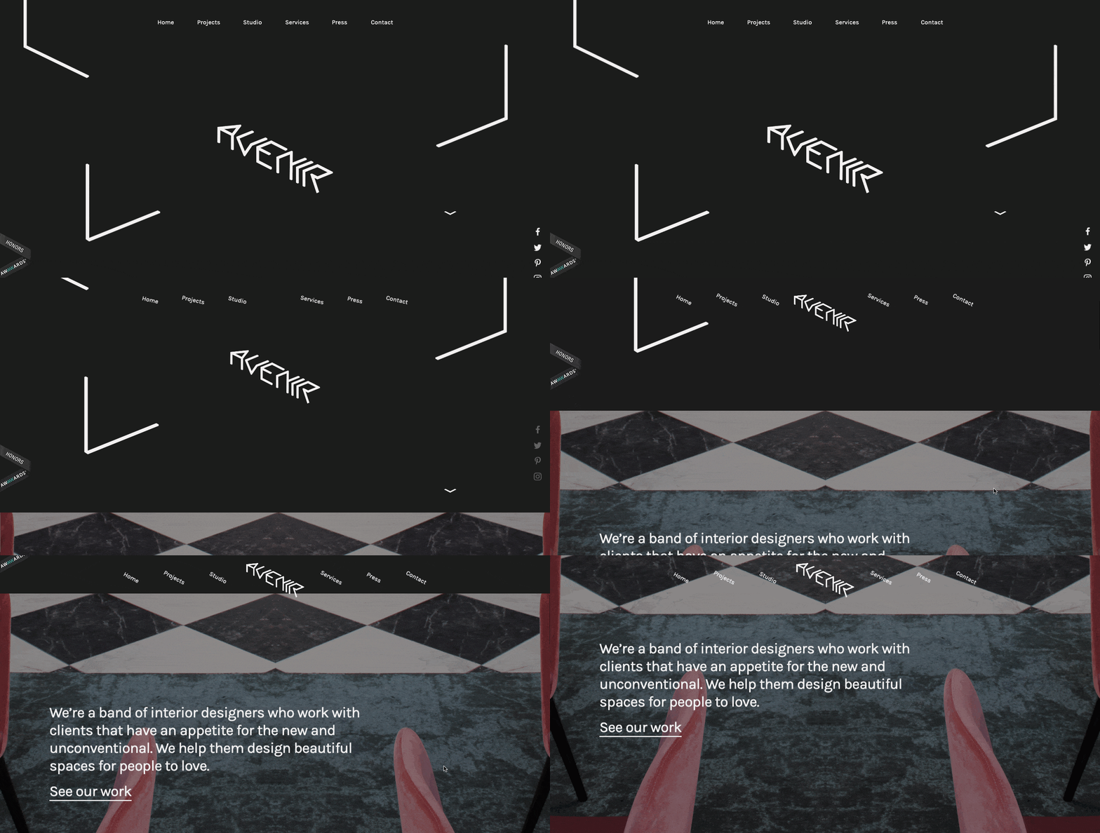
Heco Partners’ Avenir Creative is the second company on this list. Their work for the design business Avenir Creative is more angular than their other design in this blog for On Corps, which has a bubbly geometry. A multitude of parallax effects are used in conjunction with the skewed geometry, adding to the eccentric and unique atmosphere of this agency’s website.
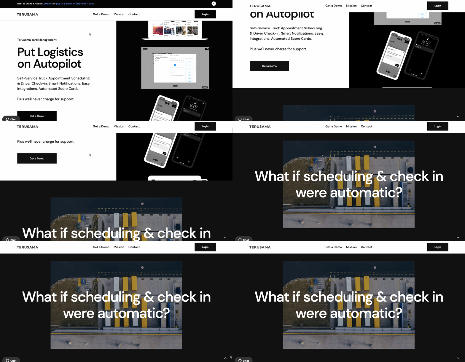
Terusama
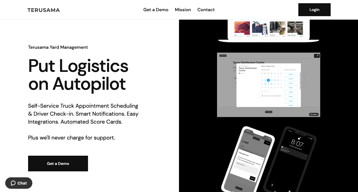
On the parade of smartphones and screenshots that fill the right hand side of their design, Terusama, a supply chain management platform, uses parallax. It’s an effect that may go unnoticed by non-designers, but it certainly caught our attention. By changing the speed of these graphics, a pleasant gap in congruity is created.
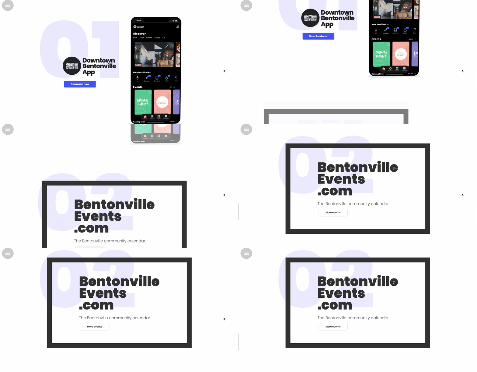
Downtown Bentonville

Are you going to be in Bentonville, Arkansas for a while? If you haven’t already, you should; as this website demonstrates, there’s a lot of cool stuff going on there (goat yoga, anyone?).
There’s a lot of content here, but there are also a few scroll-triggered features to keep things interesting, like parallax, which makes it a simple user experience.
UDX Bike

Electric BMX bikes from UDX Bike appear to be capable of considerable activity. With each bike set against a monochromatic background, the product photography highlights the nuances and raw beauty of these motorcycles. This alone would have made these BMX bikes stick out, but a parallax pushes them even further, forcing you to pay attention.

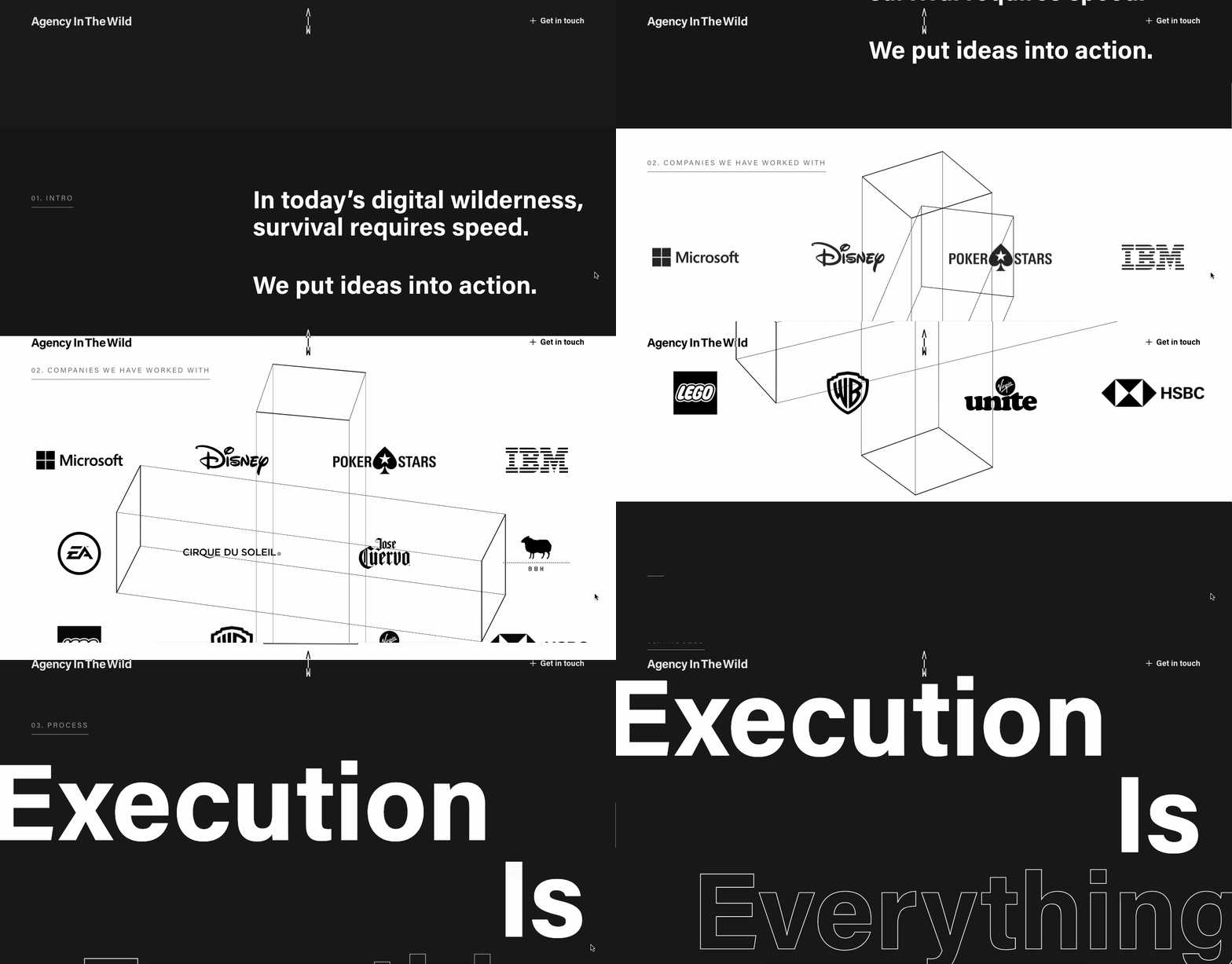
Agency In The Wild
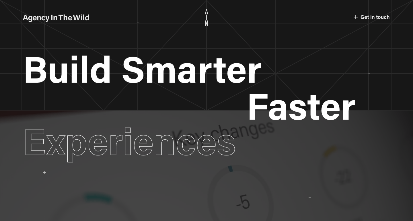
For a fantastic agency website, Agency In The Wild uses large text and snappy scroll-triggered animations. There’s a unique user-activated parallax in the shape of a moving addition sign, as well as a list of people they’ve collaborated with. Some of the best effects are purely decorative, yet they help designs stand out.
Superlab

Superlab’s agency website is full of creative flair, with vivid geometric designs, fascinating animations, and an optimistic look. Each featured project is given a tiny push by using parallax, which contrasts with the design’s static features.

Custom Web

So, we don’t know much about what this Webflow app design is all about, but what’s here in terms of parallax is well worth highlighting. Every section of this layout has an animated effect that adds movement to the space. The use of parallax is liberally sprinkled throughout, giving it much-needed depth and dimensionality.

Vectary
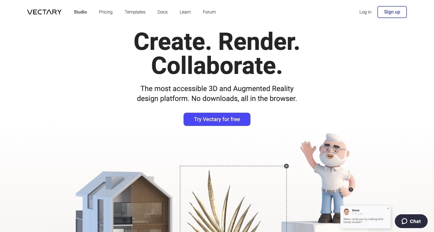
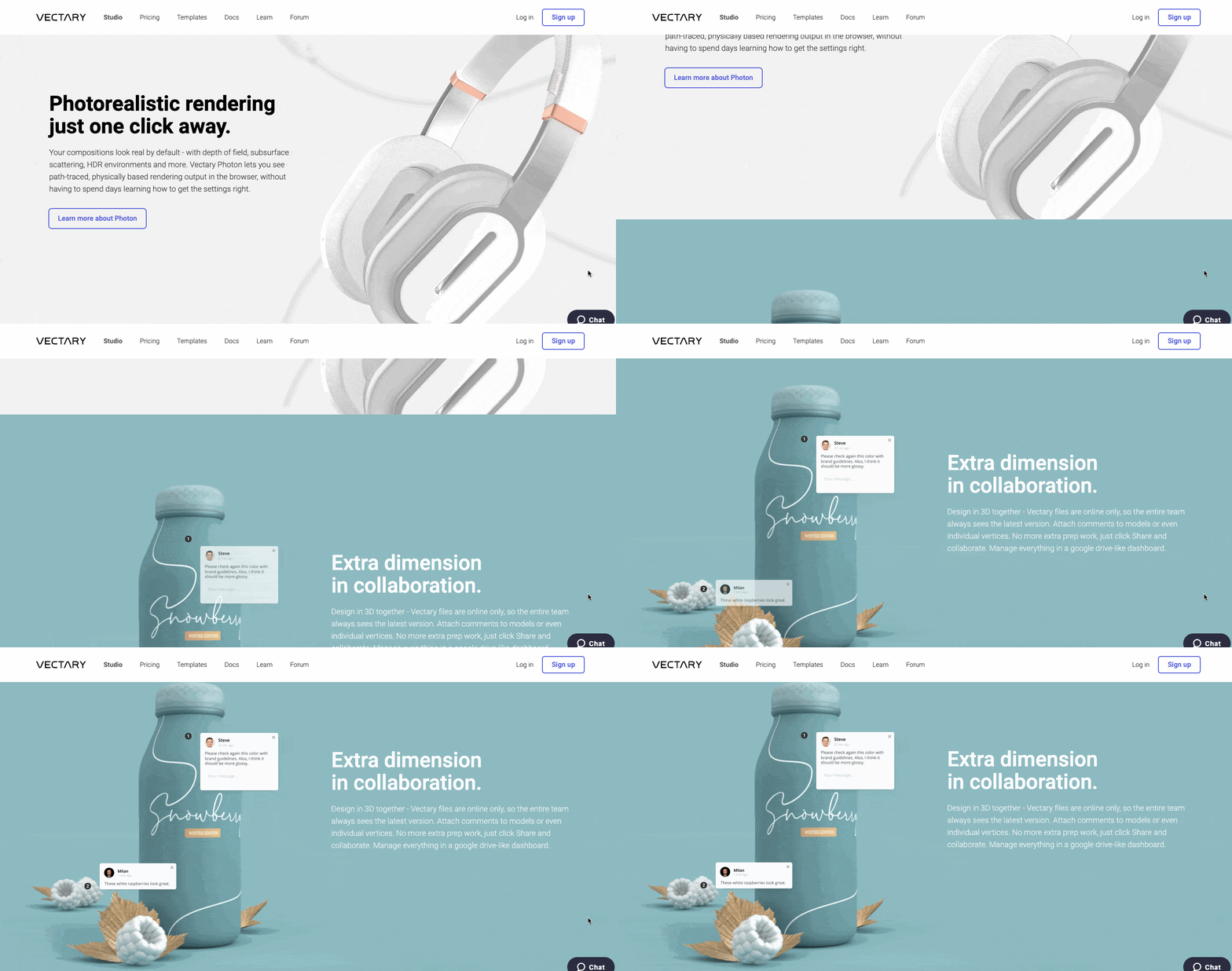
Vectary is an AR and 3D image creation platform. With this software, you can create everything from cartoon creatures to photorealistic product representations. This design features a lot of 3D visuals. However, they also include a few parallax effects, as demonstrated below, which lend even more excitement to the design.
Creative South
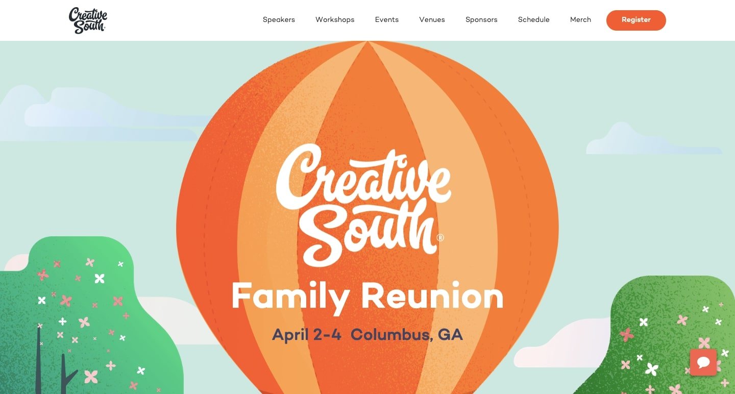
Creative South, a design conference in Columbus, Georgia, puts on an event with a stellar lineup of speakers and creative workshops. With its unique visuals and organic textures, this website perfectly portrays the essence of their conference. When you scroll through the design, you’ll notice a multitude of parallax effects that move the elements of the vibrant environment.

Digital Bake

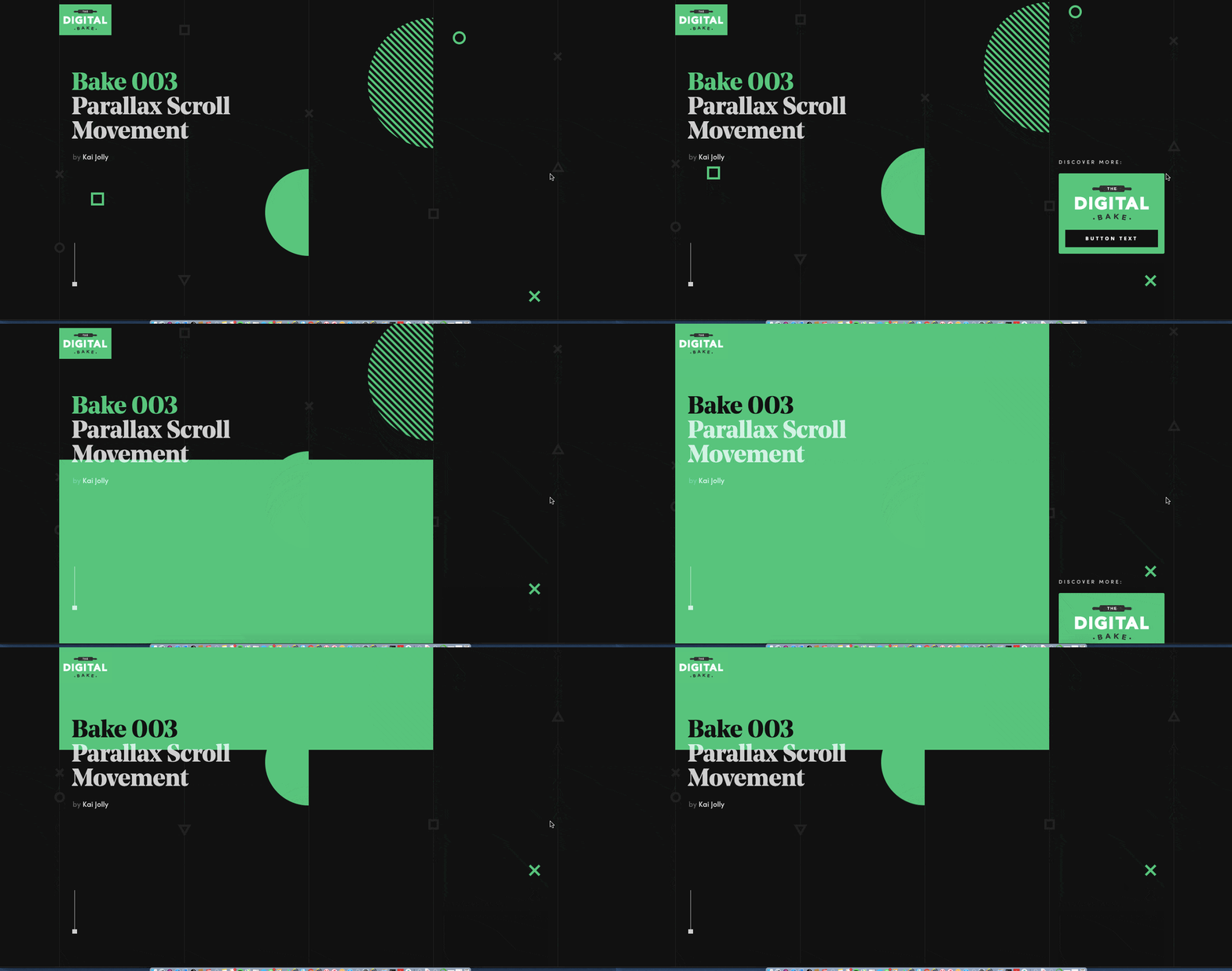
You should check out Aaron Grieve’s collection of cool and useful Webflow elements on the Digital Bake if you’re a Webflow designer. This innovative and seamless layout, complete with parallax awesomeness, provides you another more reason to visit his site and see what he has to offer.
You can clone this for free, and it has a cool array of forms and room for your own content. For your own designs, you may even change the colours and modify it however you want.
IX2

Interactions 2.0 includes parallax effects. User actions direct the route through scrolling and micro-interactions, which is a logical continuation of web design. This guide examines how far interactions have progressed to the present day, using a variety of amazing parallax effects along the way.

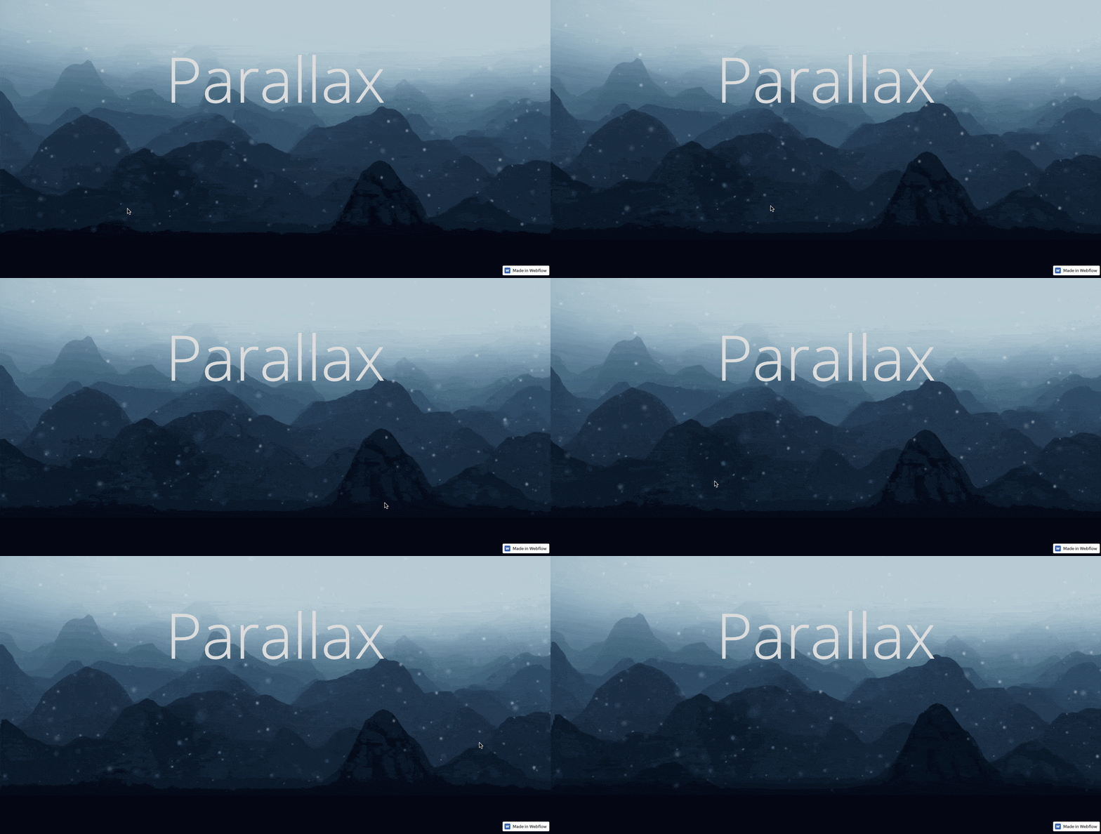
Parallax

It’s right there in the name. But this is a textbook example, and it’s free to clone. This gives you a simple tutorial on how to create something similar together on your own, with varying layers of stars and foggy mountains.
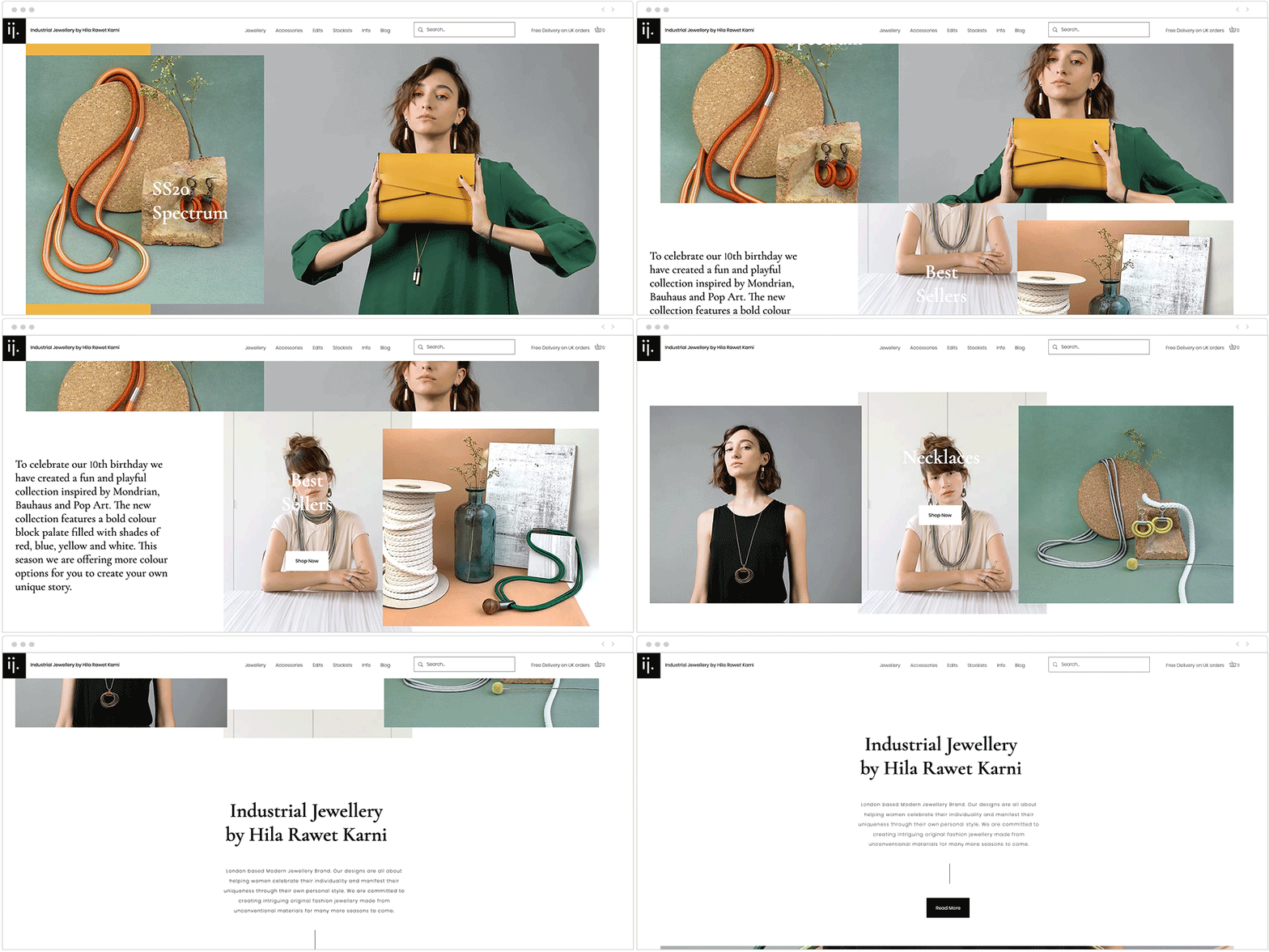
Industrial Jewellery
Hila Rawet Karni’s website uses parallax scrolling to provide an exciting and dynamic browsing experience. By stacking images and text on top of one another and having them move at different rates, the website looks to be constantly altering and generating new compositions as we scroll. The layered style of this small business website also helps it stay current with web design trends.
Take note of how the sitting woman in the centre photo keeps her stance as the other elements move around her. That photo eventually fades out of view, making space for other parts of the site and giving it a more dynamic feel.
Thanks to digital graphics and a rich colour palette, this nonprofit website has a cheerful, friendly tone. The top fold depicts a boat on the ocean, which is fitting for an organisation whose name means “The Boat Called Smile” in Portuguese.
The first fold’s ocean view, on the other hand, is gradually eclipsed by the greenery of the second as we scroll down this multilingual website. The use of parallax scrolling generates a fluid transition that resembles the layers and depth found in animated films or video games.
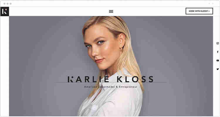
This lovely and simple website is the perfect modelling portfolio for supermodel Karlie Kloss. The website’s colour scheme, which includes white, grey, and black, as well as a lot of white space, is intended to be simple.
Minor touches such as the subtle use of pink, the thick black typeface, the impression of motion imparted by parallax scrolling, and the inclusion of video raise the website above the ordinary.
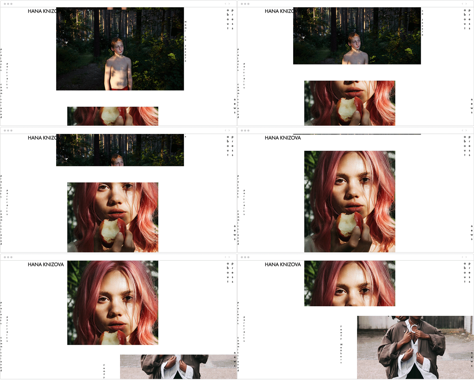
Hana Knizova’s photography website has a long scroll of exposed and covered pictures using parallax scrolling. The photographs on the homepage demonstrate Hana’s many projects and specialisations as a photographer, ranging from editorial to portrait to maternity photoshoots.
Simultaneously, the images function as the website menu, resulting in a one-of-a-kind navigation system in which each image links to a separate inner page.
Canals

Canal takes visitors on a 400-year journey through the construction and history of Amsterdam’s canals, which began in the 17th century. Marcus Brown designed it, and Aristide Benoist developed it. The website is designed to provide an editorial experience akin to leafing through a beautifully produced coffee-table book. Its smooth horizontal scrolling makes heavy use of parallax to draw attention to each new section of the storey and give the site a subtle sense of depth.
The story of The Goonies

The Goonies, a 1980s teen adventure picture, is a must-see for anybody of a certain age. This site will undoubtedly bring back memories if this describes you. Joseph Berry used WebFlow to create The Story of The Goonies, a passionate tribute to a nostalgic classic. It starts with parallax scrolling to entice viewers into the plot, then introduces the characters and exposes more about the film.
Dogstudio

The major highlight of the website is a beautiful animated 3D dog — or is it a wolf? – in the center of the page. The animated canine scales and rotates as you go down the parallax page. The lighting changes color when you hover over the titles of Dogstudio’s recent productions. The dog spinning in front of some of the page content, covering some of the words, and providing depth, is one of our favorite elements. It’s a highly professional presentation.
When Using Parallax, Keep These Things in Mind
While there are advantages to using parallax sections on your website, there are a few things to bear in mind.
Choosing Images for the Background
Consider the image you’ll use for each background part. Make sure they’re appropriate for your website and match your logo. Instead of a photo or an attention-grabbing graphic, consider utilising a block colour or subtle patterns to display a header or additional material over the top of this background image. This ensures that your image complements and promotes your content rather than detracting from it.
If you’re going to use photographs, be sure they’re of good quality. Beautiful, eye-catching photos can help your site appear more professional and distinct. These images will leave a lasting impression on your audience, prompting them to remember and return to your website. There are a plethora of stock websites where you may get high-resolution photos. Look through our list of free and paid stock picture sources to get great images for your parallax backdrops.
Parallax on the go
While parallax is a terrific method to add visual intrigue, it isn’t necessarily compatible with mobile devices. Parallax effects may not appear correctly on phones and tablets since they often use swipe navigation (rather than scrolling like desktops). Of course, the method and movements you employ for your own parallax section will determine this. However, you may wish to disable parallax on tablets for better usability.
Accessibility and Parallax
In addition to reducing mobile usability, parallax can also cause accessibility issues. Because parallax is based on motion, it might make reading more difficult and cause browser or device compatibility problems (as mentioned, on mobile especially). Furthermore, shifting layers might cause contrast issues, further affecting readability. As a result, you should take extra caution while designing parallax portions for your website.
Last Words on Parallax Effects
Try a plugin if your theme doesn’t have a built-in parallax effect or if you want to add the effect to more than just your homepage. Slider Revolution or Advanced WordPress Backgrounds (both free) are excellent options. You can use either to rapidly generate parallax sections for your websites or articles.
As you can see, incorporating a parallax effect into your website can be really beneficial. It will not only assist to improve the looks of your website, but it will also help to appeal to your audience, make it easier for them to browse and access content, and increase the amount of time they spend on it. This enhanced user experience should ultimately assist your site in achieving its objectives. Whether you want to boost the number of repeat visitors, acquire leads, or sell items or services, this is the place to be.
Will you use a parallax effect on your homepage, landing page, blog post, or elsewhere? Please let us know what you think in the comments section below.




very informative content. your site is very well decorated and I love it. I am waiting for further post. Best of luck for your future.
Thanks keep reading and sharing