Facebook Cover Photo Size 2026: Exact Dimensions for Profile, Page, Group & Event
Every pixel that matters — safe zones, device differences, file formats, video covers, and design best practices all in one authoritative guide. Stop guessing and start designing covers that look perfect on every screen.
Group: 1640×856px
Event: 1200×628px
Video: 820×462px
📌 KEY TAKEAWAYS — WHAT YOU’LL LEARN
- One universal size fails: Desktop shows 820×312px; mobile crops sides to 640×360px. Design at 820×360px with a 640×312px safe zone for cross-device perfection.
- Groups are different: Upload at 1640×856px — desktop hides the bottom 194px, so keep critical content in the top 662px.
- Video covers are silent movies: 820×462px, 20-90 seconds, no sound. Mobile sees only your chosen thumbnail.
- Compression is king: Files under 100KB in sRGB trigger Facebook’s lighter compression — sharper images, faster loads.
- Profile picture overlap: Keep the bottom-left 170×170px clear on profiles and pages — your avatar lives there.
You’ve spent an hour designing the perfect Facebook cover photo. The colors are on-brand, the typography is sharp, and your call-to-action sits exactly where you want it. Then you upload it — and Facebook crops out your logo on mobile. Sound familiar? You’re not alone, and it’s not your fault.
This is the most common frustration marketers and creators face on the platform in 2026, and it has a simple cause: Facebook displays your cover photo at completely different dimensions depending on the device. What looks flawless on desktop gets aggressively cropped on mobile, where over 80% of Facebook’s 3+ billion monthly active users actually browse. The gap between intention and reality is measured in pixels — and this guide closes that gap forever.
This guide fixes that problem permanently. You’ll find exact dimensions for every Facebook cover type — personal profile, business page, group, and event — plus safe zones, file format guidance, video cover specs, upload tips, and a complete set of design best practices drawn from the top-performing pages in 2026. No guesswork, no outdated advice, no more cropped logos.

- Quick Reference: All Facebook Cover Photo Sizes at a Glance
- Complete Facebook Image Size Chart 2026
- Facebook Cover Photo Size in Inches and Centimeters
- Personal Profile & Business Page Cover Photo Size
- The Safe Zone: Your Most Critical Design Rule
- Tablet, Mobile Browser, and Facebook Lite Display
- Facebook Group Cover Photo Size
- How to Upload a Facebook Group Cover Photo
- Facebook Event Cover Photo Size
- Facebook Video Cover Specs
- The 20% Text Rule: What’s Actually True in 2026
- File Format, Size & Quality Settings
- How to Upload & Reposition a Cover Photo
- How to Design a Facebook Cover Photo in Canva
- Design Best Practices for Maximum Impact
- Accessibility: Alt Text and Contrast for Cover Photos
- Industry-Specific Cover Photo Ideas and Specs
- Free Design Tools for Facebook Cover Photos
- Common Cover Photo Design Mistakes
- Troubleshooting Blurry & Cropped Cover Photos
- FAQ
- Future Trends: Facebook Covers in 2026 and Beyond
- Summary: Pro Tips & Warnings Recap
- Conclusion
1. Quick Reference: All Facebook Cover Photo Sizes at a Glance
Bookmark this table — it’s the fastest way to grab the spec you need. All dimensions are verified against live Facebook placements as of February 2026. We update this data quarterly to reflect any silent changes in Facebook’s display algorithms.
| Cover Type | Upload Size | Desktop Display | Mobile Display | Safe Zone | Ratio |
|---|---|---|---|---|---|
| Personal Profile | 851×315px |
820×312px |
640×360px |
640×312px |
16:9 |
| Business Page | 851×315px |
820×312px |
640×360px |
640×312px |
16:9 |
| Facebook Group | 1640×856px |
1640×662px |
1640×856px |
1640×662px |
1.91:1 |
| Facebook Event | 1200×628px |
1200×628px |
1200×628px |
1080×566px |
1.91:1 |
| Video Cover | 820×462px |
820×312px |
640×360px |
640×312px |
16:9 |
💡 PRO TIP — The Universal Safe Size
For personal profiles and business pages, design your canvas at 820×360px. This single size displays without awkward cropping on both desktop and mobile — it’s the closest thing to a universal Facebook cover dimension. Keep all key content within the centered 640×312px safe zone and you’re fully covered on every device.
2. Complete Facebook Image Size Chart 2026
The cover photo is only one image on a page that uses a dozen different formats. Designers who work across Facebook’s placements spend half their time hunting for specs, so this section collects the numbers that matter in one place. Every figure below reflects live placements verified in early 2026.
| Placement | Recommended Upload | Desktop Display | Mobile Display | Notes |
|---|---|---|---|---|
| Profile picture | 320×320px |
176×176px |
196×196px |
Cropped to a circle — keep the subject centered |
| Cover photo (profile/page) | 851×315px |
820×312px |
640×360px |
Safe zone 640×312px; avatar overlaps bottom-left |
| Group cover | 1640×856px |
1640×662px |
1640×856px |
Top-align all critical content |
| Event cover | 1200×628px |
1200×628px |
1200×628px |
1.91:1; keep text inside 1080×566px |
| Video cover | 820×462px |
820×312px |
Thumbnail only | Pages only; mobile shows the selected frame |
| Shared link preview | 1200×630px |
Up to 1200px wide | Full width | 1.91:1; the same ratio as an event cover |
| Feed image post | 1200×630px |
Up to 1200px wide | Full width | Landscape crops tighter on mobile feed |
| Square post / carousel card | 1080×1080px |
1080×1080px |
1080×1080px |
1:1; safest format for mixed placements |
| Story | 1080×1920px |
Not shown | 1080×1920px |
9:16; keep 250px clear at top and bottom for UI |
| Reel | 1080×1920px |
Centered player | 1080×1920px |
9:16; same safe margins as stories |
| Feed ad creative | 1080×1080px or 1200×628px |
Varies by placement | Varies by placement | Match the placement you are buying, not a single default |
Two practical rules emerge from this chart. First, 1200×630px is the safest landscape canvas across link previews, feed images, and event covers. Second, 1080×1080px is the safest square canvas when you do not know where an image will appear. If you build every asset from one of those two starting points and add a cover-specific version for the banner slot, you will rarely produce an image that looks wrong anywhere.
3. Facebook Cover Photo Size in Inches and Centimeters
Print designers, print-shop conversations, and brand guideline documents often specify dimensions in inches or centimeters rather than pixels. Screen resolution for web use is standardised at 72 PPI, which makes the conversion straightforward: divide the pixel value by 72 to get inches, then multiply by 2.54 to get centimeters.
| Measurement | Pixels | Inches (at 72 PPI) | Centimeters |
|---|---|---|---|
| Profile / page upload | 851×315px |
11.82 × 4.38 in | 30.0 × 11.1 cm |
| Profile / page desktop | 820×312px |
11.39 × 4.33 in | 28.9 × 11.0 cm |
| Profile / page mobile | 640×360px |
8.89 × 5.00 in | 22.6 × 12.7 cm |
| Profile / page safe zone | 640×312px |
8.89 × 4.33 in | 22.6 × 11.0 cm |
| Group upload | 1640×856px |
22.78 × 11.89 in | 57.9 × 30.2 cm |
| Group desktop / safe zone | 1640×662px |
22.78 × 9.19 in | 57.9 × 23.4 cm |
| Event upload | 1200×628px |
16.67 × 8.72 in | 42.3 × 22.2 cm |
| Event safe zone | 1080×566px |
15.00 × 7.86 in | 38.1 × 20.0 cm |
| Video cover | 820×462px |
11.39 × 6.42 in | 28.9 × 16.3 cm |
Why the PPI number does not change the size: Changing an image from 72 PPI to 300 PPI in Photoshop does not make it larger or sharper on Facebook — it only changes the metadata and the file size. Facebook displays by pixel dimensions, so 851×315 pixels is the same cover whether the file is tagged at 72 PPI or 300 PPI. Upload more pixels only if you want more pixels, not a different DPI number.
4. Personal Profile & Business Page Cover Photo Size
The cover photo at the top of your personal timeline and business page is the most valuable screen real estate on your entire Facebook presence. First-time visitors’ eyes move straight to it — before your page name, bio, or any post. Getting the dimensions exactly right is non-negotiable for making a strong first impression. In 2026, with the platform’s continued emphasis on visual storytelling, your cover is your digital storefront.
851 × 315
Facebook’s official recommendation
820 × 312
Full width, slight height trim
640 × 360
~90px cropped from each side
640 × 312
Keep all key content here
Desktop vs. Mobile: What Actually Gets Cropped
On desktop, Facebook shows your cover photo nearly full width — it displays at 820×312px with only a slight trimming at the very top and bottom. On mobile, the crop is far more dramatic: roughly 90 pixels get removed from each side of your image, narrowing the visible area to 640px wide while showing slightly more height (360px). This asymmetric cropping is why so many covers look professional on a laptop and confusing on a phone. The left and right margins are sacrificed for the vertical aspect ratio of mobile screens.
- Width shown: 820px
- Height shown: 312px
- Profile pic position: Bottom-left corner
- Full sides visible: Yes
- Width shown: 640px
- Height shown: 360px
- Profile pic position: Centered, lower area
- Sides cropped: ~90px each side
⚠️ WARNING — Profile Picture Overlap
On both desktop and mobile, your circular profile picture overlaps the bottom-left area of your cover photo — roughly a 170×170px zone. Keep this area completely clear of any text, logos, or important design elements. This is the single most common cover photo design mistake on Facebook, and it’s completely avoidable with proper planning. Always overlay a profile picture placeholder in your design software to check for conflicts.
Personal Profile vs. Business Page: Are the Dimensions Different?
No — cover photo dimensions are identical for personal profiles and business pages in 2026. Both use the same 851×315px upload spec, display at 820×312px on desktop, and crop to 640×360px on mobile. The difference is strategic context: a personal cover can be expressive and decorative, while a business page cover should serve a purpose — driving conversions, reinforcing brand identity, or communicating a clear value proposition to first-time visitors. Business pages also have the option to add action buttons directly below the cover, so ensure your cover design doesn’t visually compete with that interactive element.
5. The Safe Zone: Your Most Critical Design Rule
The safe zone is the central region of your cover photo that remains fully visible on every device — desktop, mobile, and tablet. Think of it as the protected inner rectangle where nothing will ever be cropped, blocked by your profile picture, or obscured by Facebook’s overlaid UI elements. Mastering the safe zone is the difference between a cover that communicates and one that frustrates.
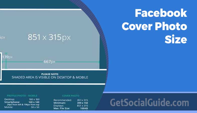
For Facebook profiles and pages, the safe zone is 640×312 pixels centered within your 851×315px canvas. This means you need roughly 105px of padding on the left and right edges where no important content should live. Background color, texture, pattern — all fine at the edges. Text, your logo, phone number, website URL — keep them squarely in the center safe zone. The same principle applies, with different numbers, to groups and events.
Safe zone rules by cover type: Personal/Business Page → center 640×312px. Group cover → center 1640×662px (top-aligned, avoid bottom ~194px on desktop). Event cover → center 1080×566px, avoiding outer 60px on each side. These are non-negotiable if you want your message to reach all viewers.
Setting Up Safe Zones in Your Design Tool
| Design Tool | How to Add Safe Zone Guides | Canvas Size |
|---|---|---|
| Canva | Use official “Facebook Cover” template — safe zone is pre-marked | 851×315px template |
| Adobe Photoshop | View → New Guide Layout → set 105px margin left & right | 851×315px canvas |
| Figma | Create 851×315px frame; add centered 640×312px guide rectangle, lock it | 851×315px frame |
| Adobe Illustrator | File → Document Setup → Bleed → 105px left/right, 1.5px top/bottom | 851×315px artboard |
| Adobe Express | Built-in Facebook cover template with safe zone baked in | Pre-sized template |
💡 PRO TIP — The Center-Lock Method
In any design tool, draw a 640×312px rectangle centered on your 851×315px canvas and lock it as a non-printing guide layer. Design everything important inside that rectangle, then delete or hide the guide before exporting. This takes 30 seconds to set up and works in every design application, ensuring your critical elements never get cropped. For groups, use a 1640×662px guide rectangle instead.
6. Tablet, Mobile Browser, and Facebook Lite Display
Desktop and mobile are not the only two rendering environments. Tablets, mobile browsers, and the lightweight Facebook Lite app each handle your cover slightly differently. Most designers never check these, which is exactly why covers that look fine on a laptop and a phone can still look off on a tablet held in landscape.
| Environment | Approximate Visible Width | What Changes | Practical Takeaway |
|---|---|---|---|
| Desktop browser | 820px | Widest view; full sides visible | This is the most forgiving view |
| iPad / Android tablet (landscape) | ~820px to 900px | Uses a desktop-style layout; shows more width than a phone | Test in landscape to spot edge issues |
| iPad / Android tablet (portrait) | ~640px to 700px | Closer to the mobile crop; sides clipped | Your mobile safe zone covers this |
| Mobile browser (Safari / Chrome) | ~640px | Same cropping as the native app, sometimes tighter | Do not assume the app is the worst case |
| Facebook Lite app | ~640px | Image resolution is reduced to save data; compression is heavier | Design with strong contrast and large type |
| In-app browsers (Messenger, Instagram) | Varies | Crops can differ again; scroll behaviour changes | Check links opened from DMs separately |
💡 PRO TIP — The Three-Device Test
Before publishing, open your page on three things: a laptop browser, a phone using the native Facebook app, and a phone using a mobile browser. If the cover reads clearly in all three, it will almost certainly hold up on a tablet, in Facebook Lite, and inside in-app browsers. The extra two minutes of testing prevents the most common “why does it look wrong on my phone” complaint.
7. Facebook Group Cover Photo Size
Facebook Groups use completely different dimensions from profiles and pages — a fact that catches most designers off guard. Groups have a much larger, nearly square canvas compared to the wide banner format used elsewhere. This extra vertical space gives community admins a richer canvas for communicating the group’s purpose and personality. In 2026, with the explosive growth of niche communities, getting your group cover right is essential for attracting the right members.
Group Upload Size
Upload at this resolution for maximum clarity. Never upload smaller — Facebook will stretch it and lose sharpness.
Desktop Display
Bottom ~194px are hidden on desktop. Design critical content above this line.
Mobile Display
Mobile shows the full 856px height — more visible than desktop. This is a key reversal.
This is an interesting reversal from profile/page behavior: whereas desktop shows more width on regular covers, the group cover shows less height on desktop than on mobile. Design your group cover from the top down — place your most important content in the upper 662px, and use the lower portion for supplementary elements that enrich the mobile experience without being critical to the core message. Many top-performing groups now use the bottom area for member spotlights or visual calls to join discussions.
⚠️ WARNING — No Profile Picture Overlap on Groups, But…
Unlike personal profiles and business pages, Facebook Group cover photos do not have a profile picture overlapping them — giving you the full width to work with. However, the group name and member count text overlay appears in the bottom-left section. Avoid placing your own text in the bottom-left corner to prevent visual conflict with Facebook’s automatic overlays. This overlay is semi-transparent but can still obscure fine print.
What Makes an Effective Group Cover?
Group covers serve a distinct purpose — they need to communicate community identity, not just brand identity. The most effective group covers do one of these three things immediately and visually:
- State who the group is for — a quick visual or text signal that helps newcomers self-identify (e.g., “for solopreneurs” or “pasta lovers only”).
- Show what the group is about — imagery or iconography that signals the niche or topic, from hiking trails to digital art.
- Create a sense of belonging — color palettes, photography, or illustration that generates an emotional pull toward membership, often featuring diverse member avatars.
💡 PRO TIP — Preview Groups on Mobile First
Since groups are predominantly accessed on mobile (where the full 856px image shows), always preview your group cover on a real smartphone before publishing. A design that looks clean on desktop may feel sparse or oversized on mobile if you haven’t considered the full vertical canvas. Use Facebook’s “View as” feature or simply ask a group member to send you a screenshot.
8. How to Upload a Facebook Group Cover Photo
Group covers have their own upload path and their own permission rules. Only admins can change them, and the option is not in the same place as a page cover. Here is the full sequence for 2026, including the checks most admins skip.
- Confirm your admin role. Open the group and check that your name appears under Admins. Moderators cannot change the cover photo — only admins can.
- Open the group on desktop. Group cover editing is more reliable in a desktop browser than in the mobile app, especially when repositioning.
- Hover over the existing cover. Click the “Edit Cover Photo” button that appears at the top of the cover area.
- Choose “Upload Photo.” Select your prepared 1640×856px file. Avoid group covers pulled from your photo library, which may already be compressed.
- Check the desktop crop before saving. The preview shows the desktop view, where the bottom 194px disappear. If any text is visible only in the lower band, move it upward before saving.
- Save, then open the group on a phone. Confirm the full 856px height is visible and that nothing important sits under the group name overlay in the bottom-left.
- Recheck after 24 hours. Caching can show an older version to some members. If someone reports the wrong cover, it is usually a cache issue rather than a failed upload.
Group cover rules to remember: No video covers on groups. No profile picture overlap. Group name and member count overlay the bottom-left. Desktop hides the bottom 194px, mobile shows everything. Keep all critical content in the top 662px.
9. Facebook Event Cover Photo Size
Your Facebook event cover is the visual equivalent of a poster or flyer — it needs to convince people in a fraction of a second whether to click “Interested” or keep scrolling. Unlike a permanent profile cover, event covers need to communicate essential information immediately: what, when, where, and why they should care. In 2026, with events increasingly hybrid (in-person + virtual), your cover must work for both audiences.
Recommended Upload
Optimal for both desktop and mobile event pages. 1.91:1 aspect ratio.
Minimum Acceptable
Below this, Facebook stretches the image and it appears blurry.
What to Include on an Event Cover
✅ Do Include:
- Event name or headline — large, legible, center-safe-zone placement
- Date and time — secondary typography, still visible at thumbnail size
- Location or “Online” indicator for virtual events
- Brand logo or organizer mark — consistent with other event marketing
- A compelling visual that represents the event’s energy or subject matter
❌ Avoid:
- Too many details — description belongs in the description field, not the image
- Small fonts under 24px — unreadable at mobile dimensions
- Text near the image edges — these get cropped on some device/OS combinations
- Low-contrast text over busy photo backgrounds — readability collapses on mobile
💡 PRO TIP — Update the Cover After Your Event
When your event concludes, update the cover with a “Thanks for attending!” message or a highlight photo from the event. Facebook keeps event pages live indefinitely. Stale covers with past dates signal an inactive organizer and undermine credibility for future events that new visitors may discover through search. A fresh cover also encourages attendees to share their photos, extending your event’s reach.
10. Facebook Video Cover Specs
Facebook allows pages to use a short looping video instead of a static image as the cover photo — one of the most underutilized features for brands and creators in 2026. A video cover auto-plays silently when visitors land on your page, creating a far more dynamic first impression than any static image. It’s like having a 20-second commercial for your brand, playing on repeat for every new visitor.
820 × 462px
16:9 aspect ratio
20 seconds
Short enough to loop cleanly
90 seconds
Aim for under 30s in practice
1.75 GB
MP4 or MOV format
Video Cover Best Practices
Video covers play without sound by default — Facebook’s own guidelines confirm this behavior. Your video needs to communicate completely visually, without any reliance on audio. Use text overlays, motion graphics, or purely visual storytelling to convey your message. Think of it as silent cinema for your brand.
- Design for silent viewing — captions, text overlays, or pure visual storytelling
- Keep important content in the center 640×312px safe zone (same as static covers)
- Use a clean, seamless loop so the end-to-start transition feels natural — jarring loops look unprofessional
- Front-load your brand identity in the first 3 seconds for brief-glance visitors
- Select a compelling thumbnail frame during upload — this is what mobile users see (and they are the majority)
⚠️ WARNING — Video Covers Are Pages-Only
Video cover photos are available exclusively on Facebook business Pages. They cannot be used on personal profiles or groups. Additionally, video covers only display on desktop browsers — mobile visitors see the static thumbnail frame you selected during upload, not the video itself. Plan your static thumbnail as carefully as your video, because for over 80% of your audience, that thumbnail is the cover.
11. The 20% Text Rule: What’s Actually True in 2026
Almost every guide to Facebook covers repeats the same warning: “keep text under 20% of the image or Facebook will penalise you.” That advice is a decade out of date, and repeating it causes designers to under-use the most powerful part of the cover — the message itself. Here is what the rule actually was, and what it means now.
Where the Rule Came From
The 20% text rule was originally an advertising policy. Facebook used a grid-based tool to estimate how much of an ad image was covered by text, and ads that exceeded the threshold had limited delivery. It applied to paid ads, not to your organic page cover photo. Over time the rule was softened, then retired as a hard limit, replaced by guidance that text-heavy creative tends to perform worse because people scroll past it.
What Actually Matters in 2026
| Claim | Reality in 2026 | What to Do Instead |
|---|---|---|
| “Facebook rejects covers with more than 20% text” | False. Covers are not rejected on text percentage. | Design for readability, not an arbitrary ratio. |
| “Text-heavy covers get less reach” | Partly true, but indirectly. Text-heavy images usually perform worse with viewers, not because of a penalty. | Use one clear message and let imagery do the rest. |
| “The rule applies to ads and covers equally” | The original rule was for ads. Cover photos were never subject to it. | Treat ad creative and cover design as separate problems. |
| “You can safely fill the cover with text” | You can, but at mobile scale it becomes unreadable and looks cluttered. | Maximum two short lines, 24px or larger. |
| “Text in the safe zone is always fine” | Only if contrast is high enough to survive compression. | Check contrast and test after upload. |
💡 PRO TIP — The Real Text Rule
Forget percentages. Use this instead: one message, two lines maximum, 24px minimum, high contrast, inside the safe zone. If a cover passes that test, it will read clearly on a phone in a feed, which is the only test that matters. If it fails, no amount of pixel-precise dimension work will save it.
12. File Format, Size & Quality Settings
Uploading at the correct dimensions is necessary — but not sufficient. Facebook compresses every image you upload, and the degree of compression depends directly on your file format, file size, and color profile. These variables determine whether your cover looks crisp and professional or muddy and pixelated. Understanding the technical backend gives you a significant edge over competitors who simply upload whatever they have. According to Facebook’s Developer documentation, the platform applies a specific compression algorithm that favors smaller, optimized files.
| Spec | Recommended | Why It Matters |
|---|---|---|
| Format (Photos) | JPG |
Smaller file size; fast loading; Facebook recommends for photographic images without text |
| Format (Graphics) | PNG |
Lossless compression preserves sharp text edges and flat color blocks; best for logos and branded graphics |
| Max File Size | Under 100 KB |
Files below 100KB trigger Facebook’s lighter compression pass, resulting in noticeably sharper output |
| Color Profile | sRGB |
Facebook converts everything to sRGB; uploading non-sRGB files causes color shifts during automatic conversion |
| Resolution | 72 PPI |
Screen displays use 72 PPI; higher DPI inflates file size without adding any visible quality on screen |
| JPG Quality | 90–95% |
Keeps image sharp through Facebook’s additional compression layer |
PNG vs. JPG: The Clear Decision Rule
The choice comes down to one question: does your cover contain text, a logo, or flat-color graphic elements? If yes, PNG. If it’s a pure photograph with no text overlay, JPG at 90–95% quality produces a visually identical result at dramatically smaller file size — which means faster page loading for mobile visitors on slower data connections. For hybrid designs (photo with text overlay), test both: sometimes a high-quality JPG preserves text well enough, but PNG is the safer bet. Resources like Smashing Magazine offer deep dives into web image optimization that complement these guidelines.
💡 PRO TIP — Compress Before Uploading
Use TinyPNG or Squoosh by Google to compress your cover to under 100KB before uploading. This triggers Facebook’s lighter compression algorithm and produces a noticeably sharper final image compared to uploading a large uncompressed file and letting Facebook perform all the compression work. This single step can dramatically improve perceived image quality.
13. How to Upload & Reposition a Cover Photo
Even with perfect dimensions, the upload process has a few nuances. Here’s the complete step-by-step for adding, replacing, or repositioning a Facebook cover photo in 2026. Follow these steps exactly to avoid the most common upload pitfalls.
First-Time Upload
- Navigate to your Facebook profile, page, or group. Make sure you’re logged in as the owner or an admin with editing permissions.
- In the cover area at the top of the page, click the “Add Cover Photo” button (visible when no cover exists yet).
- From the dropdown, click “Upload Photo” and select your prepared cover photo file from your device.
- Facebook loads a preview with a repositioning handle. Drag the image up or down to adjust how it crops — especially important if your design isn’t exactly 851×315px.
- Click “Save Changes.” Always verify immediately on both a desktop browser and a real mobile device before sharing the page link anywhere.
Replacing an Existing Cover Photo
- Hover over the existing cover photo. An “Update Cover Photo” button appears in the bottom-right corner of the cover area.
- Click the button. Choose “Upload Photo” for a new image, or “Choose Photo” to select from your existing Facebook library.
- Reposition if needed, then click “Save Changes.”
Repositioning Without Re-Uploading
- Hover over the cover photo and click the camera icon or “Update Cover Photo.”
- Select “Reposition” from the dropdown menu.
- Drag to adjust the vertical (up/down) position only — horizontal position cannot be changed manually.
- Click “Save Position.”
⚠️ WARNING — Horizontal Repositioning Is Not Possible
Facebook only allows vertical (up/down) repositioning of cover photos. Horizontal centering is fixed and automatic. If your design has critical content off-center horizontally — near the left or right edges — repositioning will not rescue it. The solution is redesigning with the horizontal center as your primary compositional anchor. Always check your design with the safe zone guide before uploading.
14. How to Design a Facebook Cover Photo in Canva
Canva is the most practical tool for most people making a Facebook cover, because the correct dimensions and a pre-marked safe zone are already built into the template. This walkthrough produces an on-spec file in about fifteen minutes, even for a first-time designer.
- Create a custom-size design. Open Canva, choose “Custom size,” and enter 851 × 315 px. Do not use a square or Instagram template and hope for the best.
- Add your safe zone guide. Insert a rectangle, set it to 640 × 312 px, centre it on the canvas, and lock the layer. Give it a thin outline and zero fill so it stays visible while you design.
- Set the background first. Use a brand color, a subtle gradient, or a photograph with plenty of empty space on the left and right. Anything busy near the edges will be cropped on mobile.
- Place your primary message. Add the headline inside the safe-zone rectangle, left-aligned or centred, at 40–60px for impact. Keep it to one line where possible.
- Add one supporting element. A subheading, a URL, or a short call to action at 24–28px. More than two text layers starts to look cluttered at mobile size.
- Check the profile picture zone. Place a 170×170px circle in the bottom-left corner to simulate the avatar. If anything important sits under it, move it.
- Hide the guides and download. Choose PNG if your design contains text or flat colors, JPG at high quality if it is photographic. Use the 1× size, not a larger multiplier.
- Compress before uploading. Run the file through TinyPNG or Squoosh to get under 100KB, then upload to Facebook and check it on a phone.
💡 PRO TIP — Save a Brand Template
Once you have a cover you like, duplicate it in Canva and save it as a reusable brand template with your fonts, colors, and safe-zone guide already in place. Every future cover update then takes five minutes instead of an hour, and your page maintains visual consistency across seasons and campaigns.
15. Design Best Practices for Maximum Impact
Having the correct dimensions is the technical foundation. Building a cover photo that actually drives results — more followers, click-throughs, or event sign-ups — requires design strategy, visual hierarchy thinking, and audience psychology. Here’s what separates high-performing Facebook covers from average ones in 2026.
Visual Hierarchy: Where the Eye Goes First
Because your cover photo is almost always the widest image on the entire page, it commands visual authority. Viewers process it before anything else. Within the wide horizontal space, eyes naturally move left to right. However, Facebook’s UI elements anchor the bottom-left, effectively pushing visual attention toward the center and right-center of the composition. The practical implication: place your hero visual or most compelling element slightly right of center for maximum impact on desktop, while keeping all textual elements within the safe zone regardless of their horizontal position.
Typography Rules That Survive Compression
Text on a Facebook cover must survive three simultaneous tests: readable on a large desktop monitor, legible on a small phone screen, and still clean after Facebook’s image compression. All three push toward the same solution — simplicity and contrast.
- Minimum 24px font size — smaller becomes unreadable at mobile thumbnail scale
- Limit text to one or two short lines maximum — covers are read in 1–2 seconds
- High-contrast color pairings — white on dark, or dark on light backgrounds
- Semi-transparent overlay behind text if your background image is complex or busy
- Display or heading fonts, not body fonts — cover text needs immediate legibility
Color Strategy and Brand Consistency
Your cover photo should use your primary brand colors consistently with your logo, profile picture, and page theme. Nielsen Norman Group research on digital brand cognition consistently shows that color consistency is the single most powerful driver of unconscious brand recognition — users who encounter the same palette repeatedly build familiarity far faster than those seeing visually inconsistent pages. In 2026, with AI-driven content flooding feeds, consistent branding is your anchor.
Cover Photo Goals Mapped to Design Strategy
| Business Goal | Design Strategy | Key Elements |
|---|---|---|
| Drive website traffic | Include a clear URL or CTA in the safe zone | URL, directional arrow, short action phrase |
| Launch a product | Product hero shot + launch date + tagline | Countdown feel, excitement language |
| Brand awareness | Brand imagery + consistent palette + logo | On-brand photography, tagline |
| Grow email list | Lead magnet visual + “Free Download” language | Benefit statement, visual of the asset |
| Promote an event | Event date + venue + key speaker visual | Date highly prominent, exciting tone |
| Social proof | Customer review + product imagery | Star rating, short quote, attribution |
“Your cover photo is the only piece of content on your Facebook page that visitors see before they decide to engage. Every other element only gets read if your cover photo earns that first click.”
💡 PRO TIP — Update Seasonally for Maximum Relevance
A static cover that hasn’t changed in 18 months signals stagnation. A page that updates for the holidays, product launches, or community milestones signals an active, engaged presence. Pages with freshly updated covers also tend to show slightly higher organic reach in the weeks following a cover change, as the update generates a notification-style post in followers’ feeds. Mark your calendar to refresh your cover at least quarterly.
16. Accessibility: Alt Text and Contrast for Cover Photos
Accessibility is no longer a nice-to-have. Screen reader users encounter your cover photo through its alt text, and low-vision users depend on contrast to read whatever text you have placed on the image. Both are quick to fix and both improve the experience for every visitor, not just those using assistive technology.
Adding Alt Text to a Cover Photo
- Open your cover photo by clicking on it so it displays in the photo viewer.
- Click the three-dot menu on the photo and select “Edit Alt Text” (wording varies slightly by surface and language).
- Describe the image’s content and purpose in one plain sentence — for example, “Cover image showing a laptop on a desk with the text: Free WordPress hosting guide.
- Save. Repeat for each cover type you manage, since groups and events have their own images.
| Check | Target | Why It Matters |
|---|---|---|
| Text contrast ratio | 4.5:1 for normal text, 3:1 for large text | Below this, text becomes hard to read for low-vision users |
| Text size on canvas | 24px minimum | Smaller text disappears at mobile scale |
| Colour-only meaning | Avoid | Colour-blind users may not detect the distinction |
| Alt text length | One sentence, under 125 characters | Long alt text is truncated by screen readers |
| Busy backgrounds | Use an overlay | Patterns reduce text legibility for everyone |
Quick contrast check: Paste your two hex colours into any free contrast checker and aim for a score of 4.5:1 or higher. White text on a mid-tone photograph almost always fails — add a dark overlay behind the text before checking again.
17. Industry-Specific Cover Photo Ideas and Specs
The dimensions are universal, but what belongs inside the safe zone changes by industry. These starting points assume the standard 851×315px canvas with a 640×312px safe zone, and they give you a design direction that matches what the audience for each sector responds to.
| Industry | Best Visual Focus | Text to Include | What to Avoid |
|---|---|---|---|
| Real estate | A signature property exterior or skyline | Service area + phone number | Cluttered listing collages |
| Restaurant / café | One hero dish photographed close-up | Opening hours or reservation line | Full menu reproduced as tiny text |
| Fitness / coaching | Action shot with clean negative space | Transformation promise or free trial | Before-and-after grids that read as spam |
| E-commerce | One flagship product on a flat brand colour | Current offer or free shipping threshold | Dense product grids at thumbnail size |
| SaaS / tech | Product interface in a device mockup | Core benefit in five words | Screenshots with unreadable UI text |
| Nonprofit | People or community photography | Mission line + donate action | Statistics-heavy graphics |
| Education | Campus, classroom, or student portrait | Enrolment deadline or open day date | Multiple course names in one line |
| Healthcare / clinic | Calm, well-lit interior or staff portrait | Booking number and hours | Clinical stock imagery that feels cold |
| Creative / portfolio | One standout piece of work | Discipline and availability status | A montage of every project at once |
| Local service | Team photo outside the premises | Service area and years in business | Generic stock photography of strangers |
18. Free Design Tools for Facebook Cover Photos
You don’t need a professional designer or expensive subscription to produce a sharp, on-spec Facebook cover. These tools are free or have generous free tiers, and all include pre-sized Facebook cover templates at correct dimensions. We’ve tested each for 2026 compatibility.
Canva
Best for non-designers. Hundreds of Facebook cover templates at exact dimensions. Excellent free tier with drag-and-drop simplicity.
Figma
Preferred by design-savvy marketers. Free tier supports unlimited personal projects with precise guide control and real-time collaboration.
Adobe Express
Adobe’s free quick-design tool. Pre-sized Facebook cover templates with safe zones built in, plus access to Adobe Fonts.
Snappa
3 free downloads per month. Purpose-built for social graphics with Facebook-exact specs baked in and a huge stock photo library.
TinyPNG
Essential for compression. Reduces PNG and JPG file sizes up to 70% with no visible quality loss. Web-based and free.
Squoosh
Google’s advanced image compressor. Fine-grained quality control and side-by-side comparison preview. Open source and free.
19. Common Cover Photo Design Mistakes
Most cover photos that underperform fail for the same handful of reasons. None of them are exotic, and all of them are fixable in a few minutes once you know what to look for.
| Mistake | What It Looks Like | The Fix |
|---|---|---|
| Designing only for desktop | Logo and URL visible on a laptop, gone on a phone | Design inside the 640×312px safe zone from the start |
| Ignoring the avatar zone | Important text hidden behind the profile picture circle | Place a 170×170px placeholder in the bottom-left and design around it |
| Too much text | A paragraph squeezed into a banner, unreadable at thumbnail size | One message, two short lines maximum |
| Low contrast | Light text over a bright sky or busy photo | Add a dark or light overlay behind the text and recheck contrast |
| Edge-to-edge critical content | Text touching the left and right borders | Leave roughly 105px clear on each side on the 851px canvas |
| Upscaled images | Soft, blurry, slightly pixelated across the whole banner | Always start from a larger source and scale down |
| Stale design | Holiday graphics still live in March, or a promotion that ended months ago | Set a quarterly reminder to review and refresh |
| Inconsistent branding | Colours and fonts that do not match the profile picture or website | Use a saved brand template with fixed colours and typefaces |
| No mobile check before publishing | Fine on the designer’s monitor, wrong on every phone | Open the page on a real device before announcing the update |
20. Troubleshooting Blurry & Cropped Cover Photos
Even when you follow every guideline, Facebook can still surprise you. Here are the most common problems — and their verified solutions for 2026. Bookmark this section for when things go wrong. For persistent issues, consult Facebook’s official Help Center, which offers real-time updates on platform behavior.
| Problem | Likely Cause | Solution |
|---|---|---|
| Blurry or pixelated cover | Image too small or Facebook over-compressed a large file | Upload at 851×315px exactly; compress to under 100KB before uploading; use PNG for graphics with text |
| Logo or text cut off on mobile | Content placed outside the 640×312px safe zone | Redesign with all key content strictly inside the centered safe zone; always test on a real phone |
| Wrong display on mobile after upload | Browser cache showing old version | Force-refresh mobile browser; clear app cache; ask someone else to view your page to confirm |
| Colors shifted after upload | Image exported in CMYK or non-sRGB color profile | Re-export in sRGB; Facebook converts all images to sRGB and the conversion shifts non-sRGB colors unpredictably |
| Profile picture blocks content | Content placed in bottom-left ~170×170px zone | Redesign to keep bottom-left area clear; move logos and text to center or right side |
| Cover appears stretched or distorted | Wrong aspect ratio uploaded | Stick to 851×315px (16:9). Square or portrait images get forcibly stretched to fit the banner slot |
| Group cover cropped at bottom on desktop | Design extends into the bottom 194px desktop hides | Keep all critical content in the upper 662px of your 856px group cover canvas |
| Blurry only in Facebook Lite | Lite reduces image resolution to save mobile data | Increase contrast and text size so the design survives heavier compression |
| Tablet shows a different crop than phone | Tablets use a desktop-style layout in landscape | Test in tablet landscape as well as portrait before finalising |
⚠️ WARNING — Never Upscale Small Images
If your source image is smaller than the recommended dimensions, do not artificially enlarge it to 851×315px in a design tool before uploading. Upscaling creates a specific type of blurriness that no post-upload adjustment can fix. Always start with a high-resolution source file and scale down, never up. If no large source exists, recreate the graphic from scratch at the correct dimensions.
FAQ
A: The recommended upload size for personal profiles and business pages is 851×315 pixels. Facebook displays this at 820×312px on desktop and crops it to 640×360px on mobile. For a single size that works on both devices, design at 820×360px and keep all important content within the centered 640×312px safe zone.
Q: Why does my Facebook cover photo look different on mobile?
A: Facebook crops your cover photo differently on desktop vs. mobile. On mobile, approximately 90 pixels are removed from each side of the image, reducing the visible width from ~820px down to ~640px. The height shows slightly more on mobile (360px). Content near the left or right edges is invisible to mobile users — who represent over 80% of Facebook’s active user base.
Q: What size is the Facebook group cover photo in 2026?
A: Facebook Group covers should be uploaded at 1640×856 pixels. On desktop, only the upper 662px of height is visible. Mobile shows the full 856px. Always keep critical content in the upper 662px safe zone, and test on a real smartphone since groups are predominantly browsed on mobile.
Q: Should I use JPG or PNG for a Facebook cover photo?
A: Use PNG for covers containing text, logos, or flat-color graphic elements — PNG’s lossless compression maintains crisp, sharp edges. Use JPG at 90–95% quality for pure photographic covers without text overlay. In both cases, compress the final file to under 100KB using TinyPNG or Squoosh before uploading to minimize Facebook’s recompression.
Q: What is the Facebook event cover photo size?
A: The recommended Facebook event cover size is 1200×628 pixels (aspect ratio 1.91:1). This displays consistently on both desktop and mobile event pages. Keep critical content — event name, date, key visuals — within the centered 1080×566px safe zone to avoid cropping on any device or OS.
Q: How do I stop my Facebook cover photo from being blurry?
A: Cover photo blurriness has three main causes: uploading at too-small dimensions (Facebook stretches the image), uploading a very large file (Facebook applies heavy compression), or exporting in the wrong color profile. Fix all three: upload at exactly 851×315px, compress to under 100KB using TinyPNG before uploading, and export in sRGB color profile from your design tool.
Q: Can I use the same cover photo for my profile and business page?
A: The dimensions are identical (851×315px), so technically yes. However, context differs significantly — personal covers can be expressive while business covers should be strategic. Additionally, the profile picture overlaps in slightly different positions on personal profiles vs. business pages. Test both placements independently before committing to a shared design.
Q: Can I use a video as my Facebook cover photo?
A: Yes — but only on Facebook business Pages, not personal profiles or groups. Video covers should be 820×462px (16:9), between 20 and 90 seconds long, in MP4 or MOV format, under 1.75GB. Videos auto-play silently on desktop. Mobile visitors see the static thumbnail frame you selected during upload — design this frame as carefully as your video itself.
Q: What is the Facebook cover photo size in inches or centimeters?
A: At the standard 72 PPI used for screen design, 851×315px converts to approximately 11.82 × 4.38 inches or 30.0 × 11.1 centimeters. The desktop display size of 820×312px is about 11.39 × 4.33 inches, and the mobile crop of 640×360px is about 8.89 × 5.00 inches. Remember that changing the PPI tag in an image editor does not change the actual display size on Facebook — only the pixel dimensions matter.
Q: Does Facebook still enforce the 20% text rule on cover photos?
A: No. The 20% text rule originated as an advertising policy and was never a hard restriction on organic cover photos. It has since been retired as a strict threshold. In practice, text-heavy covers still perform worse because they become unreadable at mobile scale. A better rule is one message, two short lines maximum, 24px minimum font size, and high contrast inside the safe zone.
Q: What size is the Facebook profile picture compared to the cover photo?
A: The profile picture should be uploaded at a minimum of 320×320 pixels and displays at roughly 176×176px on desktop and 196×196px on mobile, cropped to a circle. The cover photo is a separate wide banner at 851×315px. Keep the two in the same colour family so they read as one visual unit rather than two unrelated images.
Q: How do I add alt text to my Facebook cover photo?
A: Open the cover photo in Facebook’s photo viewer, click the three-dot menu, and choose “Edit Alt Text.” Write one plain sentence describing what the image shows and any text it contains. Keep it under about 125 characters, since longer descriptions are truncated by screen readers. Repeat the process for group and event covers, which are edited separately.
Q: Why does my cover photo look different on a tablet?
A: Tablets behave like a hybrid. In landscape orientation they use a desktop-style layout and show close to the full 820px width, while in portrait orientation they crop closer to the 640px mobile view. If your cover reads correctly on both a laptop and a phone, it will almost always hold up on a tablet, but testing in both orientations is the only way to be certain.
Q: Can I schedule a Facebook cover photo change in advance?
A: Facebook does not offer native scheduling for cover photo changes. The practical workaround is to prepare your seasonal or campaign covers in advance, store them in a shared folder with the correct dimensions and file sizes, and set a calendar reminder for the changeover date. Some third-party social media management tools support publishing page updates on a schedule, but the cover slot itself is usually changed manually.
Q: How do I make a Facebook cover photo in Canva?
A: Create a custom-size design at 851×315px, add a locked 640×312px rectangle as your safe-zone guide, and place all text and logos inside that rectangle. Keep one main message and one supporting line, add a 170×170px circle in the bottom-left to simulate the profile picture, then hide the guides and export as PNG. Compress the file to under 100KB before uploading to Facebook.
Q: Does the Facebook cover photo affect SEO or search visibility?
A: Indirectly. Facebook pages can appear in search results, and a clear, well-designed cover increases the chance that a visitor stays, follows, or clicks through to your website. Alt text also contributes to accessibility and helps Facebook understand the image. There is no direct ranking factor tied to cover dimensions, but a professional, mobile-friendly cover supports the trust signals that influence whether people engage with your page at all.
21. Future Trends: Facebook Covers in 2026 and Beyond
As we move through 2026, Facebook’s cover photo is evolving from a static branding element into a dynamic, interactive touchpoint. Understanding these trends will keep your page ahead of the curve.
- AI-Generated Personalization: Some beta tests show covers that subtly change based on viewer interests (e.g., a sports brand showing different gear to different demographics). While not yet standard, designing with modularity in mind prepares you for this shift.
- AR-Integrated Covers: Facebook is experimenting with covers that have augmented reality triggers. A visitor could point their phone at the cover and see a 3D product or a virtual try-on. Designing with a clear focal point will be crucial for AR triggers.
- Short-Form Video Dominance: Video covers are becoming more popular as bandwidth improves. Expect the recommended video duration to trend shorter (15-30 seconds) for better retention.
- Accessibility-First Design: With increasing legal and ethical focus on web accessibility, expect Facebook to introduce alt-text requirements for covers and better screen reader support. Designing with high contrast and clear text hierarchies is no longer optional.
Staying informed about these trends ensures your Facebook presence remains modern and effective as the platform evolves.
Summary: Pro Tips & Warnings Recap
✅ Top Pro Tips for 2026
- Design at 820×360px for the best cross-device result without complex dimension management.
- Keep all logos, text, and CTAs inside the centered 640×312px safe zone for profiles and pages.
- Compress to under 100KB before uploading — triggers lighter Facebook compression and sharper output.
- Use PNG for graphics/text, JPG for pure photographs, and always export in sRGB color profile.
- Update your cover photo regularly — seasonal and campaign-specific covers signal an active, engaged presence.
- Always test the final cover on a real smartphone before publishing — desktop previews don’t reveal mobile cropping.
- For groups, design from the top — keep all critical content in the upper 662px that desktop always shows.
⚠️ Warnings to Avoid
- Never place important content in the bottom-left ~170×170px zone — your profile picture will overlap it.
- Do not use the same cover photo across profiles, pages, and groups without testing each separately — cropping rules differ.
- Never upload a small image upscaled to correct dimensions — always start large and scale down.
- Don’t upload large uncompressed files and let Facebook do all the compression — pre-compress for sharper results.
- Avoid excessive text overlay — more than 2 short lines significantly degrades visual impact at mobile scale.
- Don’t skip mobile testing — over 80% of your Facebook audience sees your cover photo on a phone first.
Conclusion
Getting your Facebook cover photo right in 2026 is one of the highest-leverage improvements you can make to your page’s first impression. The dimensions are well-established — but the stakes have increased. With mobile-first browsing completely dominating and visual content competing harder than ever for attention, an improperly sized cover photo carries a real cost: in perceived professionalism, in mobile user experience, and in the effectiveness of every marketing message you try to communicate through that prime screen real estate.
The solution is methodical but entirely learnable: use the exact specs from this guide, design within the safe zone for your cover type, compress to under 100KB before uploading, choose the right file format, and always test on a real mobile device before publishing. Apply these practices consistently across your profiles, business pages, groups, and events, and every visitor to your Facebook presence will see exactly what you intended — on every device, every time.
Bookmark this guide and revisit the dimensions table whenever you’re creating a new page or refreshing an existing cover. We verify all specifications monthly against live Facebook placements so you’re always working with current, accurate information when it matters most.