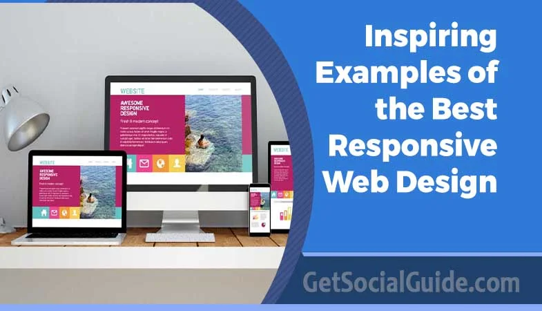
11 Inspiring Examples of the Best Responsive Web Design in 2023
A well-designed website can captivate visitors, convey your brand’s message, and establish credibility. It also enhances the user experience by making navigation and information more accessible to visitors.

In the words of SWEOR, “It takes about 50 milliseconds for the users to form an opinion about your site, which decides whether they like your site or not, whether they’ll stay or leave.” Knowing the preceding, it is clear why we require the best website designs.
The best website design is visually appealing and has an easy-to-use user interface that keeps visitors engaged and supports them to explore further.
Finding the best web design in California is difficult, but the creative websites listed below will undoubtedly inspire you. You can use this list as a quick reference to incorporate the elements that best suit the needs of your website and keep visitors glued to it. This article discusses 11 inspiring examples of the best responsive web design in 2023.
11 Best Responsive Web Design to Inspire You in 2023:

Website design inspiration can come from a variety of sources. Whether you are redesigning an existing site or starting from scratch, this information brimming with the 11 best web designs will inspire you to begin your web design project:
Dropbox
Dropbox has created an outstanding responsive website using a fluid grid and flexible visuals. When switching from desktop to handheld devices, the font color changes to match the background color, and the image rotates.
Supima
Another example of a responsive website is Supima. Its creative use of negative space and eye-catching hero image are inspiring. By incorporating negative space with pastel colors, the cotton fabric provider defies the stereotype of black-and-white minimalist design. White space allows colors and design elements to breathe while keeping the overall look clean and uncluttered.
Supima’s hero image is visually stunning, enticing visitors and making an excellent first impression. Aside from setting the tone for the web design California, it encourages visitors to interact with it and learn more about what Supima has to offer.
Freshbooks
Freshbooks’ homepage design is straightforward, with minimal copy, a neutral beige background, and effective use of white space.
They’ve taken advantage of color contrast, with blue and green CTA buttons that stand out against the color scheme, making it clear what actions users want to take when they arrive.
Freshbooks’ sub-navigation section is well-organized, with labels such as ‘Tools to support your type of business,’ which helps visitors quickly find solutions for various use cases and demonstrates empathy for their specific pain points.
Dribbble
One of the hallmarks of responsive web design can be found on Dribbble’s website: a flexible grid that condenses from five columns on laptops and desktops to two columns on tablets and mobile phones.
To make its website appear less cluttered on mobile devices, Dribbble has removed several items.
Okalpha’s
Okalpha’s web design is similarly minimalist, emphasizing simplicity and clean aesthetics. The design’s bold primary color palette is a standout feature.
Okalpha employs vibrant red, blue, and yellow to create a striking and memorable visual identity. The bold color choices reflect the brand’s mission, which evokes a sense of energy and creativity.
The animations thoughtfully direct the user’s attention to important content. The typography is readable and visually appealing, and the design elements and visual structure help visitors navigate the site quickly.
Shopify
Shopify provides a consistent user experience (UX) across all devices by adapting CTAs and illustrations for desktop and mobile users.
Shopify’s main CTA button is on desktop computers and tablets to the right of the form field. It’s underneath on smaller mobile displays, showing up clearly and providing an intuitive experience for users scrolling downward on touchscreen devices.
The email signup field is also condensed into a small icon that expands when clicked in the mobile version to encourage users to convert without crowding the screen.

Magic Leap
Magic Leap has designed a simple, mobile-first website with parallax scrolling that showcases its stunning illustrations. Their strategy makes sense since mobile phones and tablets now account for 56.74% of global internet usage.
The Magic Leap user experience is consistent across all devices, except the microcopy that directs users to scroll, which is included on desktop desktops and laptops but not on mobile devices, where scrolling is natural.
Rick Waalders
Rick Waalders is a web designer and developer whose work has been recognized in the industry. Waalders has created an award-winning website portfolio showcasing his abilities and expertise. Rick Waalders’ web design is distinguished by bold typography and 3D elements. His careful selection of fonts and typographic arrangements gives the portfolio website a distinct look.
Slack
Slack’s quirky, responsive design reflects its playful, empathetic brand values. To facilitate intuitive user browsing, their navigation menu, for example, shrinks to a ‘hamburger icon,’ with the search icon highlighted on mobile.
Slack’s responsive grid layout adapts quickly to different device sizes. They use a three-column layout on desktop and a single-column layout on mobile for elements such as customer logos.
It highlights and personalizes CTAs based on the user’s location: on desktop, it’s ‘Try for free,’ while on mobile, it’s ‘Get Slack for iOS.’ This personalized experience motivates users to act.
Cure Nails
Cure Nails has a sleek and modern website design. California’s web design showcases its nail care and beauty services with a captivating hero image on the homepage. The unique tagline in the hero section catches visitors’ attention and entices them to explore further.
Animations are strategically placed throughout the website, in addition to subtle parallax scrolling. As visitors move between sections, they add dynamism and interactivity.
Smashing Magazine
Smashing Magazine goes above and beyond by offering a personalized experience across all platforms. On desktop, their site has a two-column layout, combination mark, and full menu, which on tablets and mobile devices converts to a one-column layout and condensed menu with letter marks.
Conclusion
When creating a user-friendly, visually appealing, and effective website, researching and drawing inspiration from the most effective website designs can be a great place to start.
Learning from the innovative and successful designs of others can help you improve the overall user experience and make your site a standout online destination. As a result, read through this article and select the best design technique to inspire the creation of your website.


