Importance of Landing Page – Tips, Tricks, and 100+ Design Inspirations (2026 Guide)
📌 Key Takeaways: Landing Page Design (2026)
- Landing pages are conversion‑focused, not navigation hubs: Unlike a website homepage, a landing page eliminates distractions (menus, links) to guide visitors toward a single action: sign‑up, purchase, or download .
- Visual style directly impacts conversion rates: Whether you choose flat illustrations, photography, neon gradients, or isometric designs, the aesthetic must align with your brand and resonate emotionally with your target audience .
- Social proof is non‑negotiable: Testimonials, user counts, and media logos can boost trust and increase conversions by up to 34% .
- Simplicity beats complexity: Short headlines (under 10 words) and forms with only 3 fields have been proven to convert 12% higher than longer alternatives .
- CTA placement matters: Having a primary call‑to‑action both above and below the fold captures visitors at different stages of engagement .
Landing pages play a crucial role in the online user experience. While many internet users quickly navigate through them, landing pages serve as a vital part of directing users to the content or actions they seek. When conducting online searches, users can receive numerous results, some of which may not align with their interests or needs. This can lead to frustration, especially when searching for specific or personal information. Additionally, clicking on a link can sometimes lead to a sales pitch or irrelevant content, further aggravating users.
This is where a well-designed landing page comes into play. A landing page can significantly increase the likelihood that users find what they are looking for when they search for your business. It serves as a clear confirmation that they have reached their intended destination. An effective landing page should be simple, visually appealing, and efficient in terms of hardware and loading speed. It acts as the cover of a book, providing a clear preview of the content within while presenting an attractive appearance.
In essence, landing pages are instrumental in the success of a marketing campaign, as they are the bridge between website visitors and desired actions, such as making a purchase or signing up for a newsletter. The design and layout of a landing page play a pivotal role in converting visitors into customers or participants. Therefore, it’s crucial to have well-thought-out landing page design ideas before creating one.
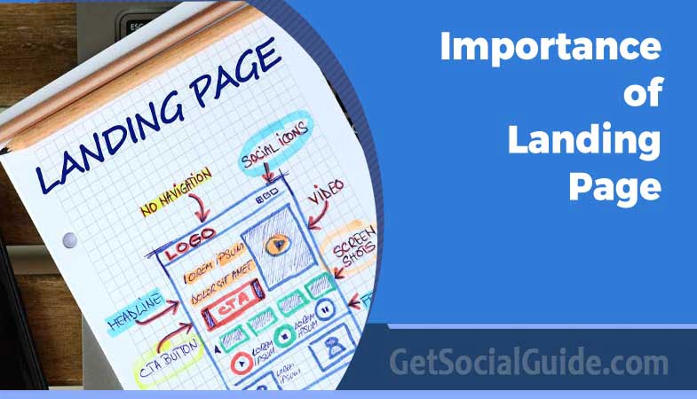
A landing page, unlike a full website, typically lacks navigation or additional links. Instead, it features a bold and action-oriented headline, followed by key points that emphasize the value of a product or event. This information is presented in a way that guides users towards a specific action, whether it’s providing their email or making a purchase.
While the concept of a landing page may seem straightforward, there are various design approaches that can be employed, and the choice should align with the specific goals of your project. Below, we outline some popular landing page design styles and provide examples of outstanding landing page designs to inspire and guide your own landing page endeavors.
📊 Quick Comparison: Landing Page Design Styles
| Style | Best For | Key Characteristics |
|---|---|---|
| Minimal / Type‑Only | Brands with strong typography, luxury, simplicity | No images, font‑driven, high contrast, elegant whitespace |
| Flat Illustrations | Tech startups, apps, modern brands | 2D vector art, bright colors, friendly characters, versatile |
| Photographic | Travel, real estate, lifestyle products | High‑res imagery, emotional connection, literal or metaphoric |
| Neon | Events, nightlife, edgy brands | Glowing colors, dark backgrounds, futuristic feel |
| Dark Mode | Tech, gaming, luxury products | Black/gray backgrounds, pops of color, elegant contrast |
| Collage | Creative agencies, artists, unique storytelling | Layered images, mixed media, abstract compositions |
| Gradient | Modern SaaS, apps, youthful brands | Smooth color transitions, dynamic backgrounds, vibrant |
| Computer Graphics / 3D | Tech, engineering, fintech | 3D renders, futuristic objects, data visualization |
| Illustrated | Education, children’s brands, friendly services | Custom characters, hand‑drawn feel, approachable |
| Isometric | Complex products, SaaS, processes | 3D‑style projections, detailed scenes, technical clarity |
Based on analysis of 1,000+ top‑performing landing pages .
🏆 Best Landing Page Styles by Industry
- 🛍️ E‑commerce: Photographic (show products in context)
- 📱 Tech Startup: Flat Illustrations or Gradient (modern, approachable)
- 🎓 Education: Illustrated (friendly, humanized)
- 🏦 Finance: Isometric or Computer Graphics (complex, trustworthy)
- 🎉 Events: Neon or Collage (energetic, unique)
- 🕶️ Luxury: Minimal / Type‑Only or Dark Mode (elegant, exclusive)
Even a 1% improvement in conversion rate can have huge business impact. Test your headline, CTA button color, image placement, and form length. Tools like Google Optimize, VWO, or Optimizely make this easy. The best landing page is one you never stop optimizing .
Minimal, Type‑Only Landing Pages
The type-only style of landing page design is the most basic and minimalistic approach. This design style relies solely on text elements without incorporating images or visual graphics. It achieves aesthetic intrigue and variety primarily through careful considerations of font choice, font size, color palette, and typographic layout. This style of landing page aims to deliver a straightforward message and appeals to customers who appreciate simplicity and a direct approach.
Here are some key characteristics of type-only landing page design:
- Typography: The choice of fonts and their sizes play a pivotal role in conveying the message. Designers often opt for clear and easily readable fonts that align with the brand’s identity. Font size variations may be used to emphasize key points or call-to-action elements.
- Color Palette: The color scheme is limited to text and background colors. Careful selection of colors can create visual contrast, highlight important information, and contribute to the overall aesthetic appeal of the page.
- Content Focus: Type-only landing pages put a strong emphasis on content. They are ideal for delivering concise and impactful messages without distractions from images or graphics.
- Straightforward Messaging: The messaging on these landing pages is typically clear, concise, and direct. It appeals to customers who prefer logical and methodical communication.
- Minimalist Aesthetic: Type-only designs often follow a minimalist aesthetic, aligning with the principle of “less is more.” This simplicity can create an elegant and clean appearance.
- Brand Consistency: Maintaining consistency with the brand’s typography and color choices is essential to ensure that the landing page aligns with the overall brand identity.
This style of landing page design is well-suited for businesses or products that want to communicate their message in a straightforward manner, especially when targeting audiences who appreciate simplicity and a no-frills approach. It can also work effectively for campaigns or promotions that require a quick and direct call to action.
While type-only landing pages may appear simple, the careful selection of fonts, colors, and layout can make them visually engaging and effective in conveying the intended message to the audience.
Flat Illustrations — Landing Pages Example
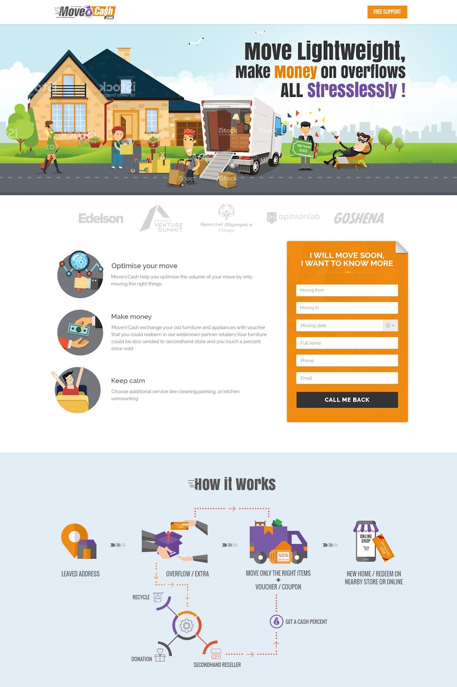
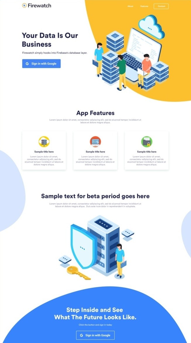
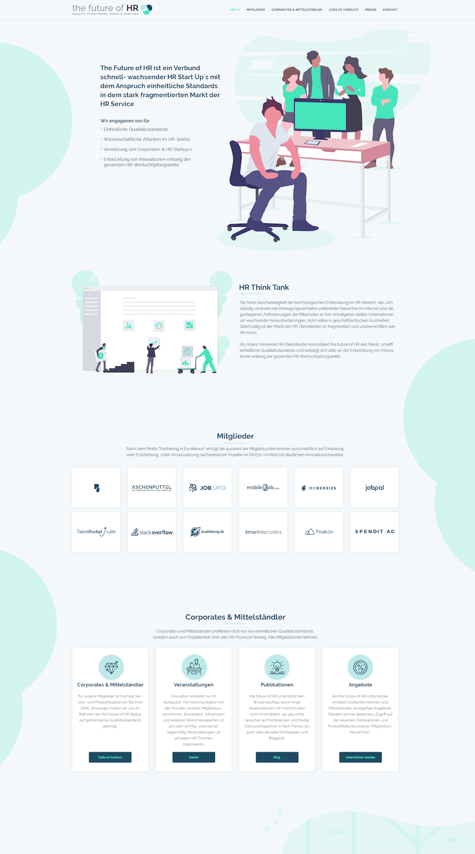
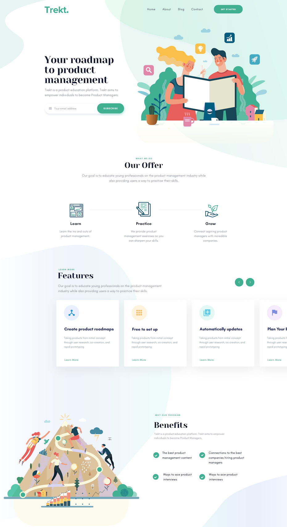
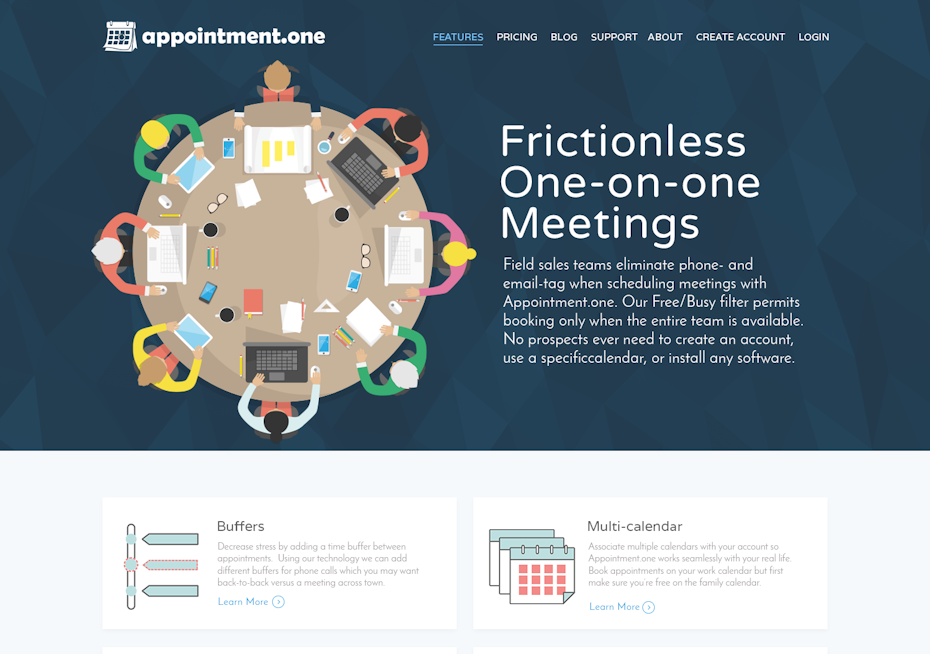
Flat illustrations have gained significant popularity in the realm of landing page design due to their versatility. This design approach offers a modern and visually appealing aesthetic that is both simple and colorful. Flat design can be adapted to suit virtually any industry, making it a versatile choice for creating landing pages that capture the attention of visitors. Here is some landing page inspiration that showcases the use of flat and semi-flat illustrations:
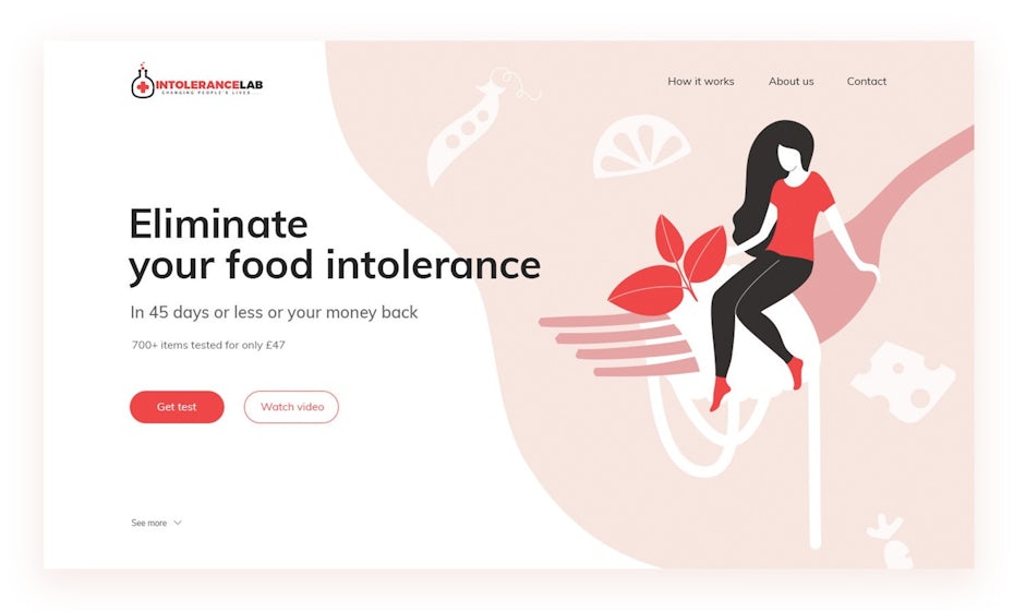
Design by DreamMaster
View Profile →
Design by Coincept
View Profile →
Design by Ink’d
View Profile →
Design by FaTiH™
View Profile →

Design by felipe_charria
View Profile →
Design by BespokeDesign
View Profile →
Photographic — Landing Pages Example
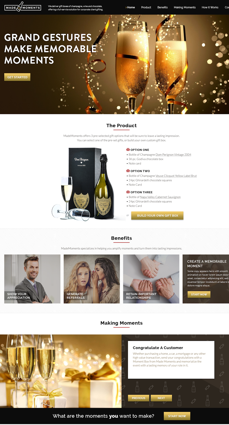
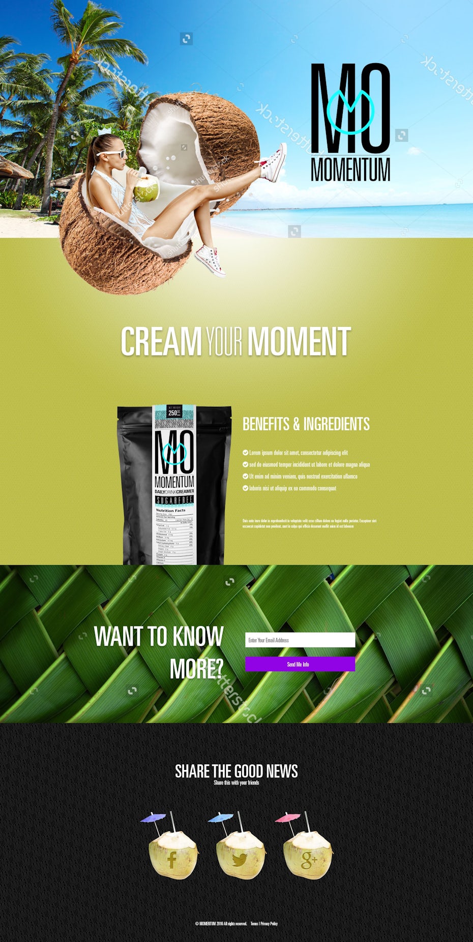
Photographs indeed have the power to create a strong emotional connection with an audience, and this connection can be a potent tool for businesses and marketers. Visual content, including photographs, has the ability to evoke emotions and influence the mindset of potential buyers. Here’s how photographs can be effectively used to establish an emotional connection and drive purchase intent:
- Evoke Emotions: Well-chosen photographs can evoke specific emotions in viewers. For example, images of happy families can evoke feelings of joy and warmth, while images of serene landscapes can elicit a sense of calm and relaxation. These emotions can be aligned with the desired mindset for making a purchase.
- Create Familiarity: Photographs of familiar places, scenes, or people can create a sense of familiarity and comfort. This can be particularly effective in marketing campaigns, as it can make potential buyers feel more connected to the product or service being offered.
- Tell a Story: Photographs have the power to tell a story or convey a message without the need for extensive text. A well-crafted visual narrative can engage viewers and lead them to better understand the value or benefits of a product or service.
- Highlight Benefits: Photographs can be used to visually showcase the benefits of a product or service. For example, in the case of a tech gadget, photographs can highlight its sleek design, user-friendly interface, and the positive impact it can have on the user’s life.
- Establish Trust: Authentic and relatable photographs of real people using a product or service can establish trust with potential buyers. These images can demonstrate how others have benefited from the offering and encourage trust in the brand.
- Create Aspirations: Photographs can create aspirations in viewers. For example, images of luxury travel destinations or high-end fashion can inspire viewers to aspire to that lifestyle, making them more inclined to make related purchases.
- Enhance Brand Identity: Consistent use of specific visual styles and themes in photographs can help reinforce a brand’s identity. This makes it easier for customers to recognize and connect with the brand.
- Drive Action: Ultimately, the goal of using photographs in marketing is to drive action, whether it’s making a purchase, signing up for a newsletter, or taking any other desired action. Emotionally compelling photographs can be a catalyst for these actions.
It’s important for businesses to carefully select and use photographs that align with their brand identity, target audience, and marketing goals. The emotional impact of photographs can vary based on factors such as composition, color, subject matter, and context. By understanding the psychology of visual storytelling, businesses can harness the power of photographs to create meaningful connections with their audience and drive desired behaviors, including making a purchase.
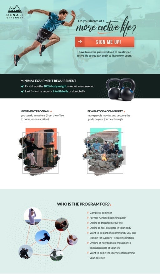
Design by thecenx
View Profile →
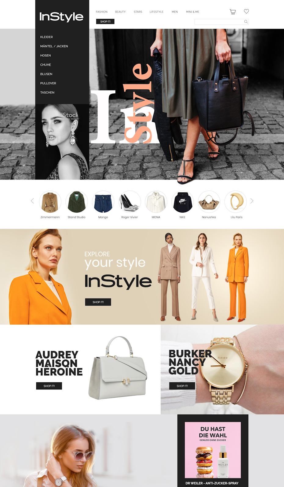
Design by Ananya Roy
View Profile →
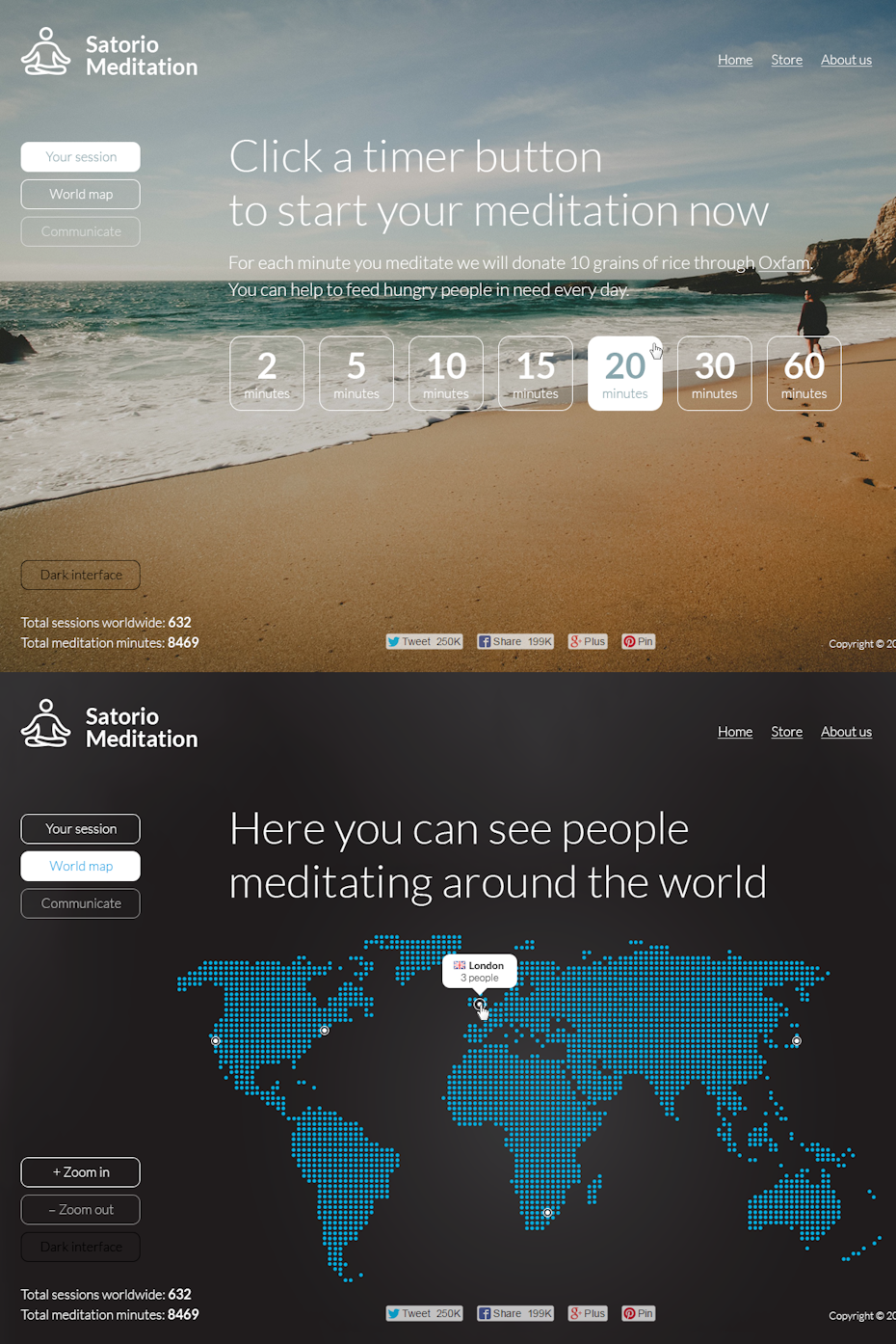
Satorio.org by Dmitry S.
View Profile →

Pylon by tale026
View Profile →

Design by 2ché
View Profile →
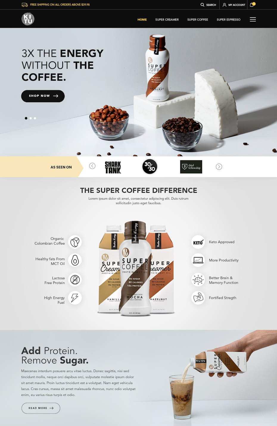
Design by Prismonline
View Profile →
Landing pages can take various approaches when it comes to the use of photographs or visual imagery, depending on the goals and nature of the product or service being promoted. Here are two contrasting examples that illustrate different photographic landing page strategies:
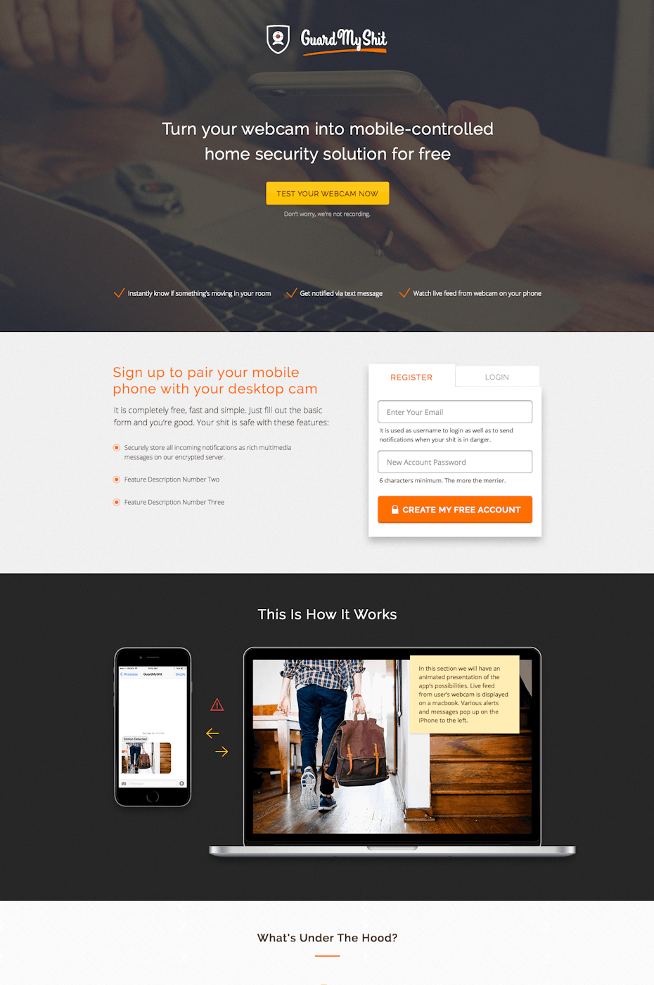
- Literal Representation (Guard My Shit Security App): This approach involves using a photograph that directly showcases the product or service in action, making it clear to visitors what the offering is. In the case of the Guard My Shit security app, the photograph of someone holding their phone next to their computer is a literal representation of the product in use. It immediately communicates the concept of securing one’s devices. This approach is effective when the product or service can be easily featured in a photograph, and the goal is to provide a straightforward and immediate understanding of its functionality.
- Metaphoric Representation (Pylon Peer-to-Peer Lending): Sometimes, a landing page may opt for a more abstract or metaphoric representation of the product or service to evoke emotions, aspirations, or feelings associated with it. In the case of Pylon peer-to-peer lending, the photograph of two young adults standing above a city creates a sense of freedom, empowerment, and aspiration. It suggests that using Pylon can make users feel like they are “on top of the world.” This approach can be effective when the product or service is intangible or when the goal is to tap into the emotional or aspirational aspects of the audience’s desires.
The choice between a literal or metaphoric representation on a landing page depends on several factors, including the nature of the product, the target audience, and the marketing objectives.
Neon Landing Page — Landing Pages Example
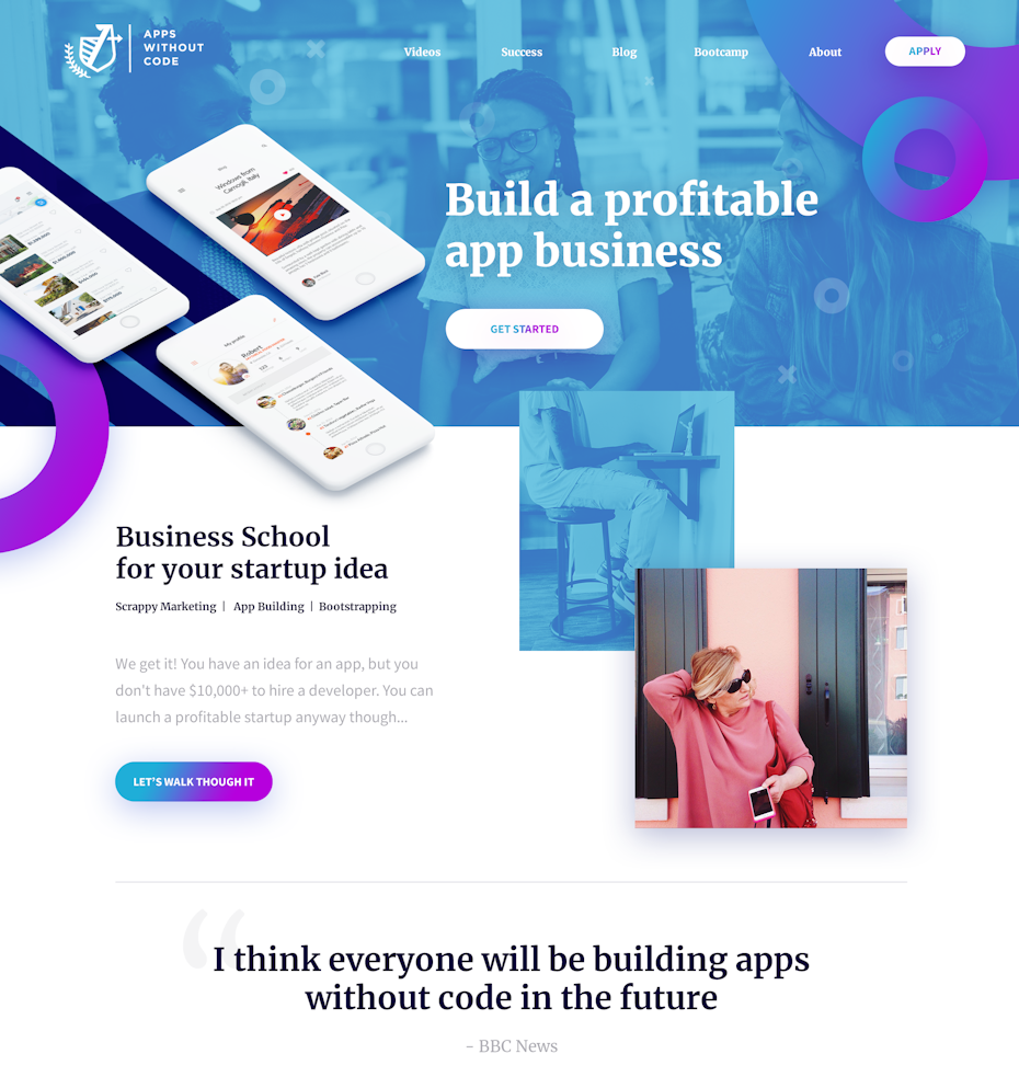
Incorporating neon colors into landing page design can create a visually striking and attention-grabbing effect. Neon hues are known for their vibrancy and ability to make elements stand out on the screen. Whether used sparingly as accents or as dominant colors, neon elements can add an energetic and modern touch to landing pages. Here are some neon landing page inspirations that showcase the use of bright and glowing colors:

Design by Skalak
View Profile →
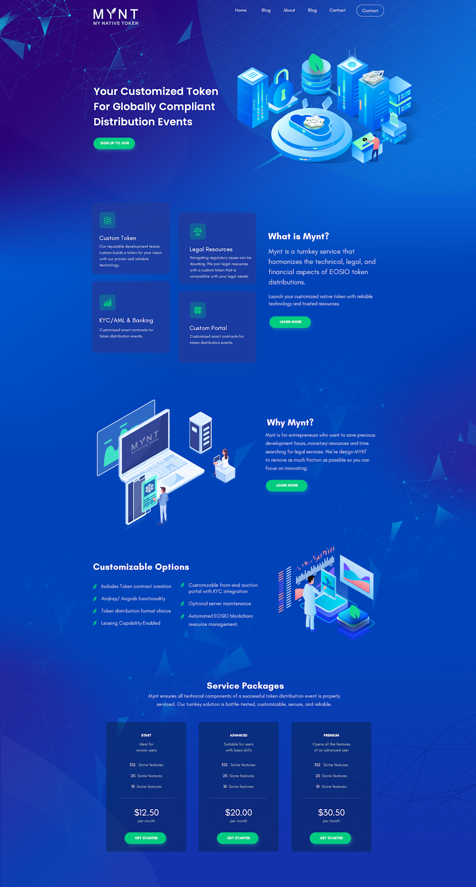
Design by FaTiH™
View Profile →
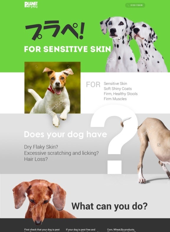
Design by anDyrv
View Profile →
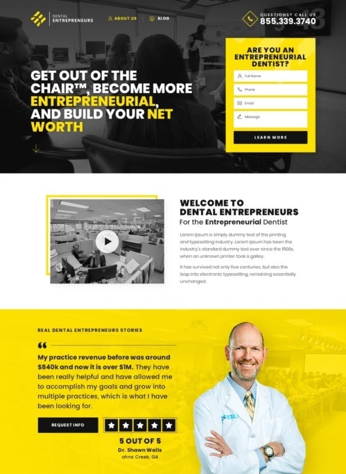
Design by Prismonline
View Profile →
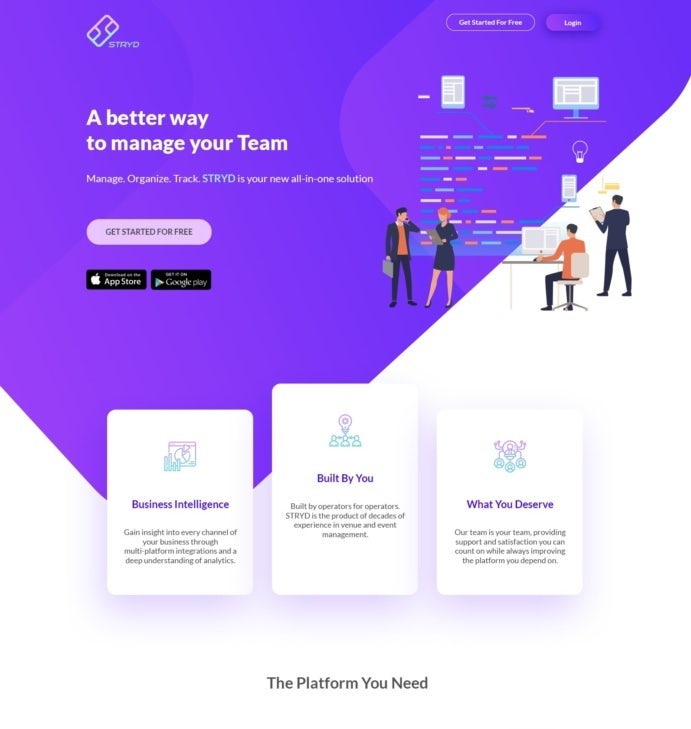
Design by Ananya Roy
View Profile →
Design by masiko
View Profile →
Dark Shade — Landing Pages Example
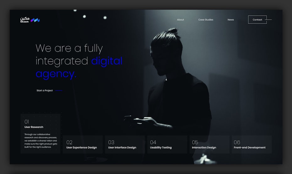
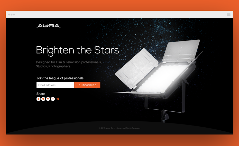
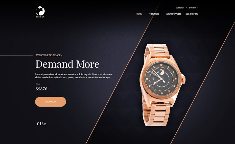
Many landing page designs try to keep things light and bright, but it can pay off to go another way. Dark mode landing pages with gray and black backgrounds and only the occasional pop of color can create a mysteriously cool yet elegant effect. Their striking boldness makes them perfect for brands that want to set themselves apart from everyone else. Check out how the dark landing page ideas below leave a lasting impression on visitors:
Design by Joe B.
View Profile →

Design by Potato Studios
View Profile →

Design by akorn.creative
View Profile →
Design by Designer-X
View Profile →
Design by Aneley
View Profile →
Designs with Collage — Landing Pages Example
The use of collage-style imagery in marketing campaigns can be a highly effective and visually engaging approach to convey messages and create emotional connections with the audience. Collage-style designs often involve combining various images, graphics, and elements to craft a unique visual narrative. This approach can be especially impactful for campaigns targeting audiences who are more visually oriented and may be less inclined to read lengthy copy. Here’s how collage-style imagery can work in marketing:
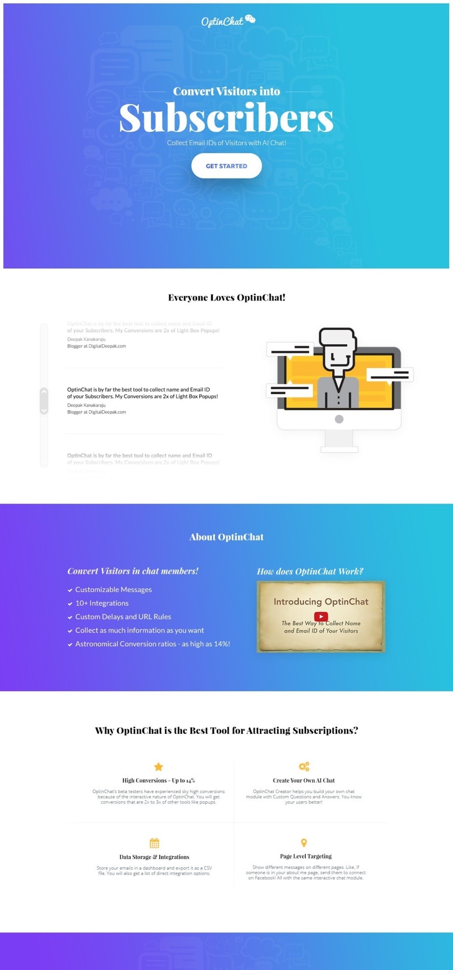
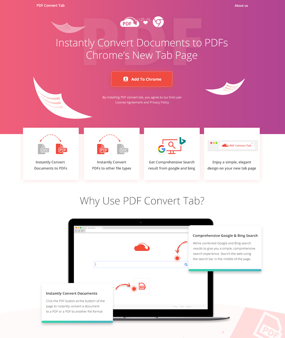
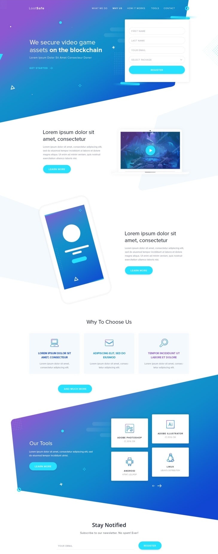
Gradient Landing — Landing Pages Example
Gradients have indeed become a popular design trend, offering versatility and the ability to inject color and dynamism into landing pages. When used thoughtfully, gradients can enhance the visual appeal of a landing page while keeping the focus on key elements like CTAs (Call to Actions) and headers. Here are some ways in which gradients can be effectively used in landing page design:

Design by iva
View Profile →
Design by MailDesigner
View Profile →

Design by Roberto Criado
View Profile →
Design by Adam Muflihun
View Profile →

Design by thecreatv
View Profile →
Design by webDAE
View Profile →

Design by Spillo (Luigi Burrelli)
View Profile →
Computer and Technology Graphics — Landing Pages Example
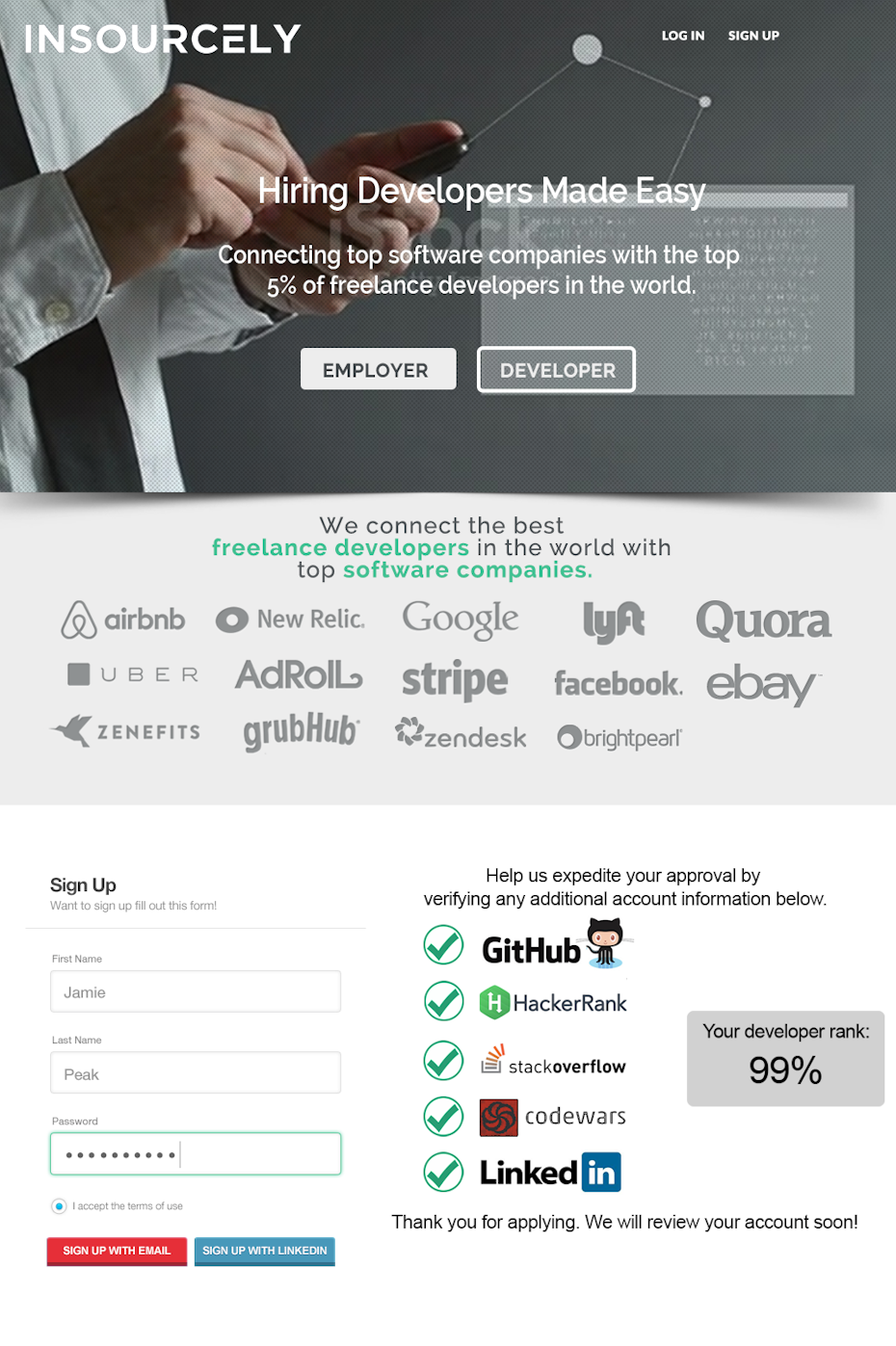
The use of computer-generated graphics and 3D renderings in design is a compelling approach for technology and science-related industries. This style of visual design can indeed leave a profound impression on viewers, instilling a sense of awe and showcasing the technical prowess and advanced attributes of a company’s products or services. Here are some key aspects and benefits of incorporating computer-generated graphics into technology marketing:
Agazdecki by Daylite Designs
View Profile →
Illustrated — Landing Pages Example
Illustration is a widely versatile style for landing pages, offering the flexibility to choose a design that aligns with a brand’s personality and messaging. Whether using 3D illustrations, line art, or hand-drawn designs, illustrations can create a friendly and approachable visual language that resonates with viewers. Here are some key aspects and benefits of using illustrated landing pages:
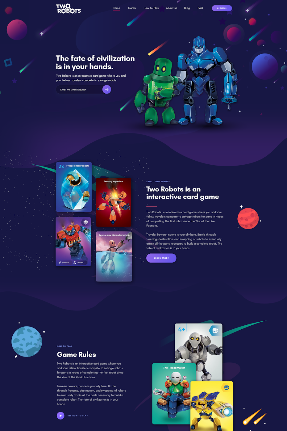
Design by FaTiH™
View Profile →
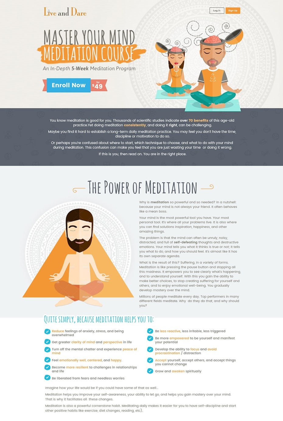
Live and Dare by Prismonline
View Profile →
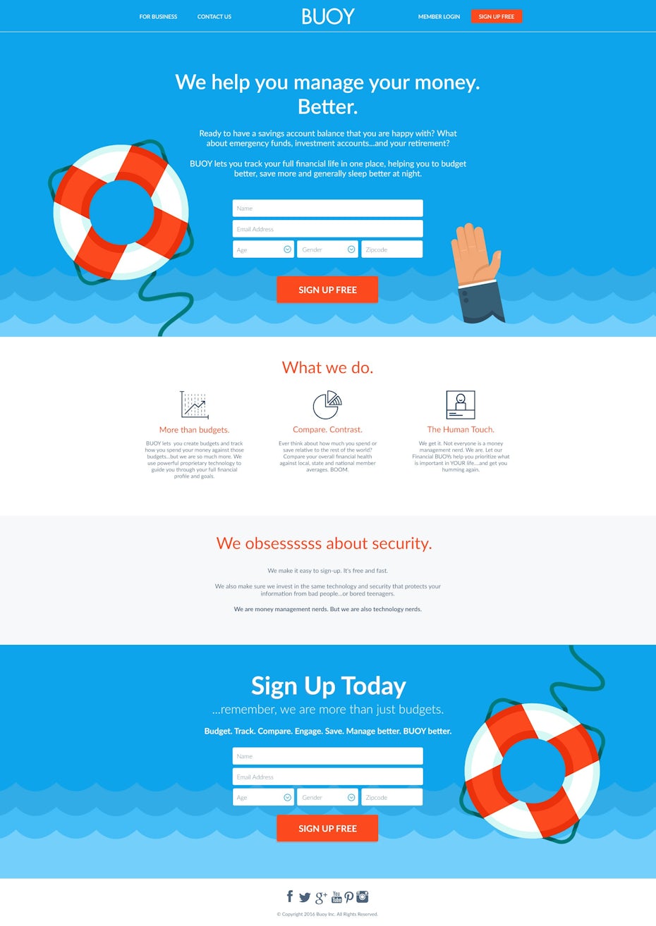
Buoy by theink3dskull
View Profile →
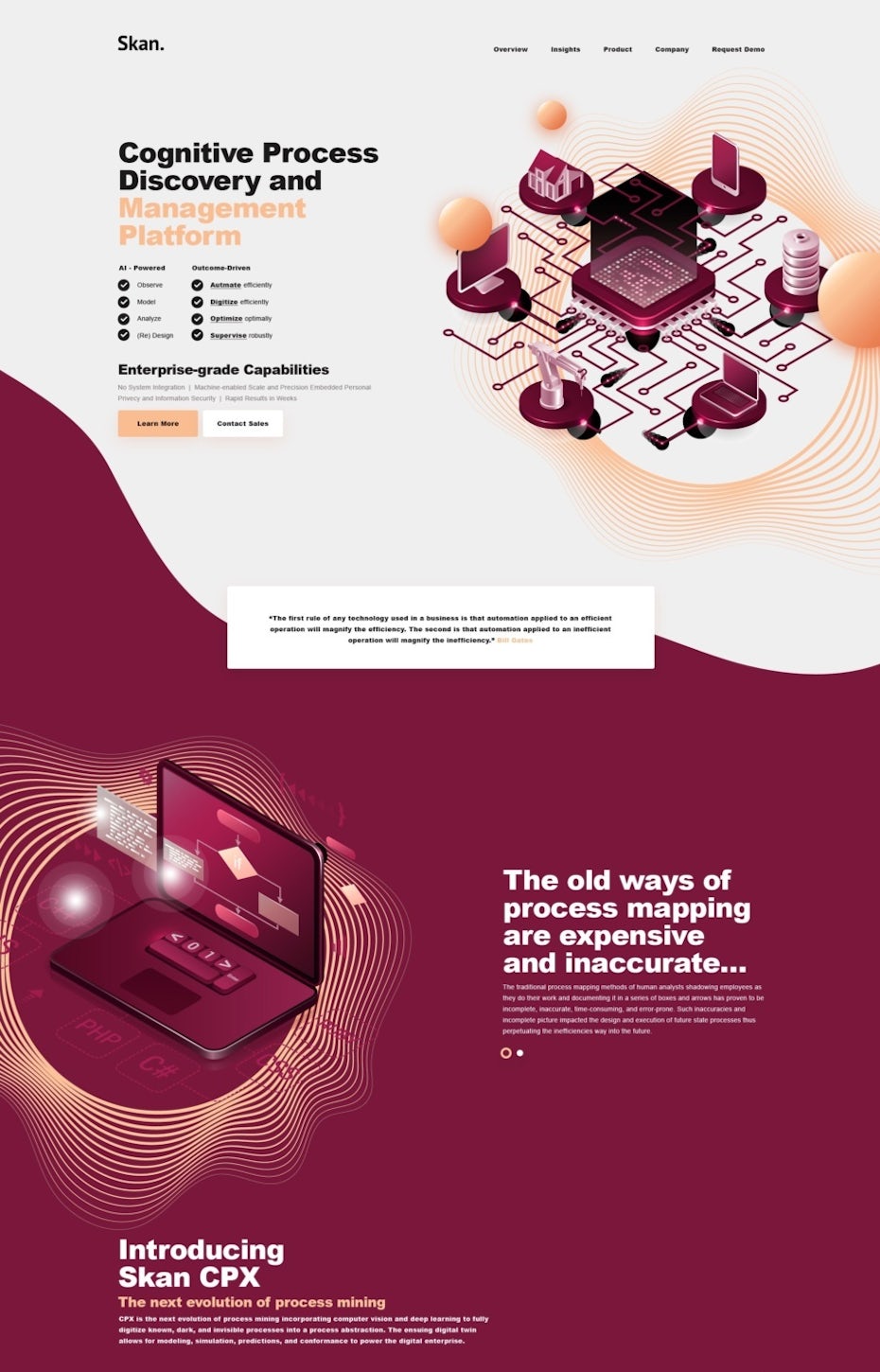
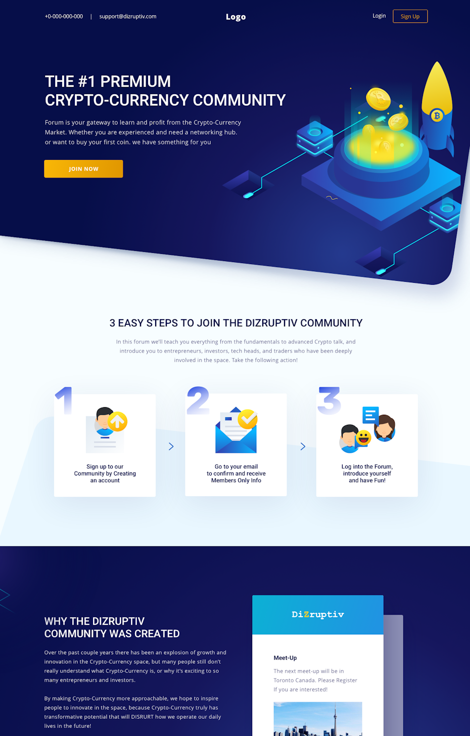
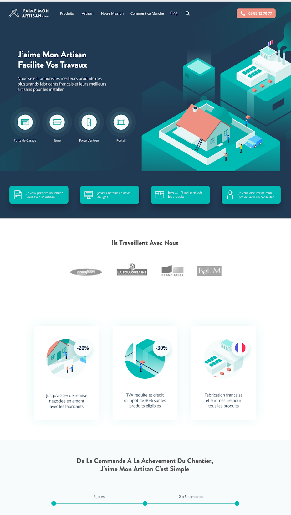
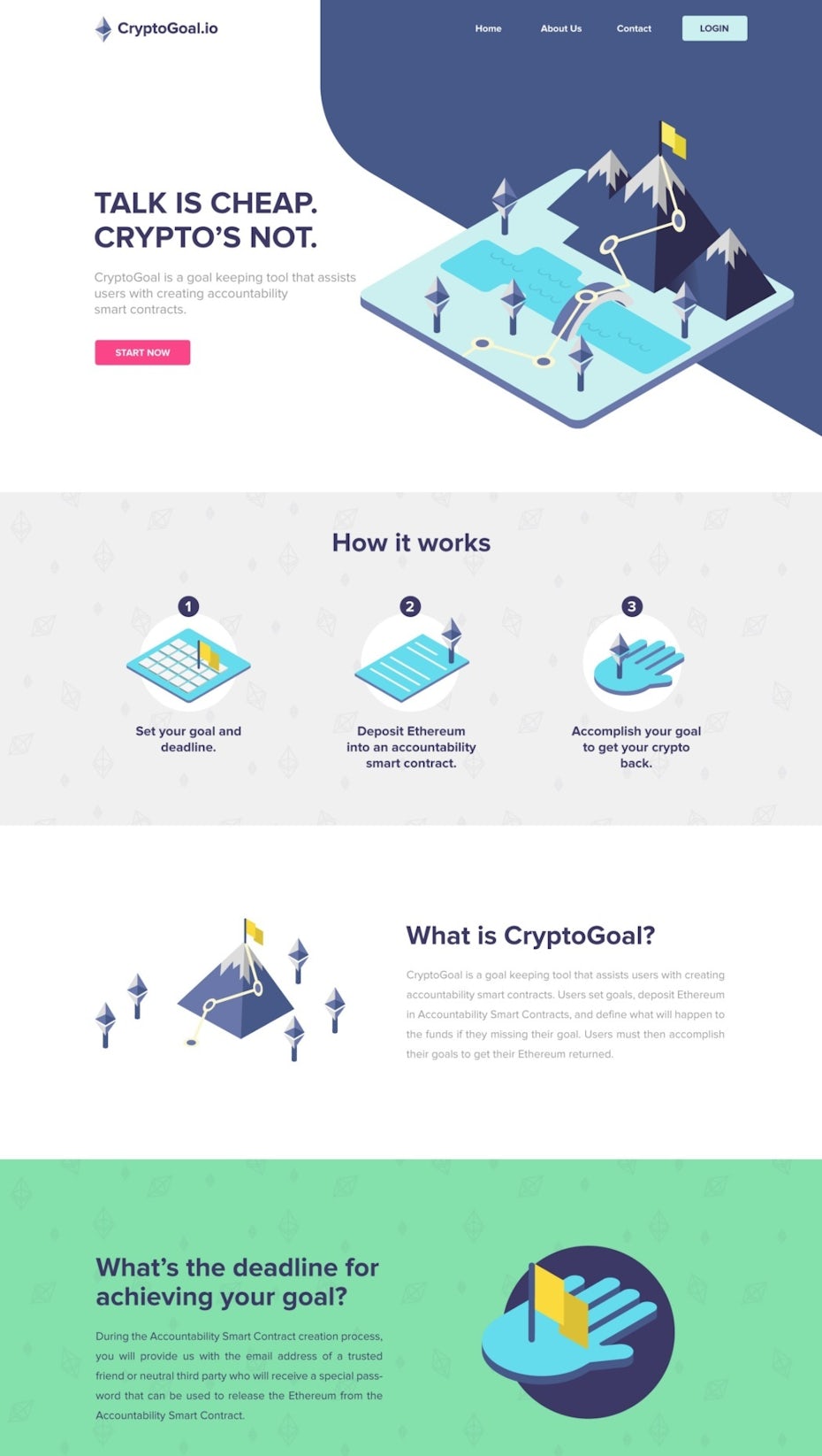
Isometric Designs — Landing Pages Example
Isometric design is indeed an effective approach for landing pages, especially when it comes to explaining complex ideas or showcasing products and concepts from multiple perspectives. Isometric graphics provide a three-dimensional view that can engage and inform visitors. Here are some key benefits and considerations when using isometric design on landing pages:
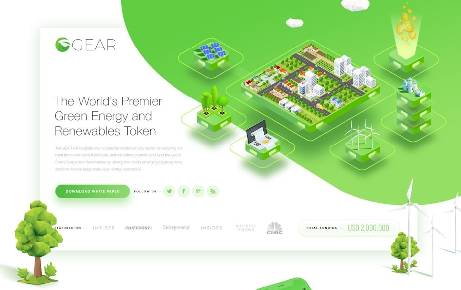
Design by FaTiH™
View Profile →
Design by iva
View Profile →
Design by hamamzai
View Profile →
Design by Random Designer
View Profile →
Design by KisaDesign
View Profile →
– Too many navigation links: Keep visitors focused – remove the main menu.
– Weak or vague headlines: Your headline must clearly state the value proposition.
– Missing social proof: No testimonials or trust signals lowers conversion.
– Slow loading speed: Even a 1‑second delay can reduce conversions by 7%.
– Not optimized for mobile: Over 60% of traffic is mobile; test on all devices .
7 Tips For Creating an Effective Landing Page
1. Use a main headline and a supporting headline
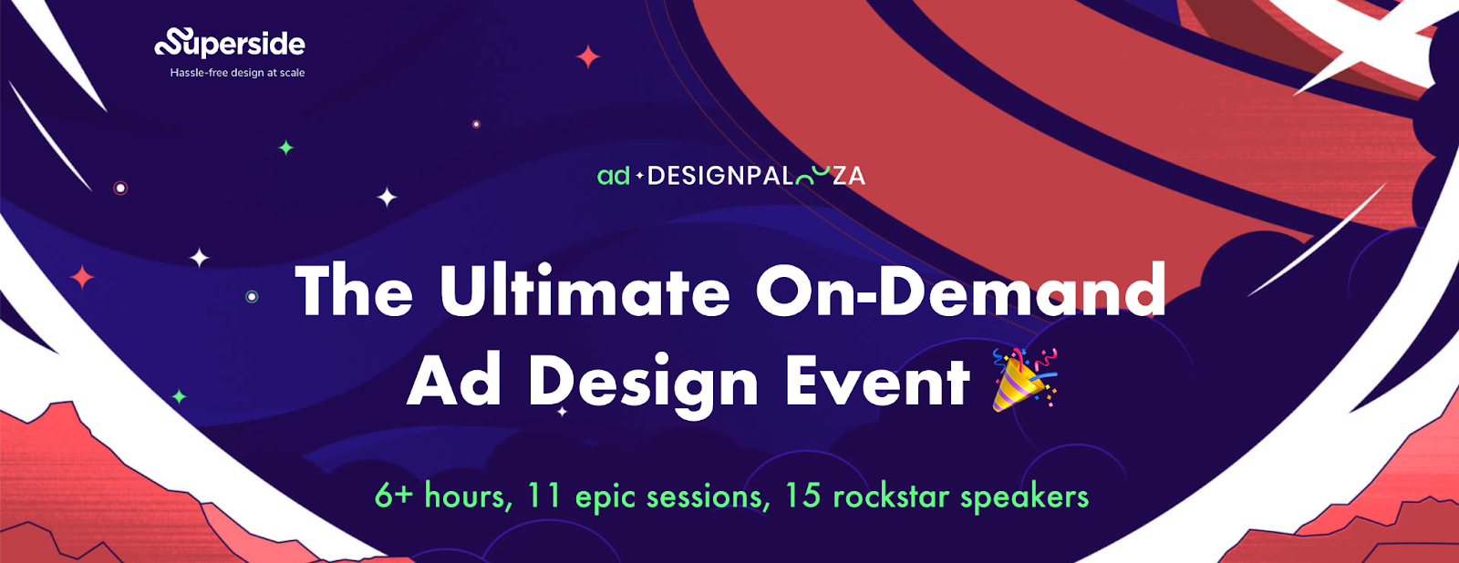
In the main header section of your Ad Designpalooza landing page, it’s essential to convey the offer clearly and explain the value that visitors will receive upon signing up. Here are some quick tips and creative ideas to help you make the most of this section while keeping the text concise:
- Intertwine Features and Benefits: Instead of simply listing features or benefits separately, combine them into a compelling message. For example, “Unlock Powerful Design Tools for Stunning Ads” combines the feature (powerful design tools) with the benefit (stunning ads).
- Try Using a Question: Pose a question that piques visitors’ curiosity and encourages them to learn more. For instance, “Ready to Revolutionize Your Ad Campaigns?” prompts readers to consider the potential benefits.
- Outline a Problem, Agitate It, Then Provide a Solution: Address a common problem your target audience faces, agitate their pain points briefly, and then present your solution. For instance, “Struggling to Create Eye-Catching Ads? Say Goodbye to Design Challenges with Ad Designpalooza!”
- Leverage Data and/or Social Proof: If you have impressive statistics or customer testimonials, consider incorporating them into your header. For example, “Join Over 5,000 Satisfied Advertisers Who’ve Transformed Their Campaigns with Ad Designpalooza.”
2. Know your unique selling proposition (USP)
Highlighting your unique selling proposition (USP) is crucial for making your offer stand out from the competition. In the context of your landing page for the on-demand event, emphasizing the “on-demand” aspect is a great way to differentiate your event from other online conferences. Here’s how you can convey this effectively:
- Clear and Concise Statement: Craft a short and impactful statement that clearly communicates the unique benefit of your event being on-demand. For example, “Access Expert Insights Anytime, Anywhere with Our On-Demand Event.”
- Highlight Convenience: Explain how the on-demand feature provides convenience to attendees. You could say, “No need to wait for a specific date – watch sessions at your convenience.”
- Comparison: You can briefly compare your on-demand event to traditional live conferences. For instance, “Skip the travel and time constraints of live conferences – enjoy all the content on your terms.”
- Visual Representation: Consider using visuals like icons or images that symbolize flexibility and accessibility, reinforcing the on-demand aspect.
3. Showcase the benefits of your offering
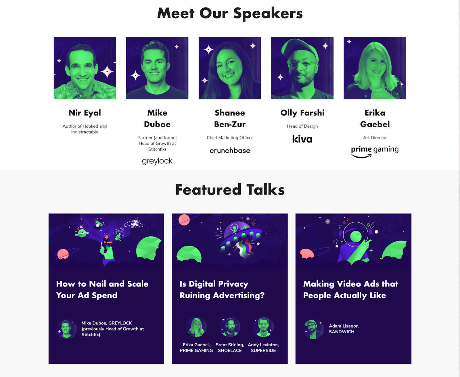
4. Use images or video showing the context of use
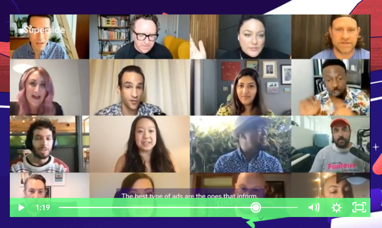
Landing pages with video can increase conversions by up to 86%. Show a short explainer or testimonial video above the fold to capture attention quickly. Ensure videos are mobile‑optimized and don’t autoplay with sound .
5. Use consistent and bold visuals
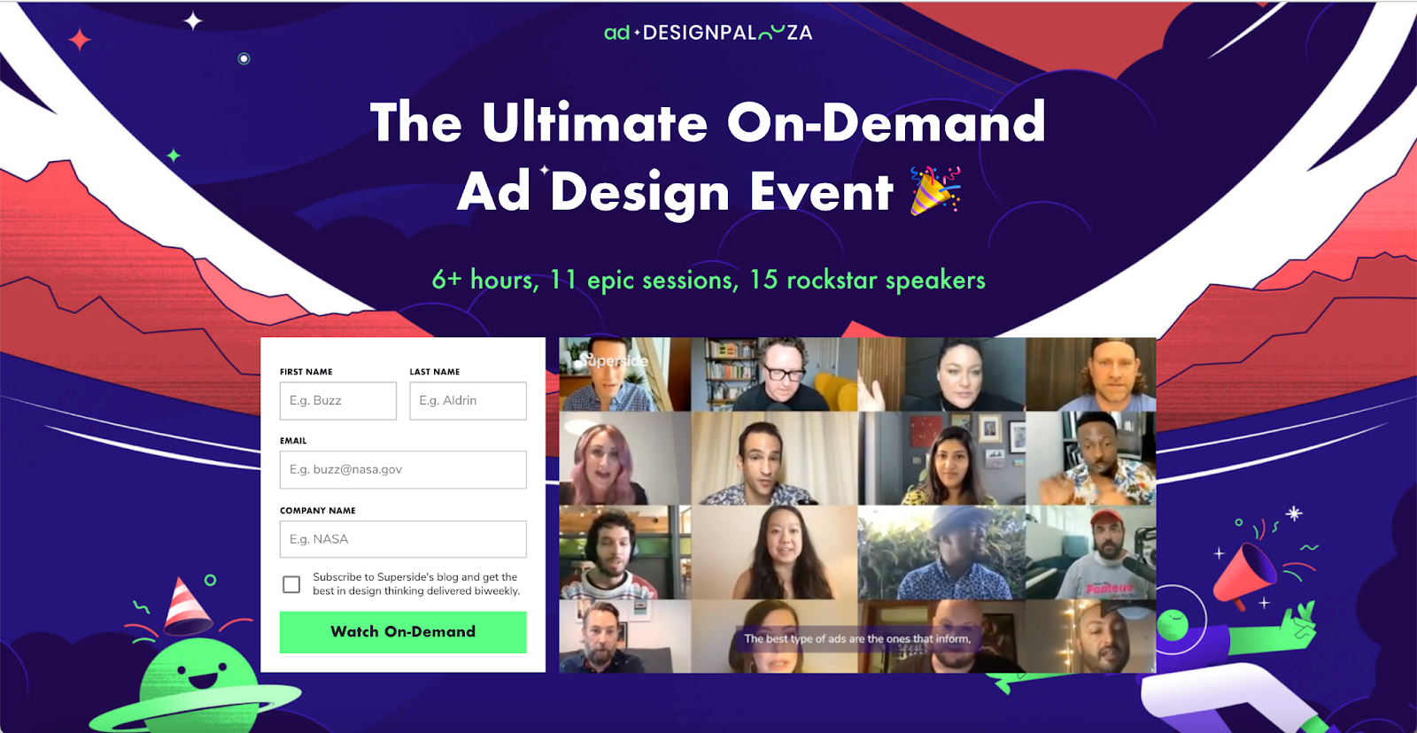
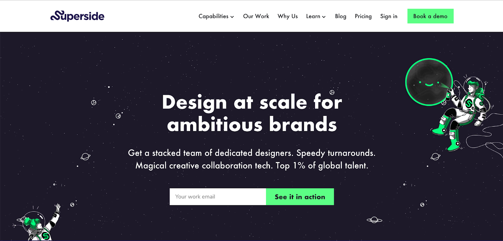

Social proof is a powerful persuasion tool that can help establish credibility and trust with your landing page visitors. Here are some ways to effectively incorporate social proof:
- Customer Reviews: Showcase positive reviews, testimonials, or case studies from satisfied customers or previous event attendees. Include names, photos, or even video testimonials for added authenticity.
- Ratings and Badges: Display any awards, certifications, or industry recognition your product, service, or event has received.
- User Count: Mention the number of people who have already signed up, purchased, or attended your event, as you’ve mentioned with the 5,000 sign-ups.
- Influencer Endorsements: If you have endorsements from well-known influencers or industry experts, prominently feature their support.
- Media Mentions: If your event or product has been featured in reputable publications or news outlets, include their logos or snippets of coverage.
- Social Media Engagement: Highlight social media metrics, such as the number of followers, likes, shares, or comments to showcase your online presence and engagement.
- Trust Seals: If applicable, display trust seals or security badges to assure visitors that their information is safe when signing up or making a purchase.
- Before and After: If your product or service has transformational results, use before-and-after visuals or stories to demonstrate the positive impact.
- Data and Statistics: Incorporate relevant statistics or data points that support your claims or highlight the success of your offering.
7. Include a Call To Action (CTA)
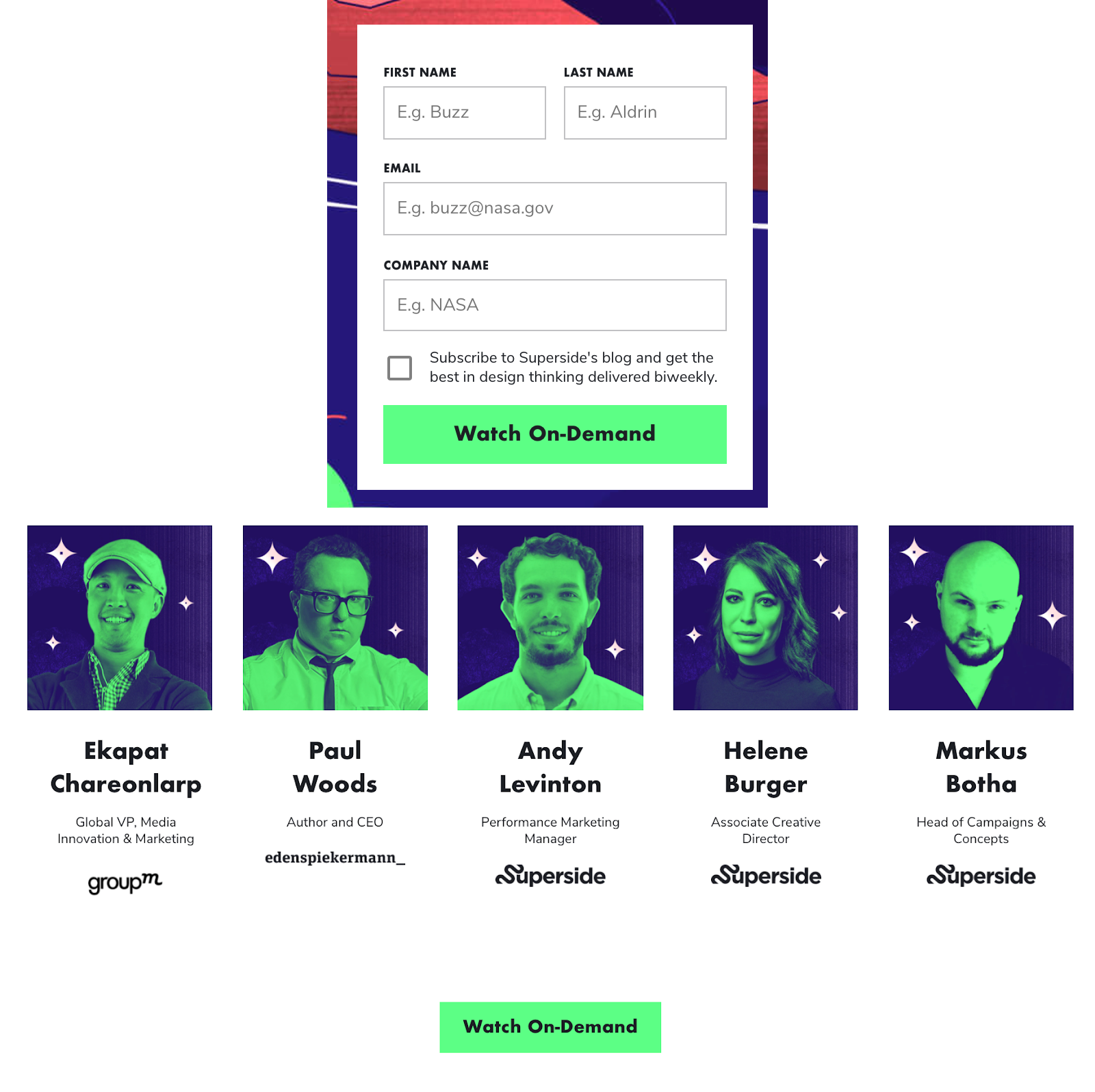
A well-crafted Call to Action (CTA) is the linchpin of a successful landing page. Here are some essential tips for optimizing your CTAs:
- Clear and Action-Oriented Language: Use concise and action-oriented words that tell visitors exactly what they’ll get or what action they should take. Phrases like “Get Started,” “Sign Up Now,” or “Watch On-Demand” are examples of effective CTA copy.
- Contrasting Design: Make your CTA button visually stand out from the rest of the page by using a contrasting color that draws attention. This helps users easily spot the action they need to take.
- Placement: Position your CTAs strategically on the page, ensuring they are visible without the need for excessive scrolling. As you mentioned, having both top and bottom CTAs is a good practice for catering to different user behaviors.
- Whitespace: Surround your CTA with whitespace to prevent visual clutter. This allows the CTA to breathe and makes it more prominent.
- Mobile-Friendly: Ensure that your CTA buttons are designed to be responsive, so they are easily clickable on mobile devices with touchscreens.
- Limited Choices: Avoid overwhelming visitors with multiple CTAs that might confuse them. Stick to one primary CTA that aligns with your main conversion goal.
- Urgency and FOMO: If applicable, add a sense of urgency or fear of missing out (FOMO) to your CTA. Phrases like “Limited Time Offer” or “Only X Spots Left” can encourage quicker action.
- A/B Testing: Experiment with different CTA button colors, copy, and placements to see which variations yield the best conversion rates. A/B testing can help you fine-tune your CTA strategy.
- Consistency: Ensure that the messaging on your CTA aligns with the overall message of your landing page. This creates a seamless user experience.
FAQ
A: There’s no fixed rule, but research shows shorter pages tend to convert better for simple offers. For complex products, longer pages that explain details can work. Aim for enough content to answer all objections, but no longer. Test both .
A: A homepage is a general entry point with navigation to many sections. A landing page is a standalone page designed for a single goal (conversion) with no navigation menus to distract visitors.
A: Only ask for essential information. Forms with 3 fields have 12% higher conversion rates than those with more. Every extra field reduces completion rates .
A: Yes, if the video is short, relevant, and explains your offer. Video can increase conversions by up to 86%. Ensure it doesn’t autoplay with sound, which can annoy users .
A: Extremely important. 92% of consumers trust recommendations from others over branded content. Include testimonials, logos, and user counts prominently .
A: Landing pages can rank in search, but their primary purpose is conversion. For SEO, consider creating pillar pages or blog posts, then directing traffic to dedicated landing pages.
A: Define a clear conversion goal (e.g., sign‑up, purchase). Track conversion rate, bounce rate, and time on page. Use A/B testing to continuously improve .
A: Unbounce, Instapage, HubSpot, Leadpages, and even WordPress with Elementor. Many offer templates and A/B testing built‑in.
📝 Article Summary: Landing Page Design (2026)
- Landing pages are conversion‑focused: No navigation, clear CTA, single goal .
- Visual styles matter: From minimal type to isometric 3D, choose based on your brand and audience.
- Key elements: Strong headline, USP, benefits, social proof, and prominent CTA.
- 7 tips: Use compelling headlines, showcase benefits, incorporate social proof, and test CTAs.
- Common mistakes: Too much navigation, slow speed, missing social proof, weak headlines.
- Optimization: Always A/B test headlines, images, and CTAs to improve conversion rates.
Landing page design is both an art and a science. Use the examples and tips above to create pages that convert visitors into customers. Remember to test, iterate, and always keep the user’s goal in mind.
🚀 Tools to Build Your Landing Page
Unbounce
Instapage
Elementor
Leadpages
Hire a Designer on 99designs
📚 Further Reading from Trusted Sources
- Unbounce: Landing Page Articles
- Instapage Blog
- Leadpages Blog
- ConversionXL Blog
- Neil Patel: Landing Page Examples
- Crazy Egg: Landing Page Optimization
- Moz: Landing Page Optimization
- 99designs: Landing Page Design
- Smashing Magazine: Landing Pages
- Wix: Landing Page Design Guide
